
Leading UI/UX Design Agency
We Design Products That
Drive
Results


.avif)
Proven Success in Every Industry
Travel
Easy Booking for Dream Trips
Triply is a hassle-free & effective tour solution for travelers. It's an all-inclusive booking and planning website that helps people make their dream trips easier.
Pages in Projects
Retention Growth

Restaurant
Transform Your Dining
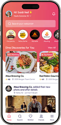
At Plate, we bring you a handpicked selection of premium restaurants that offer not just meals, but memorable dining experiences, you'll cherish.
Location
Project Duration

SaaS
Reducing Carbon Footprints
Yenex is a smart and sustainable energy platform. It empowers users with distributed energy solutions to reduce carbon footprints effortlessly.
Project timeline
Customer Acquisition

Healthcare
Revolutionize Fitness Goals
Fitmate transforms fitness in Australia with flexible gym access, personalized schedules, and AI-driven insights to solve common workout limitations for users.
Project scope
Project Duration

Vehicle Maintenance Platform
Simplifying Vehicle Care
Zantrik is an innovative vehicle maintenance app. We revamped it with a fresh design, gamification, and intuitive features to boost user engagement.
Project Duration
Work Scope

Success Stories
That Inspire Us
Smarter Design, Supercharged by AI
From wireframes to launch, we blend AI tools with strategy to deliver faster, sharper, and data-led design results.
UX Copy That Clicks
We use AI to create effective copies like CTAs and microcopy that speaks.
%20(1).avif)
Visuals, Instantly on Point
We generate custom visuals using AI for faster concept directions, brand-ready

Data-Led Design Decisions
We predict user behavior before launch with AI-powered heatmaps that help us
%20(1).avif)

Smarter & Faster Wireframes
We rapidly turn ideas into functional wireframes using AI tools, with less

Launch Quicker, Spend Less
AI reduces revisions and guesswork and makes your website ready to launch
%20(1).avif)
No Blank Canvas Struggles
AI generates editable mockups from prompts so we can skip the slow start
%20(1).avif)
Why Us? Because Your Growth Is Our Mission
See the difference thoughtful design makes. Our works highlight the dedication we bring to every client partnership.
.svg)
We Design Brands That Speak to Audiences
UI/UX Design
UI/UX Design, App Design, Website Design, Dashboard Design, Wireframing & Prototyping, Interaction Design, and Product Design.

Web Development
Frontend Development, Backend Development, Full Stack Solutions, Mobile App Development, Custom Web Applications, API Integration.

Logo & Branding
Logo Design, Full Branding, Business Branding, 3d logo, Custom Logo, Visual Identity, Brand Strategy, Social Media Branding, and Brand Guidelines.

Webflow & Framer
Custom Webflow Websites, Webflow Plugin, Framer Prototypes, Framer Material, Framer App, CMS Integration, Rapid Development.


We Design for the Future to Drive Today’s Success
Unlimited Revisions
We’re committed to your satisfaction with unlimited revisions at every step. Our mission is to make your vision come to life exactly as you imagine.
Lifetime Support
With our lifetime support, you’re never alone. We’ll be there for you at every stage with necessary guidance and assistance whenever you need it.
Personalised Plans
Get top-quality service without breaking the bank. Our rates are designed to fit your budget so that you can get the best value for your investment.
Custom Design Solutions
Our easy payment options are completely flexible. So, you can invest in your success while staying within your budget.
24/7 Customer Support
Benefit from the expertise of our carefully chosen resources that are designed to make your journey smooth and effortless with outstanding results.
Unbeatable Value
Unmatched Quality
Website Design
Web/Mobile App Design


Monthly Subscription
Bonuses Worth Over $2,500-Yours Free!
Free Design Prototype
Experience your design in action before development.
Developer Handoff
We ensure what we design is exactly what gets built.
Project Management
Stay on track with our expert project management.
Project Consultation
Get professional advice to enhance your project.


Design Monks’s Alternative?
Think One More Time!
Design Monks


In House Team
Creative Agencies
Freelancers
Self-Service Tools
.avif)

Be a Monk! Like us

Trusted by People
Chosen by Brands
Your Questions
Answered!
How can I start a project with Design Monks?
Starting a project with us is simple. Just reach out through our contact form or email, and share a brief about your needs. We’ll schedule a call to understand your goals, discuss the scope, and recommend the right approach tailored to your product or brand.
Yes, Design Monks is a start-up-friendly agency. We understand the unique challenges start-ups face and offer affordable and flexible design solutions that fit your budget and needs. Our team is committed to helping your start-up build a strong brand and user-friendly digital presence from the ground up.
Why is Design Monks different?
The team Design Monks prioritizes a perfect mix of creativity, client-focused strategy, and deep industry insights. We consistently deliver high-quality UI/UX design across branding, product design, and web design. Our collaborative process ensures designs align with your goals to help your brand grow and succeed. This is definitely a unique process that makes us different from others.
Yes, Design Monks is a start-up-friendly agency. We understand the unique challenges start-ups face and offer affordable and flexible design solutions that fit your budget and needs. Our team is committed to helping your start-up build a strong brand and user-friendly digital presence from the ground up.
How Long Does a Design Project Take?
Starting a project with us is simple. Just reach out through our contact form or email, and share a brief about your needs. We’ll schedule a call to understand your goals, discuss the scope, and recommend the right approach tailored to your product or brand.
Yes, Design Monks is a start-up-friendly agency. We understand the unique challenges start-ups face and offer affordable and flexible design solutions that fit your budget and needs. Our team is committed to helping your start-up build a strong brand and user-friendly digital presence from the ground up.
Is Design Monks a start-up-friendly agency?
Yes, Design Monks is a start-up-friendly agency. We understand the unique challenges start-ups face and offer affordable and flexible design solutions that fit your budget and needs. Our team is committed to helping your start-up build a strong brand and user-friendly digital presence from the ground up.
Yes, Design Monks is a start-up-friendly agency. We understand the unique challenges start-ups face and offer affordable and flexible design solutions that fit your budget and needs. Our team is committed to helping your start-up build a strong brand and user-friendly digital presence from the ground up.
What design tools do you use?
We use different industry-leading tools. For pixel-perfect UI/UX and Web designs, we swear by Figma and Figjam. When it comes to crafting visually stunning branding and product designs, our go-to is the Adobe suite, which includes Photoshop, Illustrator, and After Effects. And for seamless project documentation? Notion's got our back. All are aimed at delivering top-quality results.
We use different industry-leading tools. For pixel-perfect UI/UX and Web designs, we swear by Figma and Figjam. When it comes to crafting visually stunning branding and product designs, our go-to is the Adobe suite, which includes Photoshop, Illustrator, and After Effects. And for seamless project documentation? Notion's got our back. All are aimed at delivering top-quality results.
Do you provide UX audits or redesigns for existing products?
Yes, we offer detailed UX audits as well as full redesign services. Whether your product needs usability improvements or a visual refresh, we analyze existing flows, identify issues, and create strategic design solutions. We manage everything to boost the user experience and performance of your platform.
Yes, Design Monks is a start-up-friendly agency. We understand the unique challenges start-ups face and offer affordable and flexible design solutions that fit your budget and needs. Our team is committed to helping your start-up build a strong brand and user-friendly digital presence from the ground up.
Enhance Your Brand Potential At No Cost!
Expect a response from us within 24 hours
We’re happy to sign an NDA upon request.
Get access to a team of dedicated product specialists.


Why risk it with the wrong partner? Get 100% value and guarantee. Don’t miss out - Secure your brand’s future today.
Why risk it with the wrong partner? Get 100% value and guarantee. Don’t miss out - Secure your brand’s future today.


.svg)
.svg)


.svg)


.avif)
.svg)









.svg)
.svg)
.svg)
.svg)

.avif)


