
Key Takeaways
- Travel website success depends on balancing inspiration, usability, and seamless booking flows.
- Mobile-first, fast-loading, and responsive design directly impact user retention and conversions.
- High-quality visuals and immersive media strongly influence traveler trust and decision-making.
- Simple navigation, clear information, and filters reduce friction in complex travel journeys.
- Security, reviews, and brand consistency build long-term trust and customer confidence.
Planning a trip is exciting, but finding the right website to help with travel arrangements can make all the difference. Travel website design plays an important role in this process. Indeed, the design along with the UX can determine the user experience of this site.
A travel booking website design can either simplify or complicate the journey from dream to reality. These websites are more than just online brochures; they do more, like letting you book flights, accommodations, and activities.
That’s why, getting the design right isn’t just about aesthetics, it’s about creating an engaging experience for users. Today, I’m about to discuss everything about the design of a travel website.
So, don’t skip anything if you have a plan to try one.
Why Designing a Travel Website is Different
Travel websites stand apart from traditional websites because of their unique purpose and audience. They must pose a delicate balance between inspiration and booking processes.
Unlike e-commerce sites that focus on product sales or informational platforms, a travel website can have different goals. These websites try to capture the elixir of a journey while guiding users through knotty planning steps.
The design of a travel website demands a blend of creativity, functionality, and real-time interaction. It serves a zestful audience who seek both information and experiences. These factors create unique challenges for designers, as travel websites are different from digital platforms.
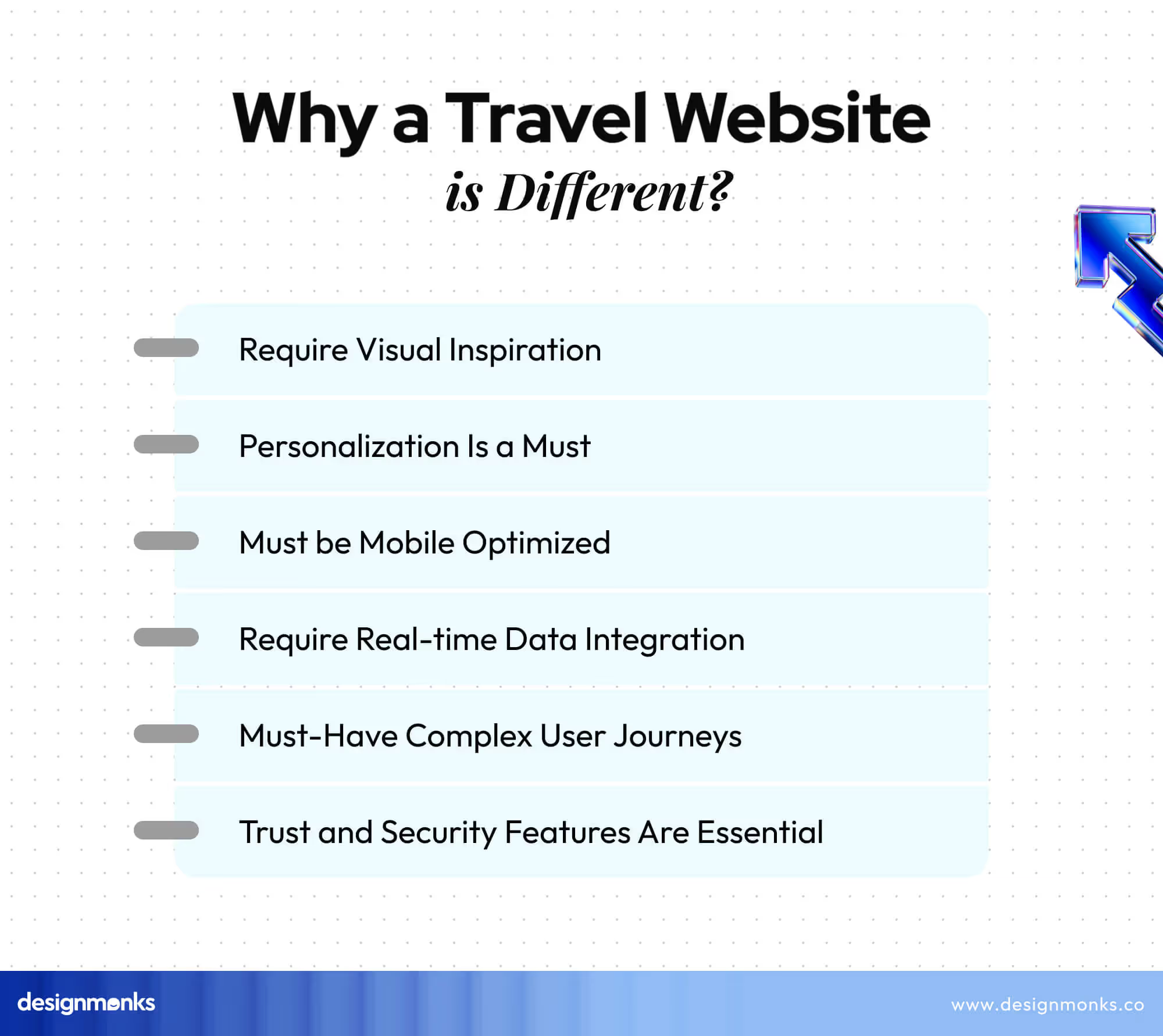
Here are some of the major aspects that make travel websites different from the traditional ones:
- Must-Have Complex User Journeys: Travel websites call for multi-step processes. Users navigate through flight bookings, hotel reservations, car rentals, and tour planning. So, the designers must create clear pathways.
- Require Visual Inspiration: A collection of high-quality images, videos, and virtual tours are essential. These visuals bring forth emotions, spark imagination, and encourage users to explore different destinations.
- Personalization Is a Must: Travel websites should offer customized content and recommendations. It has to suggest destinations based on user preferences, customize search results, and remember past behaviors.
- Require Real-time Data Integration: Latest information on prices, availability, weather, and local events is essential. You must create interfaces that can display and update this information without overwhelming the users.
- Trust and Security Features Are Essential: Almost all travel websites handle large transactions and sensitive personal data. So, designers must add secure payment gateways.
- Must be Mobile Optimized: Many users plan and book trips on mobile devices. You must adopt a mobile-first approach. It will confirm that all features and content are accessible across various screen sizes.
Types of Travel Websites
Usually, there are different types of travel websites according to their purposes, functions, and target audiences. Here are some of the main types of travel websites and their unique design elements:
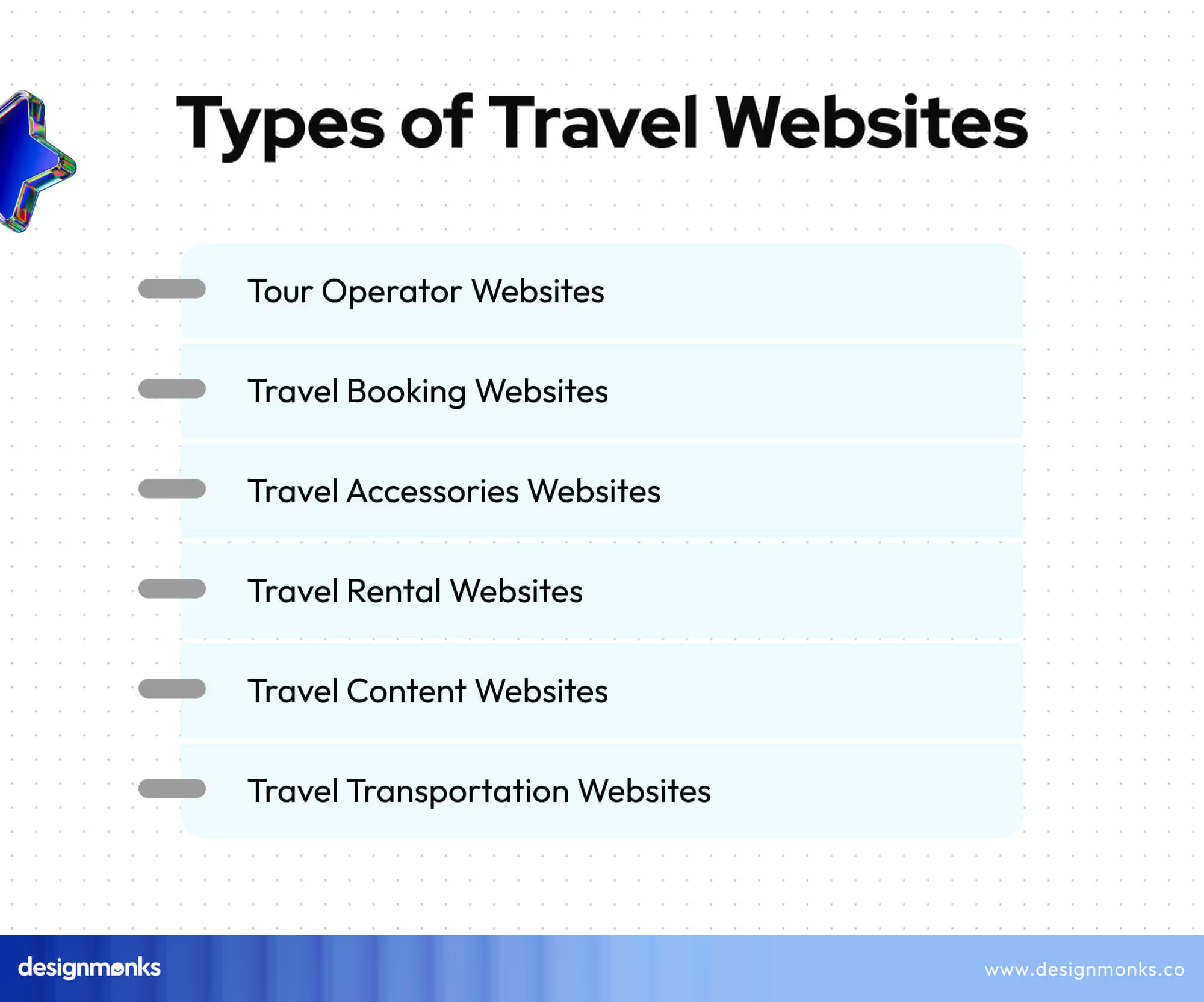
Tour Operator Websites
Tour operator websites offer organized tours and trips. Their design focuses on showcasing pre-packaged tours. They are mostly divided into inbound, domestic, or outbound categories.
Inbound tour operators target international travelers visiting a specific country. On the other hand, domestic operators focus on trips within the same country.
Outbound operators promote international trips. These websites often highlight itineraries, pricing, and booking options. Also, they focus on clear calls to action to convince travelers to book tours quickly.
Travel Booking Websites
These websites help users find flights, hotels, rental cars, and so on. Well-known booking platforms like Expedia and Kayak feature easy search functions. Also, they take in comparison tools and user reviews.
Designs of these websites emphasize simplicity and functionality. So, it is easy for travelers to complete bookings with minimal effort. These sites prioritize user experience over everything. It ensures quick load times and seamless navigation to avoid frustration during the booking process.
Travel Accessories Websites
Websites that sell travel gear and accessories need an e-commerce-focused design. So, they require clear product categories, detailed descriptions, and high-quality images.
These sites pursue a smooth shopping experience over anything else. Also, they want to provide users with quick access to luggage, gadgets, and other travel essentials.
Travel Rental Websites
Travel rental websites like Airbnb focus on short-term rentals and unique accommodations. The design of these websites highlights location-based search, property images, and user reviews.
Here, it is important to build trust between hosts and travelers. So, verified reviews and secure payment options play a big role.
Travel Transportation Websites
Transportation websites assist with transportation logistics, like car rentals or public transit. Their design focuses on maps, real-time tracking, and route suggestions. So, these websites focus more on utility and ease of use.
Travel Content Websites
Alongside all the mentioned types, there are websites for travel blogs and magazines. This type is designed to inspire and inform with stories, tips, and destination guides. These websites often utilize high-quality visuals and easy navigation through categories like food, culture, or adventure.
Each travel website type has specific design needs, but all share the goal of creating a seamless user experience. So, they can help travelers plan their trips confidently.
Best Practices for Travel Website Design
A travel website design needs a combination of design, usability, and functionality. This combination is essential to keep visitors engaged and ensure a smooth experience. Here are the best practices for designing a travel website:
1. Prioritize User Experience First
UX is important for any type of website. It’s even more essential for a travel website as they require a mobile-friendly design. It’s because most users book trips or browse destinations on their phones.
A responsive layout is a must to make the site work flawlessly on any device like a mobile, tablet, or desktop. An intuitive and accessible search bar is another requirement here.
Also, you should use filters to let users refine searches by price, location, or type of accommodation. It’ll help them quickly find what they’re looking for. At the same time, you need to prioritize fast load times to keep users engaged. For these matters, you need to ensure a better UX for the travel website.
2. Utilize High-Quality Visuals
Travelers rely on visual content to make decisions. Here, visual elements work better than texts. That’s why you should use high-resolution images and videos to showcase destinations, hotels, and activities.
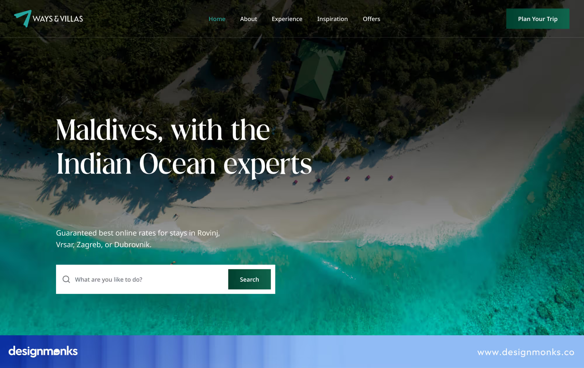
Utilize High-Quality Visuals
Make sure to add virtual tours or 360-degree views of popular spots to provide a more immersive experience. Large, captivating banners with aesthetic scenery images can set the tone for the rest of the site. This way, you can make your website more attractive for the travelers.
3. Provide Valuable Information
Your users who might be customers may not know much about the travel destination you are displaying. That’s why you should add concise descriptions of each destination, highlighting major attractions and must-visit spots.
Another nice idea is to offer hotel or accommodation suggestions and link them to booking platforms. You can also add travel guides that cover local culture, activities, and popular spots.
Travel tips like packing advice, maps, and transportation info can also help users plan better. Make this information easy to find and accessible from different sections of the site.
4. Ensure Easy Navigation
The navigation of the website should be clear and simple. Use a clean menu structure that stays consistent on all pages. Descriptive labels make it easy for users to know exactly where they are headed. Eventually, they don’t need to rely on industry jargon for that.
Breadcrumbs help visitors track their journey through the site, and organize content into logical categories like destinations, packages, activities, etc. They ensure that the users find what they need quickly. A search bar can add another layer of usability so that users can pinpoint specific content quickly.
5. Build Trust and Security
Security is essential, especially when users are booking trips and entering payment details. So, never forget to use SSL certificates to secure sensitive information.

Also, you should display trust symbols and clear refund policies to ensure customers feel confident while booking. Reviews and testimonials also build trust and showcase real customer experiences.
6. Maintain Brand Consistency
Your website should reflect your brand’s identity. From colors to typography, ensure uniformity in design elements on all pages. Try to use adaptable templates to personalize the website’s appearance.
However, make sure that the site is not losing coherence in this case. Prioritize a consistent brand image that will increase recognition and help build trust with potential customers.
7. Optimize for Search Engines
Search engine optimization (SEO) can help you bring traffic to your site. That’s why you should always prioritize SEO matters. Use relevant keywords in titles, meta descriptions, and content to rank higher in search results.
Local search optimization can attract users from specific regions. In this case, consider having fast load times, mobile optimization, and responsive design for better SEO rankings.
8. Focus on Booking Simplicity
The booking process should be seamless for a travel booking website design. Make it easy for users to check availability, compare prices, and confirm bookings in a few simple steps. Also, you should avoid unnecessary forms or details, as complexity can lead to abandoned bookings.
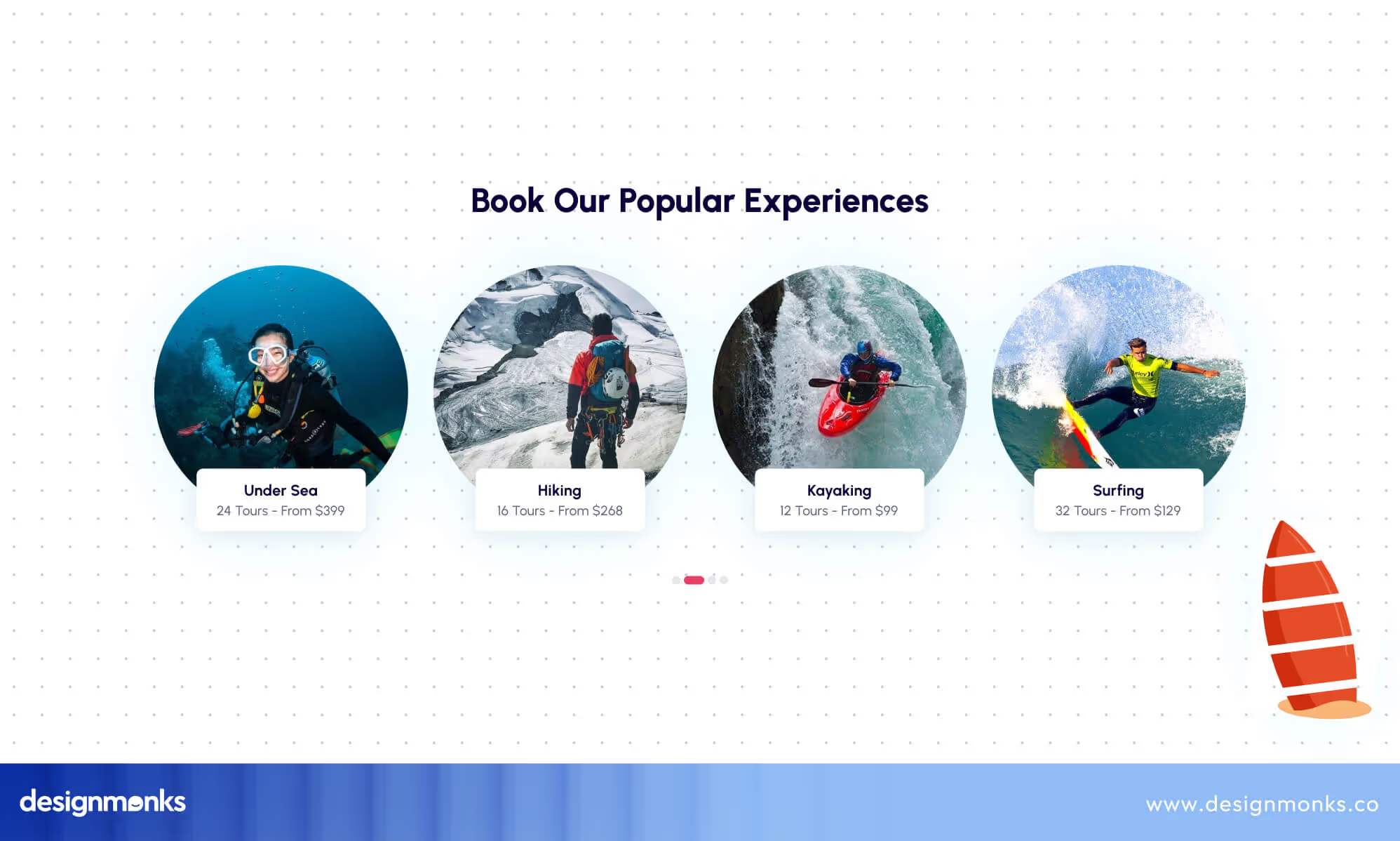
Alongside all the mentioned practices, you should add reviews, ratings, and user-generated content to encourage potential customers to trust your services.
Best Travel Website Template Examples
Now, you must be expecting some vacation website design template to kickstart your travel website, right? Below, we’ve reviewed 5 of the best templates, each offering unique features for agencies, operators, and travel startups.
1. MonksTrip by Design Monks
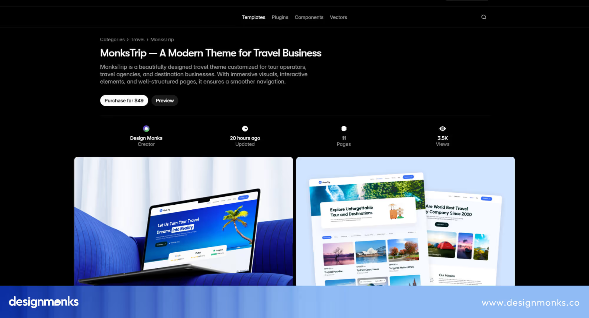
A sleek & modern Framer template designed by Design Monks for agencies and travel platforms that want a strong balance between visuals and functionality. Monks Trip combines immersive destination showcases, smooth animations, and built-in components for reviews, FAQs, and blogs to make it perfect for storytelling-driven travel sites.
2. Travelicious
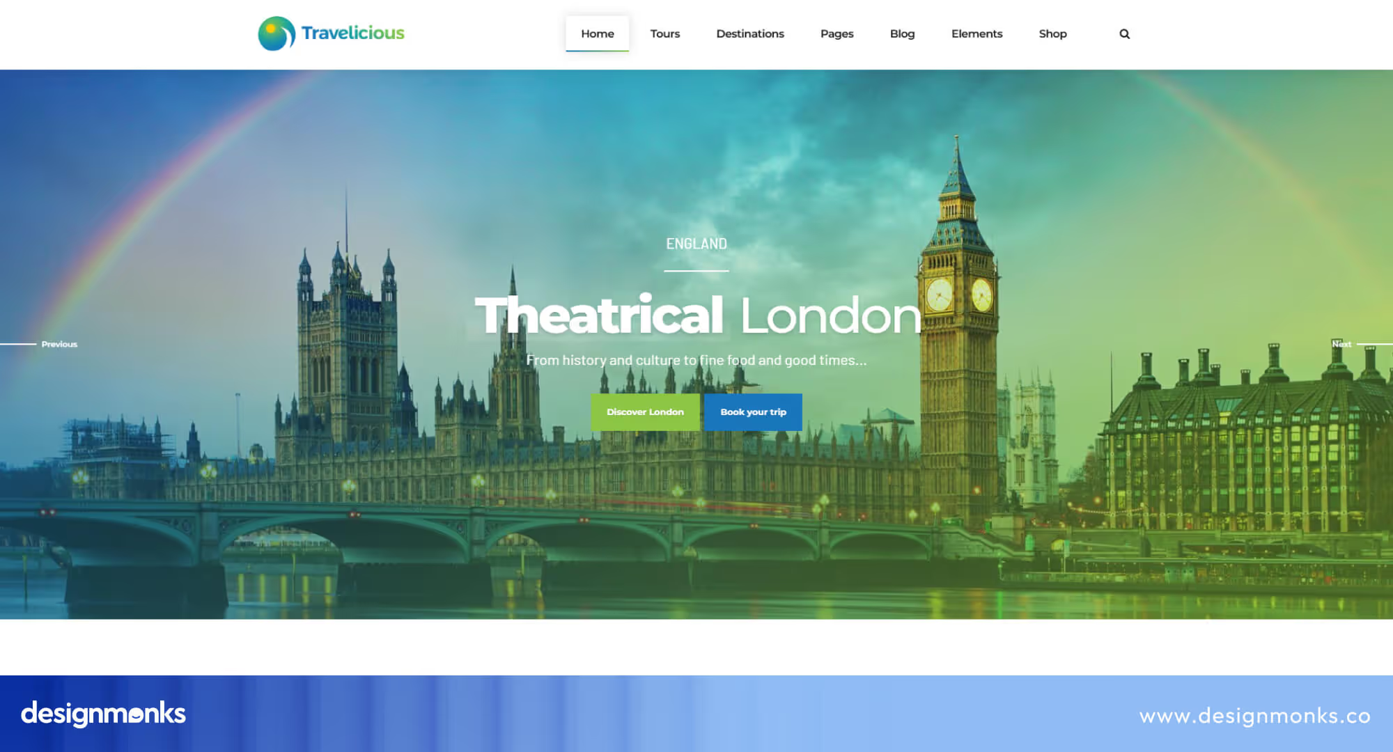
Built with flexibility in mind, Travelicious is an all-in-one WordPress theme suited for tour operators who manage multiple itineraries. It comes with homepage variations, interactive maps, and advanced booking forms for travelers to browse and book directly on your website.
3. Star Travel: HTML Travel Website Template
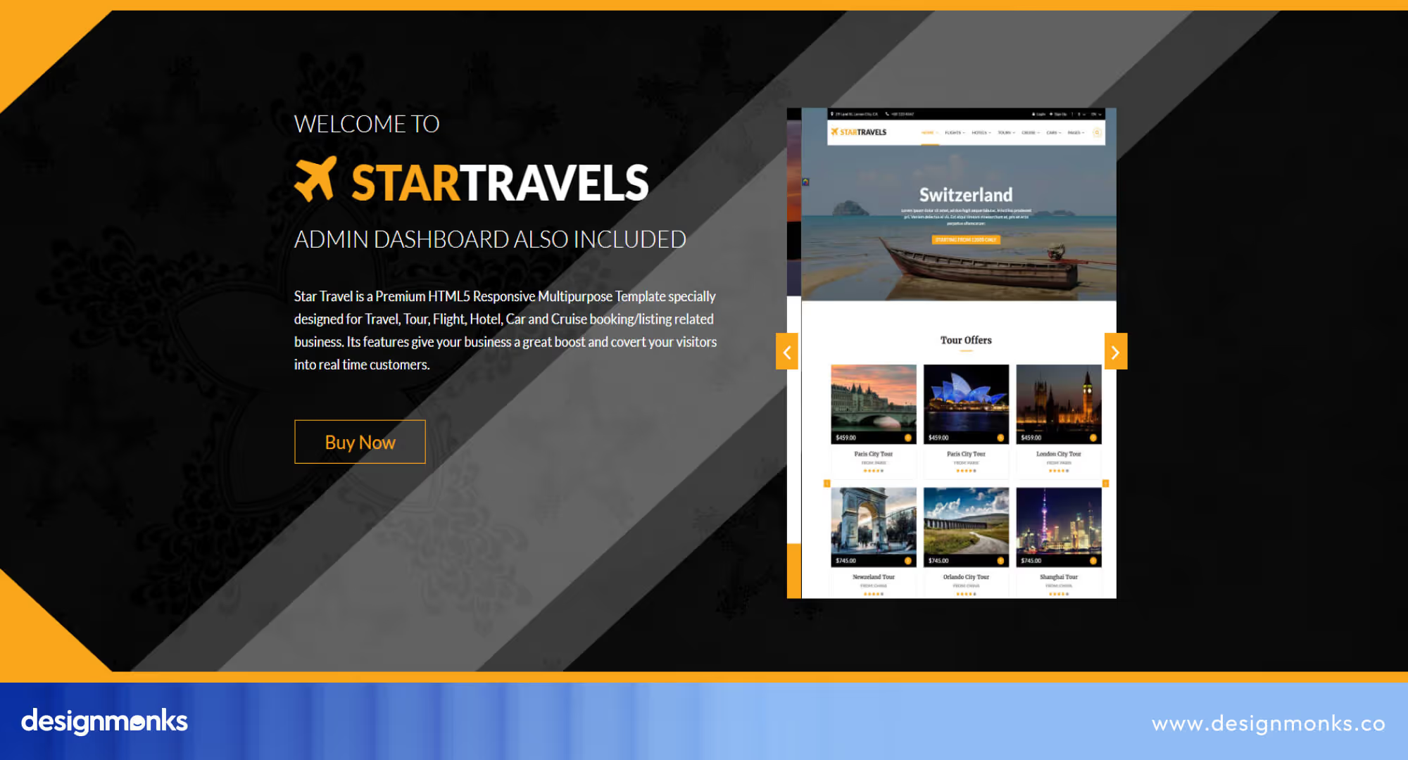
Star Travel is a powerful HTML5 template offering 120+ pre-made pages and colorful layouts. It’s best suited for large travel agencies with heavy content needs. It also provides easy customization while maintaining a professional, engaging look across booking, tour, and destination pages.
4. Sightseeing Travel Template
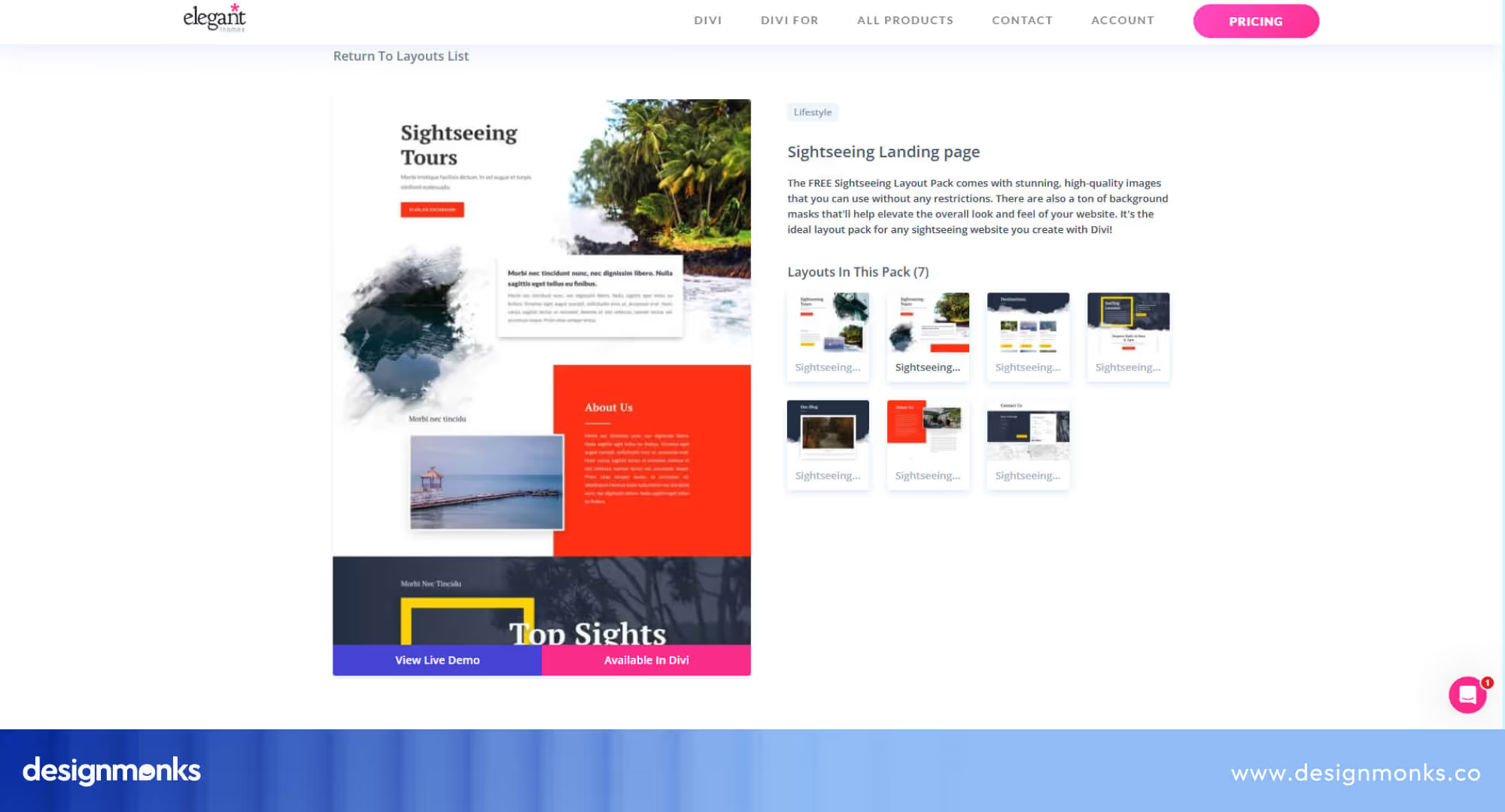
Sightseeing Travel Template
This Divi-based layout, Sightseeing, is designed to capture the excitement of sightseeing tours. Its simple, engaging structure and strategically placed CTAs help travel businesses attract tourists and promote activities effectively. It’s perfect for smaller operators that want a clean and easy WordPress-compatible design.
5. Travel Agency Template
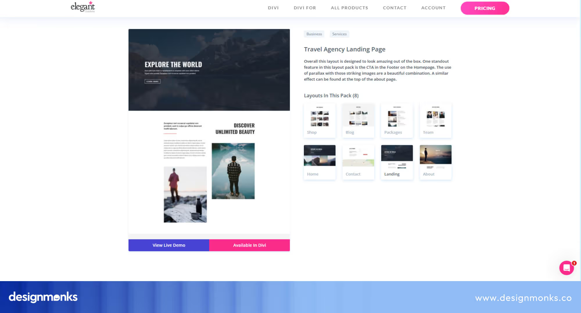
Another Divi option, this template provides a polished and highly visual layout. This Travel Agency Template is perfect for agencies that want to showcase a wide range of travel services with a professional appeal. The clean design and easy customization make it ideal for building trust and credibility.
Travel Website Design Trends in 2025
In 2025, the biggest design trends highlight personalization, advanced technology, and mobile-first approaches. Let’s check out the 5 most prominent trends of tour travel website design in 2025:
Personalization Is Driving Vacation Website Design
Modern vacation website design is all about tailoring experiences for the traveler. From AI-driven destination suggestions to personalized itineraries, sites are moving away from static layouts and toward dynamic designs only when they get a touch of personalization.
Minimalist Aesthetics Paired with Visual Storytelling
Travelers want clarity and inspiration, not clutter. Clean layouts combined with high-quality photography and video storytelling are now essential. A minimalist interface allows destinations and experiences to shine, while strategic use of white space improves focus, readability, and booking conversions.
Design a Travel Website with Mobile in Mind
With most users browsing on their phones, mobile-first design is non-negotiable. When exploring how to design a travel website in 2025, responsive layouts, fast loading times, and seamless booking flows ensure users can plan trips on the go without frustration.
The Rise of Webflow Travel Website Design
Webflow travel website design is gaining massive traction due to its no-code flexibility, visual CMS, and advanced animation capabilities.
Agencies and startups get Webflow design service to build custom booking systems, responsive layouts, and immersive experiences without relying heavily on developers, accelerating design-to-launch timelines.
Integrating Immersive Tech for Engagement
Virtual tours, interactive maps, and AI-powered chat assistants are transforming travel websites into engaging platforms. These features let visitors explore destinations digitally before booking, creating trust and excitement while bridging the gap between online browsing and real-world experiences.
Successful Travel Website Design Example
Triply is one of the many projects by Design Monks. It’s an all-in-one travel booking platform that helps users discover, plan, and book trips seamlessly. The goal was to solve major travel frustrations: scattered information, complex booking steps, lack of destination insights, and missing personalized recommendations.
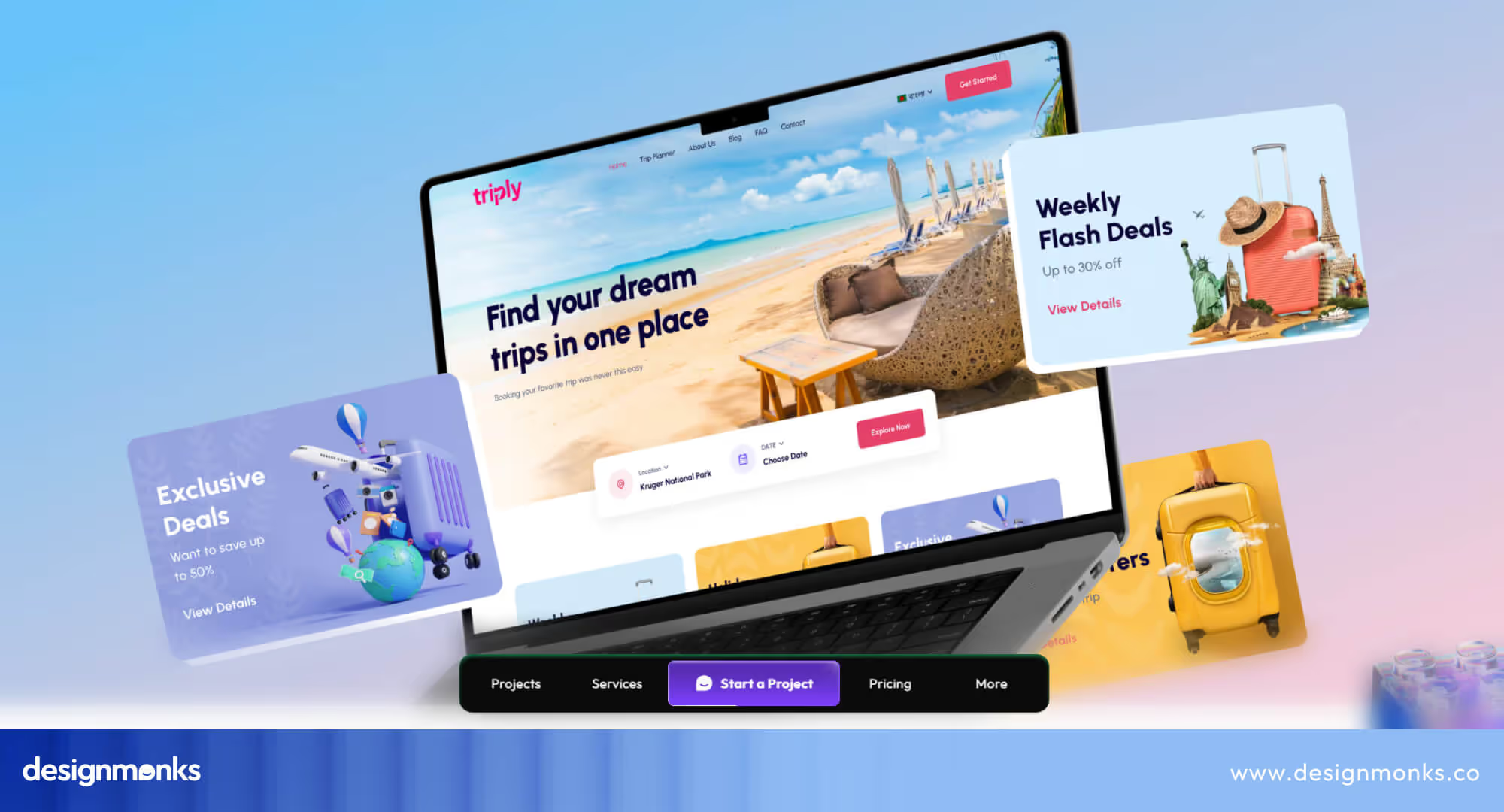
Challenges we addressed:
- Scattered platforms made trip planning slow and frustrating.
- Limited destination insights affected decisions and trip satisfaction.
- Missing personalized recommendations reduced engagement and relevance.
With 40+ pages and two months of development, Triply became a unified platform where travelers can explore destinations, compare options, and book flights, stays, and experiences in one place. Personalized offers based on preferences and search history made planning smoother and more engaging.
Design highlights:
- Visually appealing, intuitive interface for easy customization.
- Integrated booking + planning workflow to save time and effort.
- Real-time recommendations and availability to support faster decisions.
Our structured design process, from research and strategy to wireframes, UI, and components, ensured that Triply delivered both functionality and delightful experiences.
The results were significant: Triply improved user retention by 36%, simplified booking, and enhanced overall satisfaction.
Client feedback summed it up best: “Design Monks were reliable and creative. Their design solutions worked perfectly and gave our websites a strong theme and style.”
FAQs
How can I improve mobile UX for a travel website?
You can improve the mobile UX factor on your travel website by following these tricks:
- Ensure a responsive design.
- The layout must adjust to different screen sizes.
- Simplify the navigation.
- Reduce load times.
- Use touch-friendly buttons.
- Ensure the booking process is easy.
- Use an intuitive user interface.
What visual elements work best for travel websites?
High-quality visuals like destination photos, videos, and 360-degree virtual tours engage users in a travel website. Large, inspiring images in headers and throughout the site can effectively motivate travel decisions.
How does SEO impact travel website UX design?
Good SEO improves the website’s visibility in search engine results. It can effectively bring more traffic to the site. For a better UX, you need to ensure a mobile-friendly, fast-loading site with relevant content, keywords, and meta tags.

End Note
You must understand that designing a travel website isn’t just about creating a visually appealing platform. Indeed, it’s about building an experience that guides users smoothly through their travel journey.
In this case, factors like intuitive navigation, engaging content, visual elements, etc are necessary. You need to focus on the user’s needs and incorporate thoughtful design elements as well.
Now that you’ve explored the major aspects of effective travel website design, utilize these insights into practice to create a site that converts.
Happy designing!

.svg)


.avif)
.avif)
.avif)
.avif)


.avif)
.avif)
.avif)
.avif)


.avif)


