Key Takeaways
- Figma UI3 introduces resizable panels, revamped properties, and bottom toolbar placement.
- Designers gain more canvas space with minimized UI and organized navigation.
- Enhanced assets tab, action menu, and Dev Mode streamline design-to-dev workflows.
- Mixed user reactions: positive on features, some frustration with adaptation issues.
- Overall, UI3 boosts efficiency and flexibility and introduces powerful integrated AI tools.
After the announcement of Figma AI, the most important highlight of Figma Config 2024 was Figma UI3. This company has redesigned its UI and launched it called UI3. This updated UI has brought a lot of enhancements that dramatically speed up designers’ workflow.
However, Figma UI3 comes with essential updates like resizable and collapsible panels, a revamped properties panel, and the integration of powerful AI tools. The canvas has now more space to work on.
Even though the new update is getting a flood of positive reviews, some users have already been frustrated because of some issues. Today, we’ll talk about everything regarding the new Figma UI. So, join us to learn what you’ve missed about it.
About Figma’s New Redesigned UI
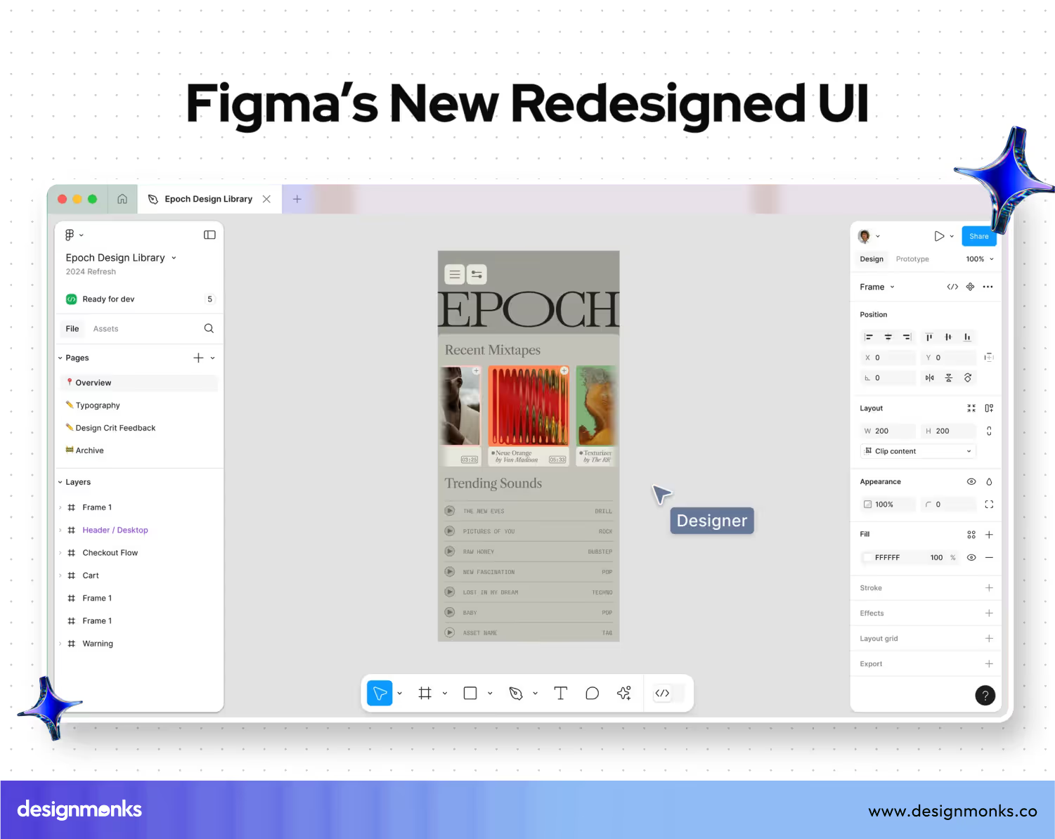
Figma's new UI3 redesign generally aims to simplify and enhance the user experience. This update comes with resizable and collapsible panels. Here, we find a reorganized navigation panel alongside a more intuitive properties panel.
The toolbar has moved to the bottom to free up canvas space and also to add new AI features. There are also lots of changes like easier access to components via the Assets tab, a revamped actions menu for faster workflows, and improved consistency across Figma’s products.

We can now minimize the UI for more canvas space to access Dev Mode directly from the toolbar. This approach also enables property labels for clearer control descriptions.
These updates are supposed to make Figma more focused and approachable for designers of all levels. Still, we can't assume that all of them will appreciate it. It's because you know, everyone doesn't love changes, right?
New Changes in Figma UI3
Figma's UI3 redesign brings lots of enhancements to improve usability and streamline the design process. You will notice them clearly while using the tool.
UI3 clears space on the canvas for you to bring your creative vision to life. Figma
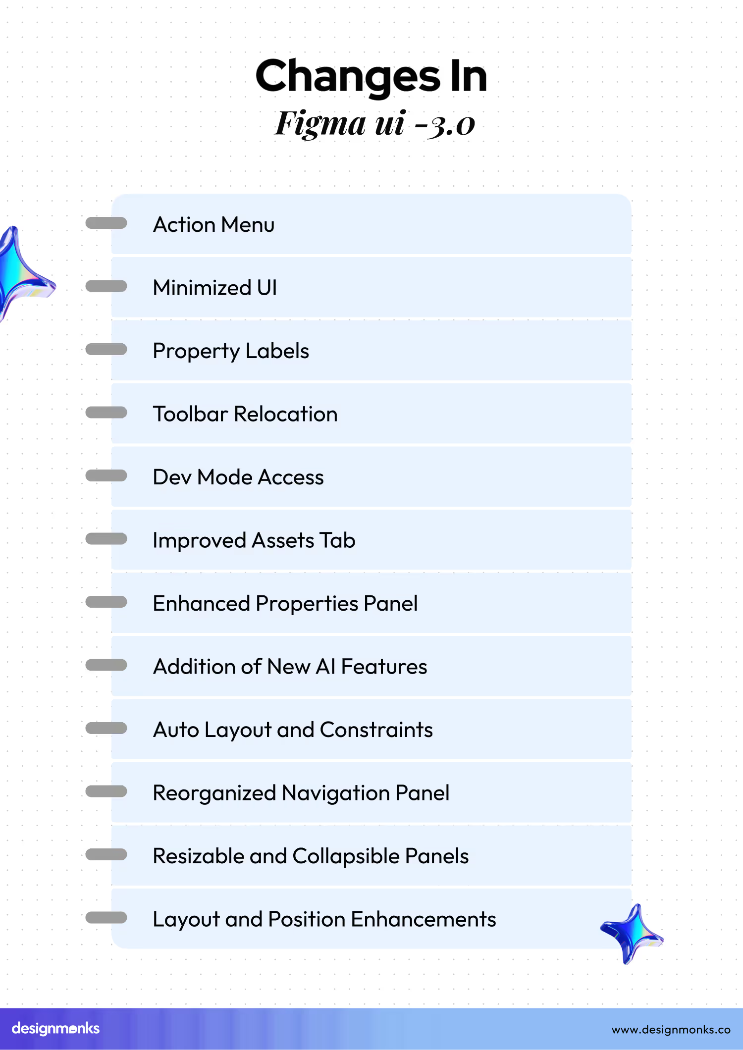
However, let's check out the major changes in this update:

Resizable and Collapsible Panels
On the new version of UI, we can resize and collapse the interface panels to maximize the workspace on the canvas. These options let us get a more customizable and focused design experience.
Reorganized Navigation Panel
The left-side navigation panel has been reorganized to house all file-related information. As a result, it becomes easier for users to navigate and manage projects.
Minimized UI
A new feature lets us minimize the UI on the navigation panel. As a consequence, we get more space on the canvas. When you select an object with the minimized interface, the properties panel reopens to provide access to necessary controls.
Toolbar Relocation
The toolbar has been moved to the bottom of the editor. Now, it frees up additional working space. This new toolbar layout, for sure, provides enough space for the brand-new AI features on the actions menu.
Enhanced Properties Panel
The properties panel has been redesigned to be more user-friendly. In this case, the developer organized properties in a group according to modern design workflows. The panel can also be resized, which is useful when working with components that have long names.
Property Labels
You can now turn on property labels for clearer descriptions of what each property does. If you need, activate it from the dropdown menu next to the zoom percentage in the properties panel.
Improved Assets Tab
Searching, browsing, and inserting components from the Assets tab has been made easier in this new update. This approach simply enhances the overall efficiency of the design process.
Dev Mode Access
The Dev mode also gets some enhancement. Here, you can access the mode directly from the toolbar. For sure, it's a handy improvement as it simplifies the process of switching between design and development modes.
Action Menu
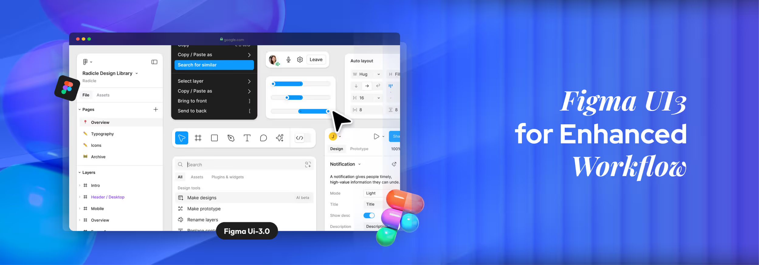
A new Actions menu in the toolbar provides access to all of Figma’s AI tools. Here, you'll get common productivity actions, plugins, widgets, components, etc. This menu undoubtedly, streamlines the workflow from imagination to reality.
Layout and Position Enhancements
All properties related to an object’s layout and position are now more intuitively organized. Layout properties, like width, and height, are under the Layout section. At the same time, constraints and other positioning properties are placed under the Position section.
Auto Layout and Constraints
The auto layout has been enhanced in this update as well. It can now adjust automatically based on the content changes and screen sizes. Constraints are more accessible and that makes it easier to define how layers should behave when resizing parent frames.
Addition of New AI Features
The redesigned Figma introduces new AI features that have already become the town's talk. In the new interface, we get all the AI-featured tools leveled properly.
These changes in Figma UI3 are designed to make the tool more intuitive, efficient, and user-friendly. Well, many of you are wondering about how effective the changes are, right? In the next section, we will add a brief of users' reactions to the update.
Figma UI3: Users’ Reactions
After Figma launched UI3, we are seeing mostly positive reactions from the Figma community. But all the users are not happy with some issues. So, we can't fully agree that it's a hundred-perfect user-satisfying update. However, here are our takes on the user's mixed reactions:

A Flood of Positive Feedback
As said earlier, most users are, on average, happy with Figma's new user interface. A big part is appreciating its expanded emoji reactions for comments. Previously limited to a set of preset emojis, users can now use any available emoji to react to comments.
Besides, spacing up on the canvas is a really good decision. The new additions of functionality and customization options also leave a good impression on the users.
Issues and Support Response
Even if the overall feedback is positive, some users have encountered issues with the platform. Reports of unexpected charges for team members not added by users have surfaced. Compounding the problem, Figma's support team has been experiencing higher than usual volumes.
Request for Private Viewing
Another point of feedback from users is the desire for a "private viewing" setting. This feature would prevent others from browsing the same file simultaneously. Some users find this approach disruptive.
Even though this feature has not yet been implemented, Figma has introduced "reaction stickers" to keep design reviews focused and productive.
Challenges for Adaptation
As millions of users have been used to the previous UI, the new update requires some time for adaptation. They must spend some time getting used to this new UI style. These facts create challenges for the users who don’t like to switch at all.
As we see, the reception of Figma's UI3 update has been largely positive. Users appreciate the increased functionality, customization options, and the ability to express themselves more freely with expanded emoji reactions.

End Note
Technology, systems, needs, hypes, trends, everything is changing. The aim is to be better than before, so those who have the guts to adapt to the changes can shine in this competitive era. However, Figma UI3 is such a change that designers need to embrace it.
The new UI has brought a lot of enhancements that we really wished for. So, we have to embrace the good things as well as the tiny bad, if there are any. Let’s hope for the best.

.svg)


.avif)
.avif)
.avif)
.avif)


.avif)
.avif)
.avif)
.avif)


.avif)


