.svg)


Key Takeaways
- UI elements are the building blocks of intuitive digital interfaces.
- Choosing the right element improves usability and enhances user experience.
- Input, navigation, and informational elements form the core interface types.
- Consistency, clarity, and simplicity are crucial when designing UI elements.
- Icons, buttons, and modals guide users and enable smooth interactions.
One of the common confusion new designers face is the use and choice of UI elements. Getting introduced to the useful user interface elements is the basic solution to this issue. Well, by UI elements, we refer to the buttons, text fields, checkboxes, icons, and other blocks of an interface.
There are lots of choices and options available. That's why newbies find it challenging to select and use the appropriate elements for their projects. However, using the right UI elements is crucial because they make your design intuitive and user-friendly.
So, learning about the basic UI elements is the initial duty of beginners. Today, we're going to introduce you to the most essential UI elements every designer should know. So, keep reading.
What are UI Elements?
User Interface elements are like the basic blocks if you consider a digital interface a building. To say it more clearly, they are the components you see and interact with on the screen of an interface. So, they are the buttons, menus, icons, and text fields.
These elements help users navigate and interact with a digital product. For example, a button lets you submit a form, a text field lets you enter information, and so on.
UI elements of an ideal interface should be clear and easy to use so that users can understand the message without confusion. Learning about these elements is essential for any designer because they form the foundation of user-friendly designs. It is said that, the better element you can choose, the better UI designer you can be.
Types of UI Elements
Generally, there are different types of UI elements. Learning about these types is necessary because they help designers create intuitive and user-friendly interfaces. Also, it helps design websites and apps that are easy to navigate and use.
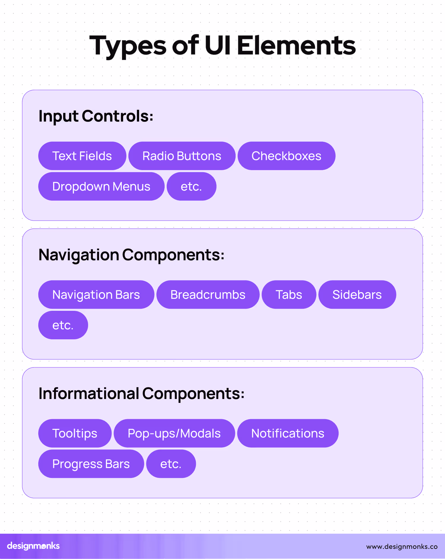
Here are the common 3 types of UI elements:
1. Input Controls
Input controls let users enter information into a system. That means the elements that users will use directly by clicking or adding texts. They are the elements like text fields, checkboxes, radio buttons, and dropdown lists.
Here, a login form comes with text fields for the username and password that users need to fill up. Also, a checkbox for "Remember me," and a submit button are the options the users utilize directly to interact with the interface.
2. Navigation Components
These components help users move around a website or app. That simply refers to the elements that help users move around the complete interface.
For example, a website's main menu with links to different pages that helps users find specific pages. Also, a tabbed interface that lets users switch between content sections, or a slider to browse through images.
3. Informational Components
Informational components provide users with information. Tooltips, progress bars, notifications, and message boxes are the appropriate examples of this type.
Usually, a tooltip appears when you hover over an icon to inform you about the use of other options. A progress bar appears to show the completion of a task. Also, a notification alerts you to new messages.
So, these are the common types of UI elements you can face on an interface. All these three types are equally necessary to make a good interface.
40 Common User Interface Elements
Now, let’s come to the point, the most useful user interface elements. Here, I’ve described 40 elements briefly. However, these are not the only elements you can use. There are more. As you keep learning, they will appear and get introduced to you automatically.
So, now, check out the following UI elements for a good interface:
1. Icon
Let's start with Icons. They are small graphical representations we use to signify specific actions, objects, or ideas in an interface. Icons usually come in designs or shapes that indicate particular actions.
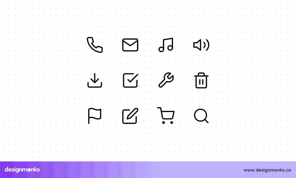
As we know, a trash can icon represents a delete function. Similarly, a magnifying glass icon denotes a search function. Icons should be simple, clear, and universally recognizable to avoid confusion.
2. Bento Menu
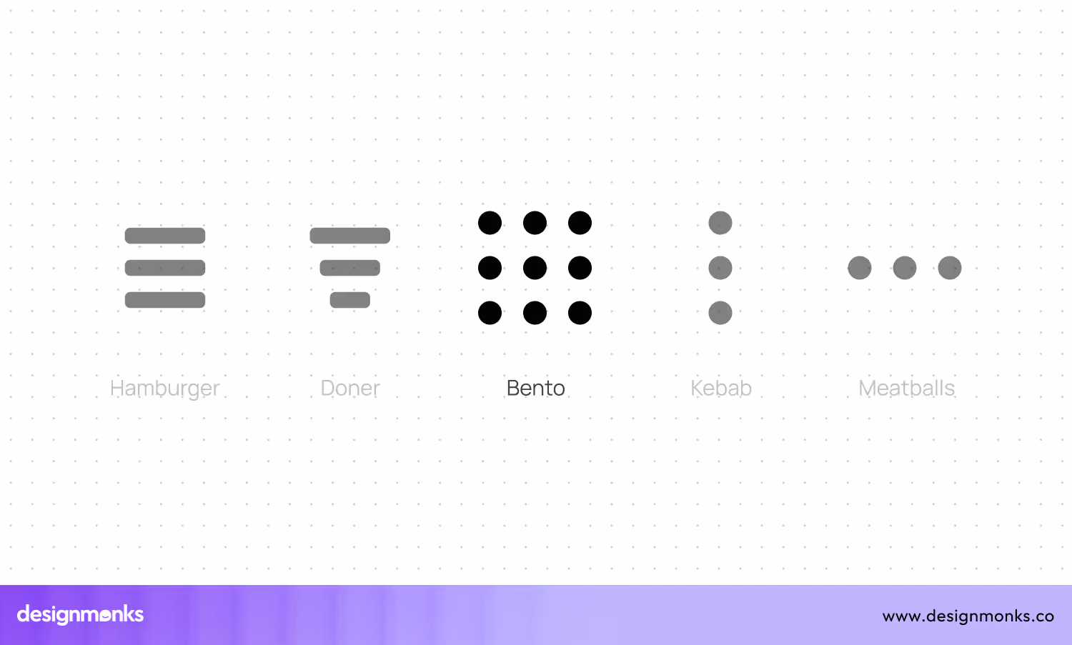
A Bento Menu is also known as a grid menu. It simply displays options or features in a grid layout. This type of menu usually presents multiple options simultaneously in a compact and visually appealing format.
To effectively use a Bento Menu, prioritizing simplicity and clarity is necessary. Also, it's better to avoid overcrowding the grid with too many options, as this can overwhelm users.
3. Search Field
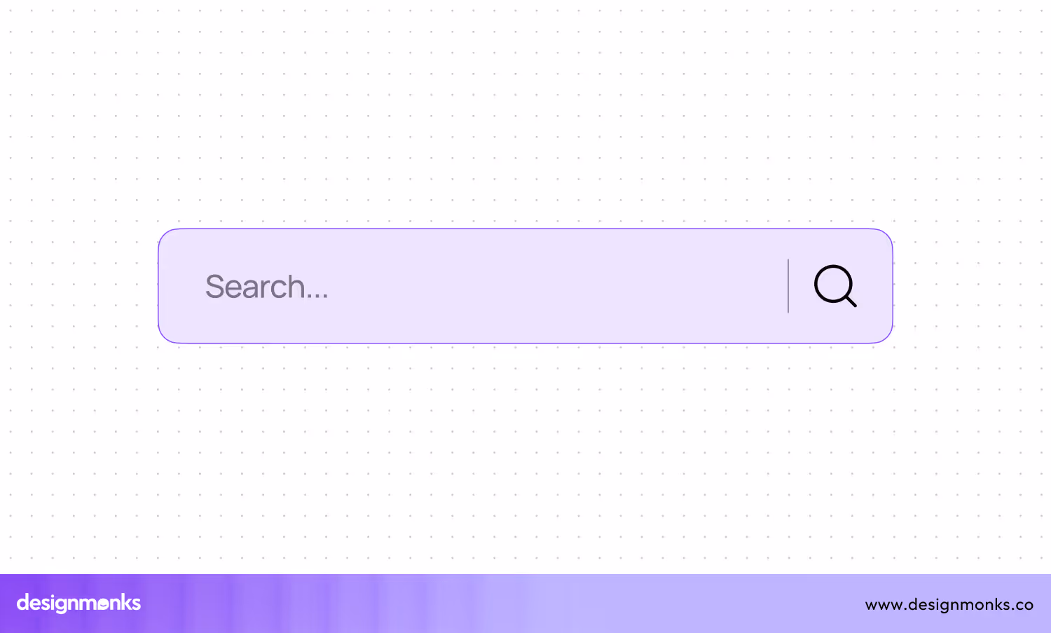
This option lets you enter keywords or phrases to find specific content within a website or application. It improves navigation, especially on content-rich interfaces like e-commerce sites or large databases.
When designing a search field, it's good to place it in a prominent location, like the top of the page. Also, you should use a recognizable search icon, like a magnifying glass, and provide placeholder text to guide users on what to enter.
4. Checkboxes
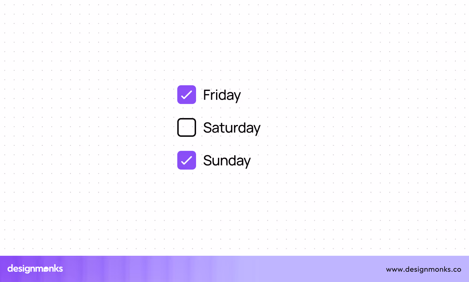
Checkboxes are interactive UI elements that let you select one or more options from a list. They are commonly used in forms, settings, and filters. Each checkbox can come with a label that describes the option it represents.
Usually, checkboxes are ideal for scenarios where multiple selections are allowed, like choosing preferences or filtering search results. To design effective checkboxes, ensure they are large enough to be easily clickable on all devices, including mobile.
5. Buttons
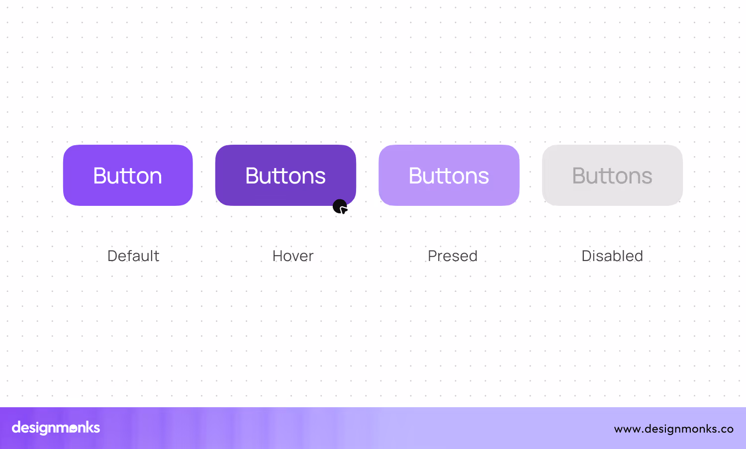
Buttons trigger actions like submitting forms, navigating pages, or performing commands. They can be of different styles like text buttons, icon buttons, and text-icon combinations. Buttons should be recognizable and distinguishable from other elements.
That's why one should design buttons with clarity and simplicity. Use descriptive text like "Submit," "Cancel," or "Learn More." Also, it's good to choose contrasting colors to make buttons noticeable.
6. Slider Controls

With the features of slider controls, you can glide through content or adjust values effortlessly. These interactive UI elements let users navigate through lots of options by dragging a handle along a track.
To optimize slider controls, ensure they are responsive and easy to manipulate. Use clear labels to indicate the value or range being adjusted. You can also provide visual feedback, like dynamic changes to the background or value display.
7. Carousel
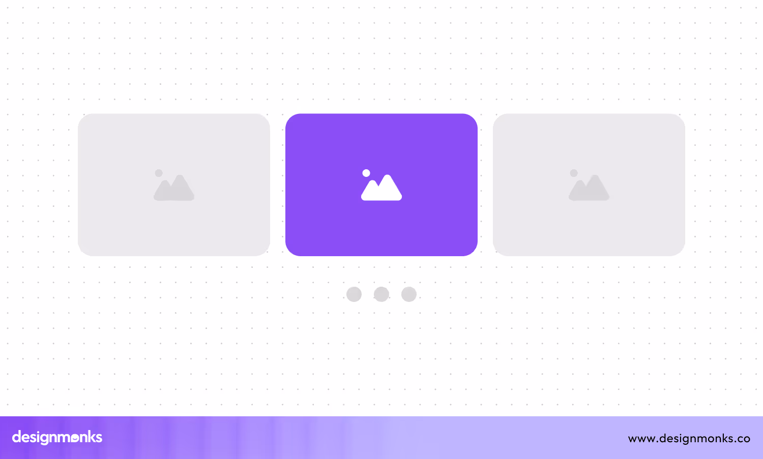
A carousel spins users through a selection of content, whether it's featured images, product highlights, or customer testimonials. This engaging element is perfect for showcasing multiple pieces of information within a confined space. It can easily capture attention, and encourage engagement.
To create an effective carousel, use intuitive navigation controls to easily move between slides. Use high-quality visuals and concise, impactful text to make each slide engaging. Also avoid overloading the carousel with too many items, as it can overwhelm users.
8. Feed

Imagine a never-ending stream of content, constantly updating and keeping users engaged – that's the power of a feed. This element ensures social media updates, news articles, and similar content with a continuous flow of information to their interests and preferences.
Designing an engaging feed requires balancing variety with relevance. You can use clear headings and visual hierarchies to differentiate between different types of content. Implement infinite scrolling or pagination to make navigation easier.
9. Sidebar
The sidebar is your secret weapon for efficient navigation and quick access to important content. You will find it on the edge of the screen and it provides users with shortcuts to various sections for dashboards, blogs, and complex websites.
To make the most of a sidebar, ensure its contents are organized logically and consistently. Use clear, descriptive labels and group related items together. Keep the design minimalistic to avoid clutter, focusing on essential links and tools.
10. Dropdowns
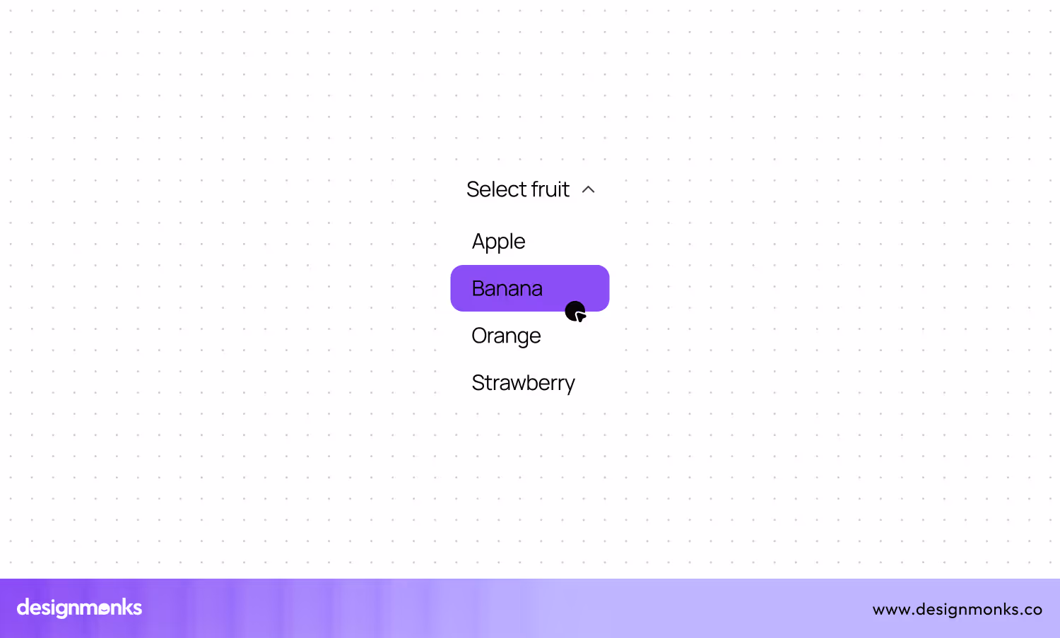
Another compact way to present multiple options and let users choose one is the dropdown menus. They are useful for selections where space is limited, like choosing a country or selecting a category.
You can design dropdown menus with clear labels and concise options. It's better to use placeholder text to guide users on what to select. Ensure the dropdown is large enough for easy interaction and that options are easily scannable.
11. Comment
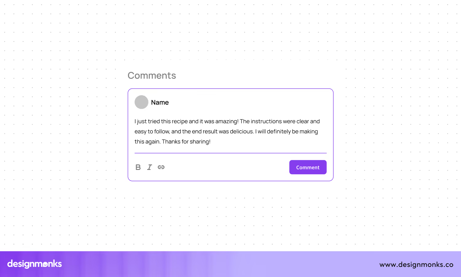
The comment section is where conversation viewers add their feedback. It's a space for users to share their thoughts, ask questions, and engage with content, whether on a blog post, a product page, or a social media platform. This interactive element unites the communities and makes the content more engaging and dynamic.
For an inviting comment section, clarity and simplicity matter. You should use clear text fields and intuitive submission buttons to encourage participation. Also, make sure to display comments in a threaded format for easy tracking of discussions. Besides, implement moderation tools to maintain a positive environment and filter out spam.
12. Notification
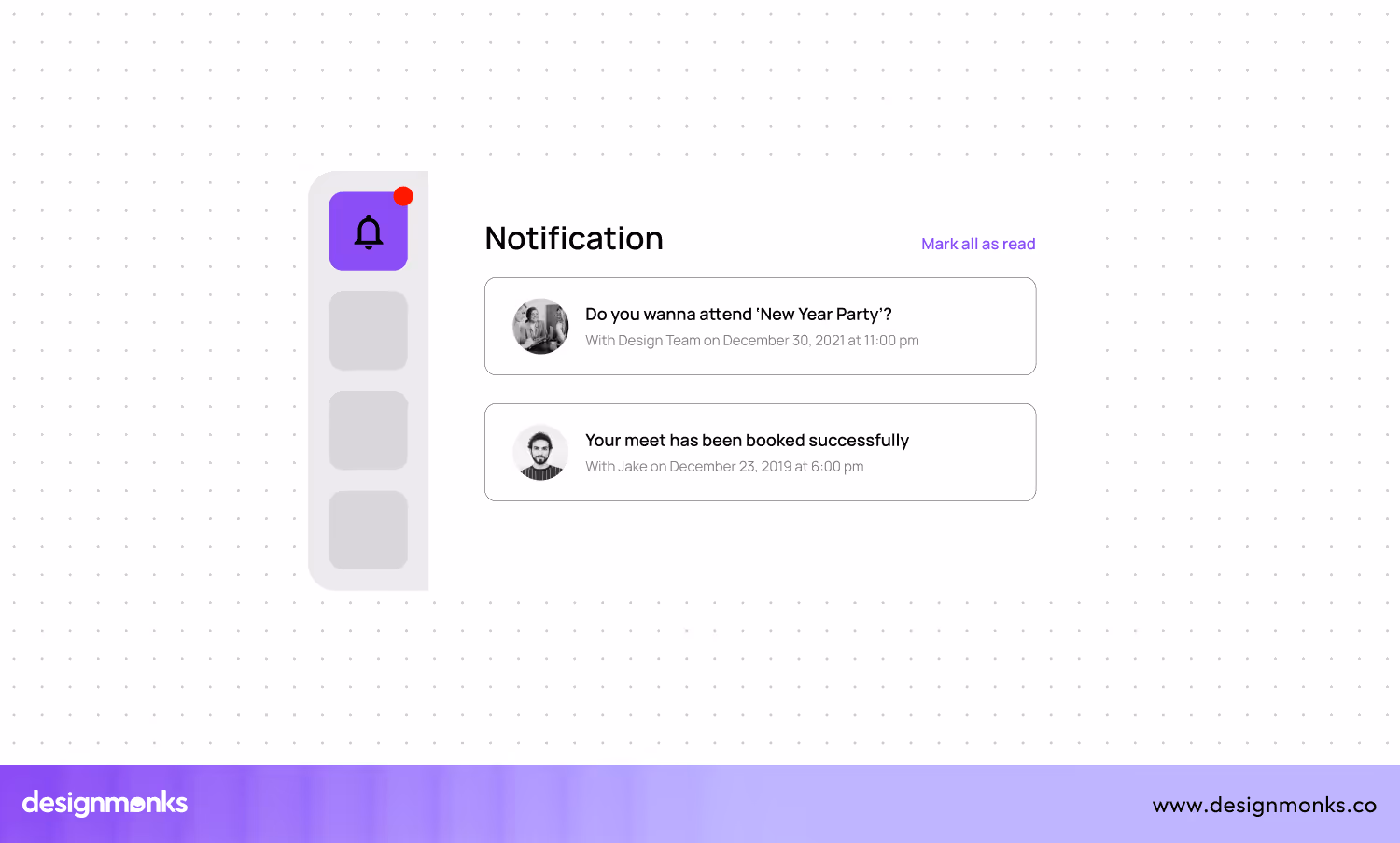
Notifications are gentle nudges that keep you informed and engaged. Whether it’s a new message, an important update, or a friendly reminder, notifications ensure you never miss out on essential information. These notifications can appear as banners, badges, or alerts, drawing attention without being intrusive.
Usually, effective notifications should strike a balance between visibility and subtlety. You can use concise, clear messages to convey the necessary information. Also, you should categorize notifications by importance and urgency to ensure critical alerts stand out.
13. Breadcrumb
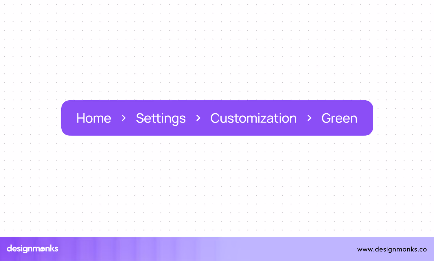
Breadcrumbs are the navigational trail that guides us through the depths of a website. This path of links, usually found at the top of a page, helps viewers understand their location within the site’s hierarchy. It also lets us easily backtrack to previous sections.
Perfect breadcrumbs should be clear and descriptive. They must structure the site accurately. For that, you should use a simple, horizontal layout with separators like arrows or slashes for easy readability. Besides, ensure each breadcrumb link is clickable, and provides a straightforward way to return to higher-level pages.
14. Text Field
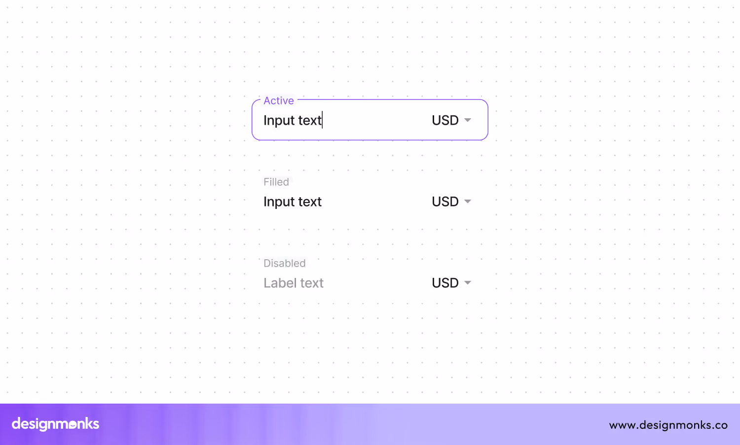
You need to use a text field on an interface to input text data, like names, emails, or search queries. They are essential for forms and data entry. This element is a must-have for any type of website, especially e-commerce websites.
When designing text fields, you should ensure they are clearly labeled to indicate what information is needed. Use placeholder text for additional guidance. Make text fields large enough for easy typing and reading. Also, try to provide clear error messages and validation feedback to help users correct mistakes.
15. Radio buttons
This specific button is essential to select a single option from a group of choices. They are ideal for mutually exclusive options, like selecting a payment method or choosing a subscription plan.
These radio buttons should have clear and concise labels. For that, you can group related radio buttons and align them vertically for easier comparison. Use radio buttons only when users can select one option, and ensure default selection when appropriate.
16. Tabs
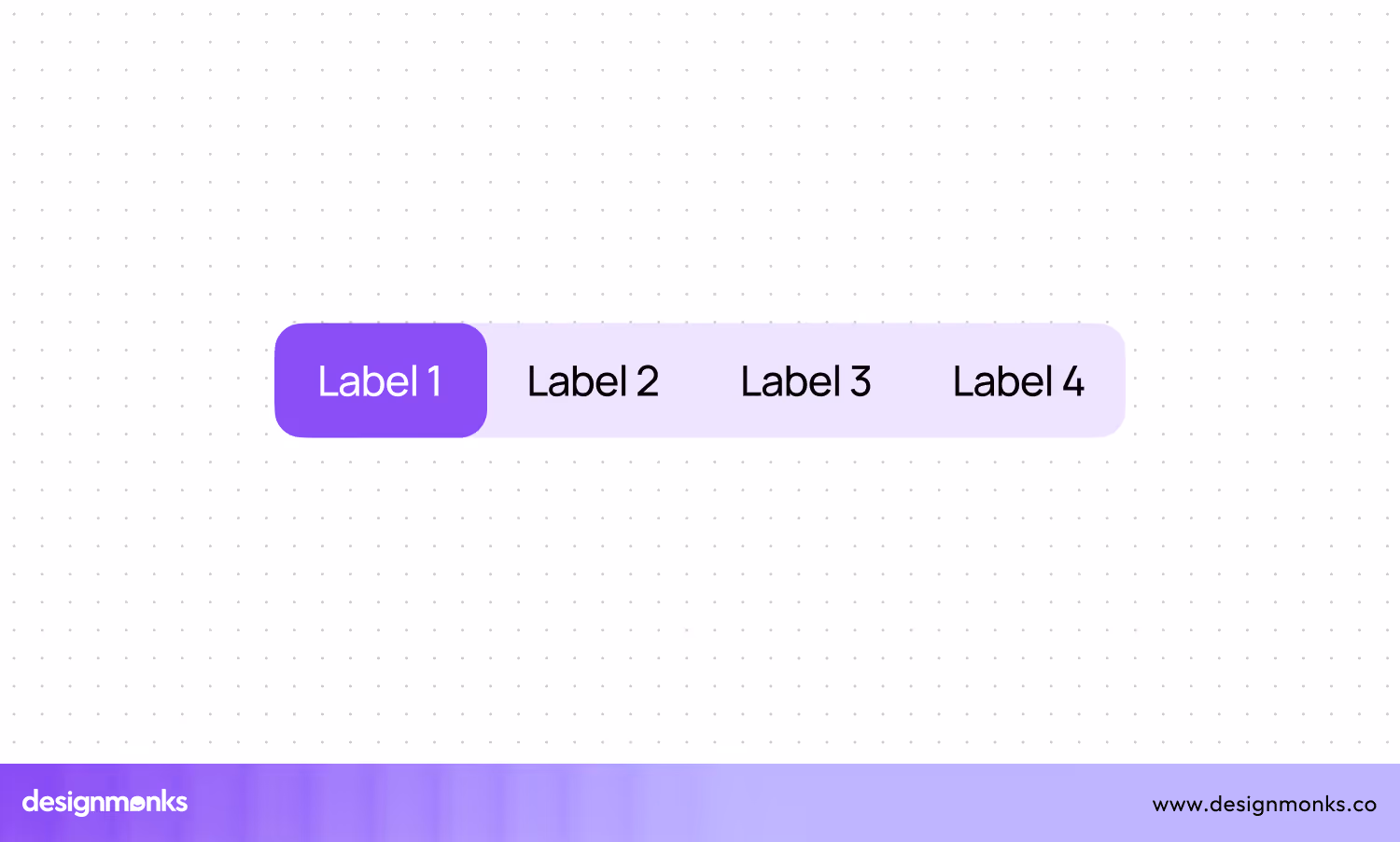
The navigational elements that let you switch between different content sections without leaving the page are the tabs. They are usually arranged horizontally at the top of a content area. Here, each tab represents a different section.
You can use tabs properly, once you understand what each tab represents. Try to keep the labels short and descriptive. Also, ensure that only one tab is active at a time. It'll provide clear visual indicators, like highlighting, to show the active tab.
17. Progress Bar
You must notice the visual indicator that shows the completion status of a task. It can be like file download, form submission, etc. These indicators are known as the progress bars. It helps users understand how much of the task is completed and how much is left.
To use a progress bar properly, keep it visible and positioned in a place where users can easily see it. Use smooth animations to show progress and add percentage labels. This approach will help you provide more precise information.
18. Modal Window
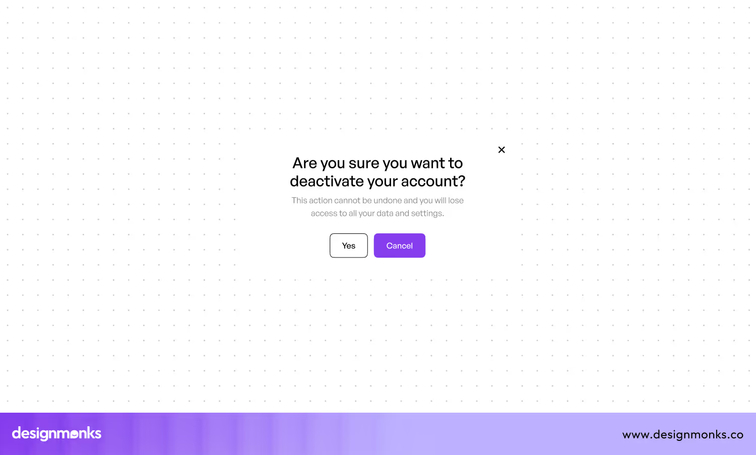
Usually, a Modal Window is a pop-up interface element you'll see on top of the currently opened page. It is often used for tasks like confirming actions, displaying important messages, or collecting user input. Modals mainly focus user attention on a specific task by blocking access to the underlying content until the modal is dismissed.
You should use modal windows sparingly and only for important actions that require the user's full attention. Keep the content within the modal concise and relevant. Also, provide clear options for closing or completing the task.
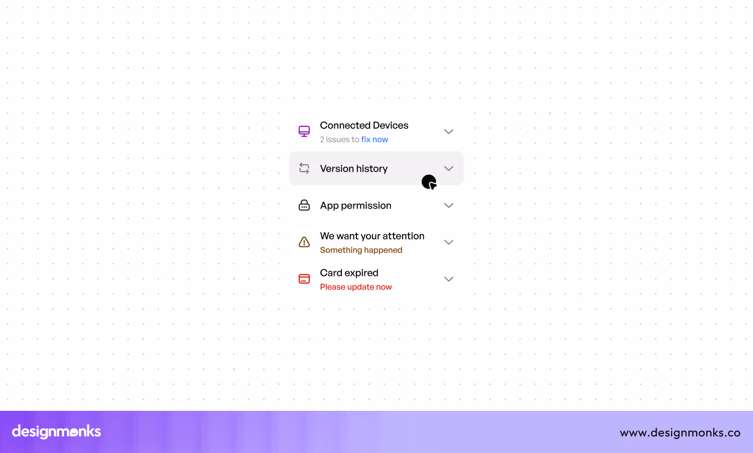
19. Accordion
An Accordion lets you expand and collapse sections of content. It is commonly used to organize content compactly, especially when dealing with large amounts of information. They help navigate content efficiently by only showing the information users need.
When designing an accordion, ensure that the headings are clear and descriptive. It will help users easily identify the content within each section. Use smooth animations for expanding and collapsing content. Also, avoid nesting accordions within each other.
20. Tooltip
The small pop-up box that you see when hovering over an element is the tooltip. It provides additional information or context. Tooltips are commonly used to explain icons, buttons, or other interface elements that may not be immediately clear to users.
Using tooltips is easy and effective. Try to keep the information concise and relevant. Position the tooltip close to the element it describes. Also, avoid overloading tooltips with too much information, as this can overwhelm users.
21. Toggle Switch
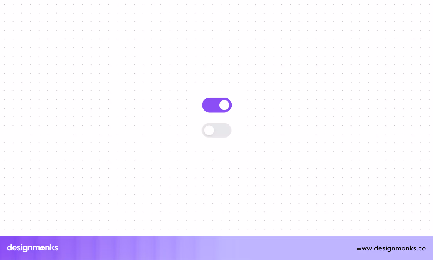
A toggle switch is a small, interactive UI element that enables users to flip between two opposing states, usually "on" and "off." So, designers use this tool for settings where a binary choice is required, such as enabling or disabling notifications, activating dark mode, or toggling a feature.
The toggle switches should be large enough to be easily clickable or tappable. While designing them, try to incorporate clear labels or icons to avoid confusion about what the switch controls. Also, try to use distinct colors for each state to enhance clarity, like green for "on" and gray for "off."
22. Pagination
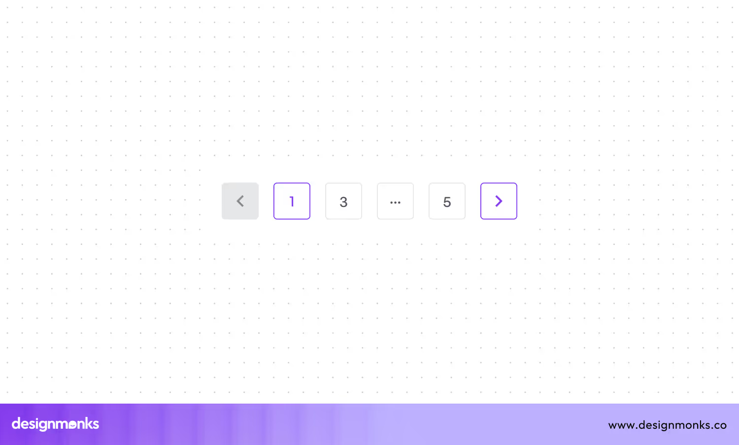
The UI mechanism divides large sets of content into smaller, more manageable chunks using numbered pages is known as Pagination. It's commonly used in search results, blogs, or any scenario where displaying all content on one page would overwhelm the user.
To design effective pagination, prioritize simplicity. Highlight the current page number and use clear, visible buttons for navigation. Also, try to avoid clutter by limiting the number of page links displayed at once, especially on smaller screens. Besides, add features like "next" and "previous" buttons for sequential navigation.
23. Alert Box
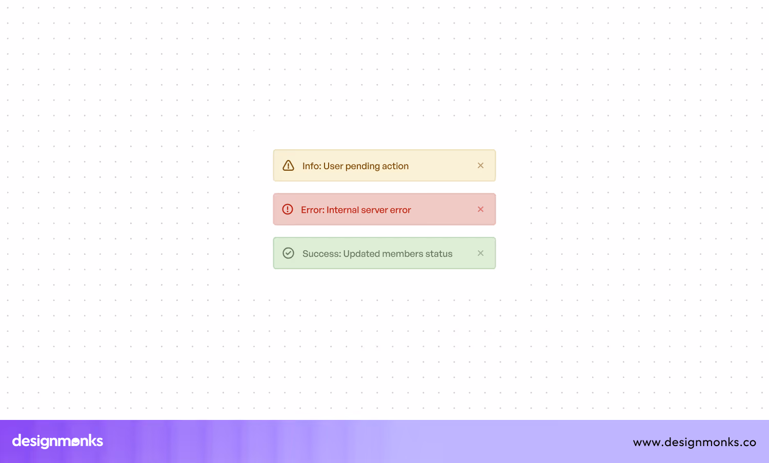
While using an app or website, you must get some critical messages and notifications, right? The Altar box presents those messages and notifications. It usually appears as a pop-up overlay that interrupts the user's current task. The aim is to communicate important information, like errors, warnings, or confirmations.
An alert box should carry a message that is brief and to the point. You should use colors that match the message's tone, like red for errors, yellow for warnings, and green for success. Also, ensure the alert box is not intrusive, giving users the option to dismiss it or take action easily.
24. Image Gallery
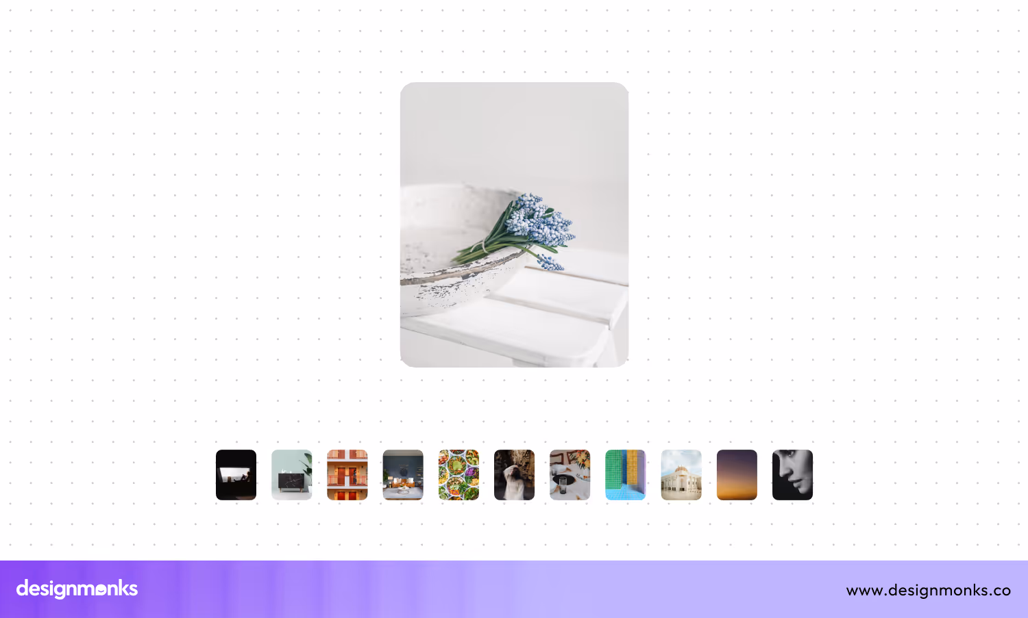
This UI feature displays multiple images in a structured, often in a grid-like format. This gallery lets users browse and interact with visual content. It's commonly used in portfolios, product pages, or any context where showcasing a collection of images is essential.
An engaging image gallery should be easy to use. they must have visual appeal with high-quality images that load quickly. You should maintain a consistent aspect ratio for a uniform look. Also, try to implement navigation tools like arrows or dots to guide users through the gallery.
25. Avatar
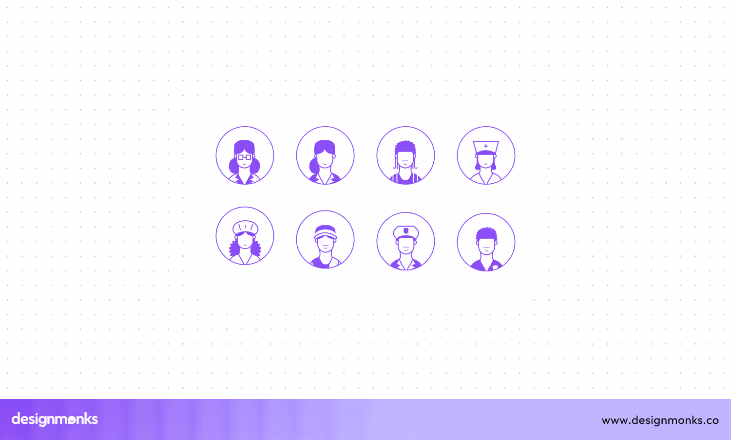
An avatar is a visual representation of a user in a digital environment. They can be depicted as a photo, icon, or custom illustration. Avatars personalize user profiles, comments, and interactions that add a human element to digital platforms like social media, forums, or collaboration tools.
When designing avatars, you should provide options for customization, to let users upload their images or choose from a set of predefined icons. Besides, ensure the avatar size and shape are consistent across the platform to maintain visual harmony.
26. Card Layout
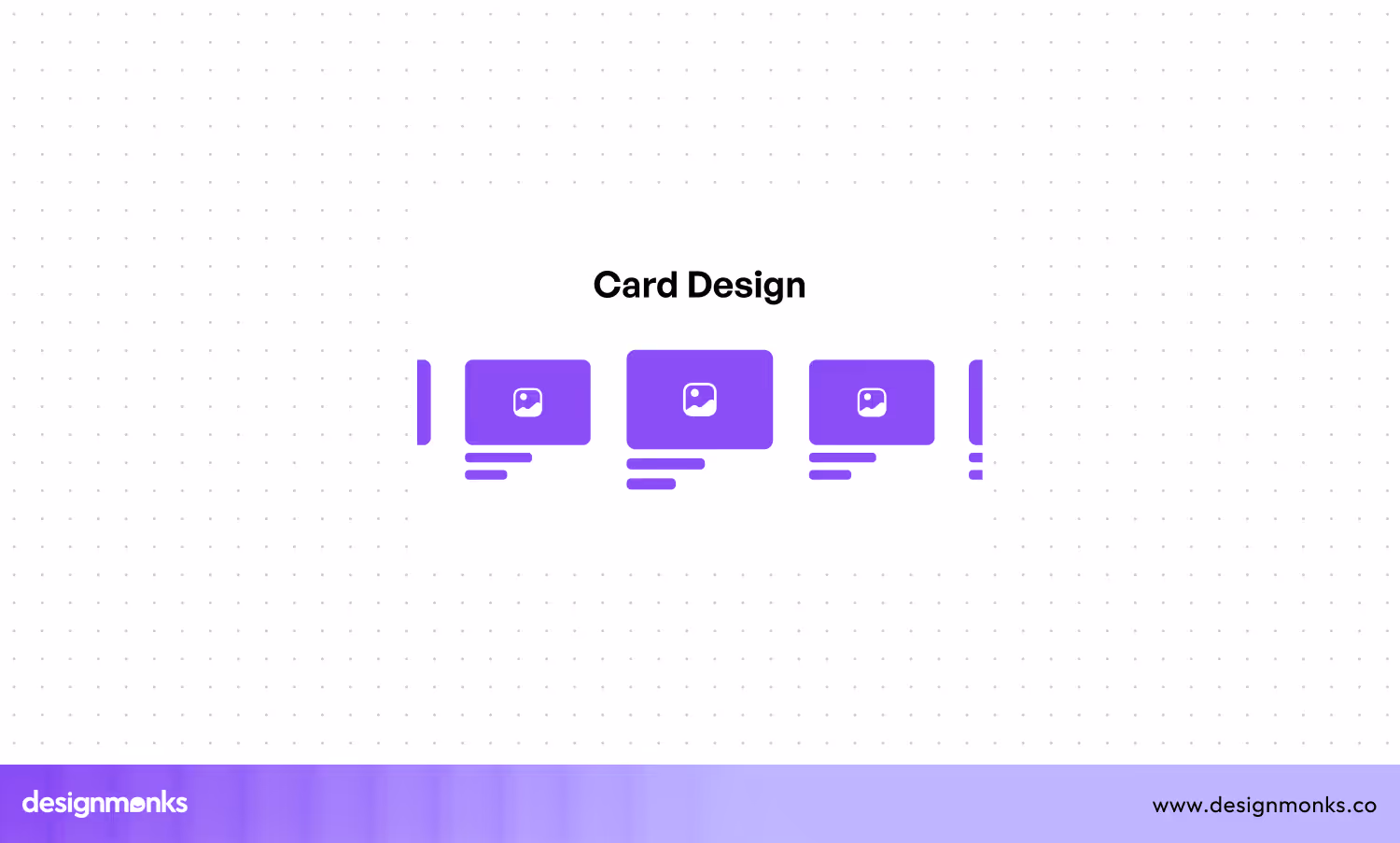
A card layout is a popular UI pattern that organizes content into distinct, rectangular sections. So it can resemble physical cards. Each card contains a cohesive unit of information. They can be an image, title, and brief description.
When you design card layouts, you must maintain consistency in size, spacing, and alignment. It will offer a clean, organized appearance. You can use a visual hierarchy to guide users’ attention to the most important elements within each card.
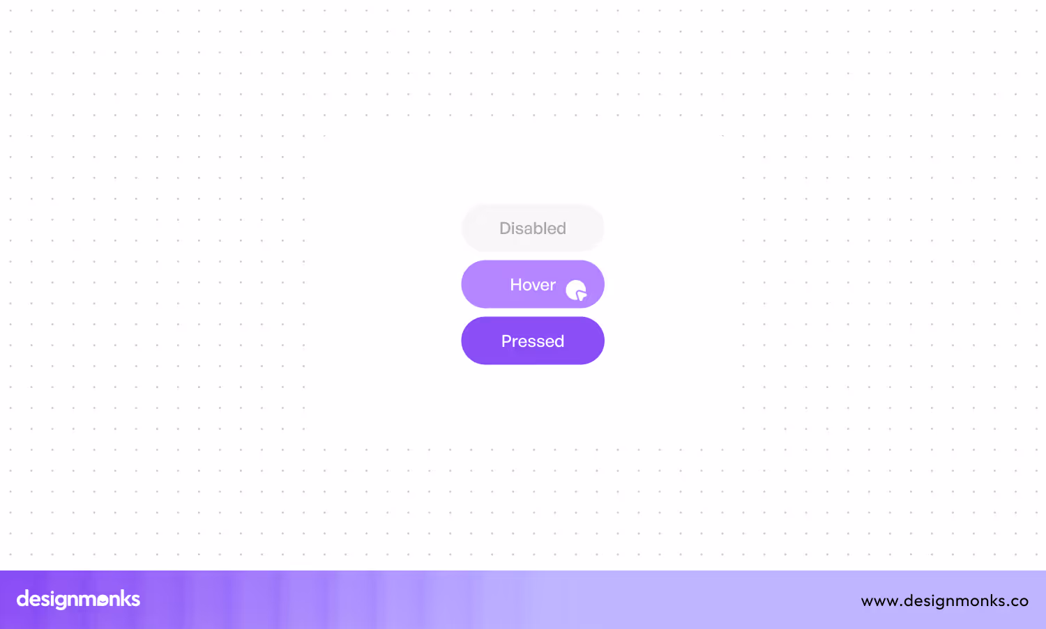
27. Hover States
Hover states are UI design elements that change their appearance when a user hovers their cursor over them. It provides the users with immediate visual feedback. This interaction is common in web design, especially for buttons, links, and images.
When you design hover states, you must confirm the changes are noticeable. You must enhance the user’s experience without overwhelming them. Try to avoid drastic transformations that could confuse users or disrupt the layout. You should add the functionality of hover states through keyboard navigation too.
28. Loading Spinner

If you go through the loading spinner, you will realize it is a UI element that indicates to users that a process is ongoing. Like a page is loading, data is being fetched, or an operation is in progress. It appears as a rotating circle or animated icon that reassures users that the system is working.
To implement a loading spinner, you must keep the design simple and non-intrusive. It will blend seamlessly with your UI. You can consider pairing it with a brief message or progress indicator.
29. Call to Action (CTA) Button
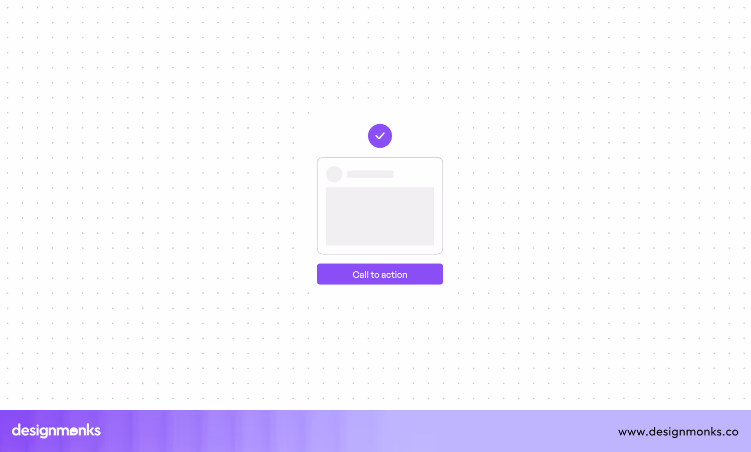
The Call to Action (CTA) button is a fundamental UI element. It guides the users to take a specific action. Some of them are signing up, purchasing, or downloading. The CTA button stands out visually. Also, it is strategically placed to guide users toward the desired goal.
If you want to design an effective CTA button, you must add attention-grabbing colors that contrast with the rest of the page. Also, you can use action-oriented text that clearly communicates the benefit or the next step. Don't forget to test different variations of the buttons after designing.
30. Forms
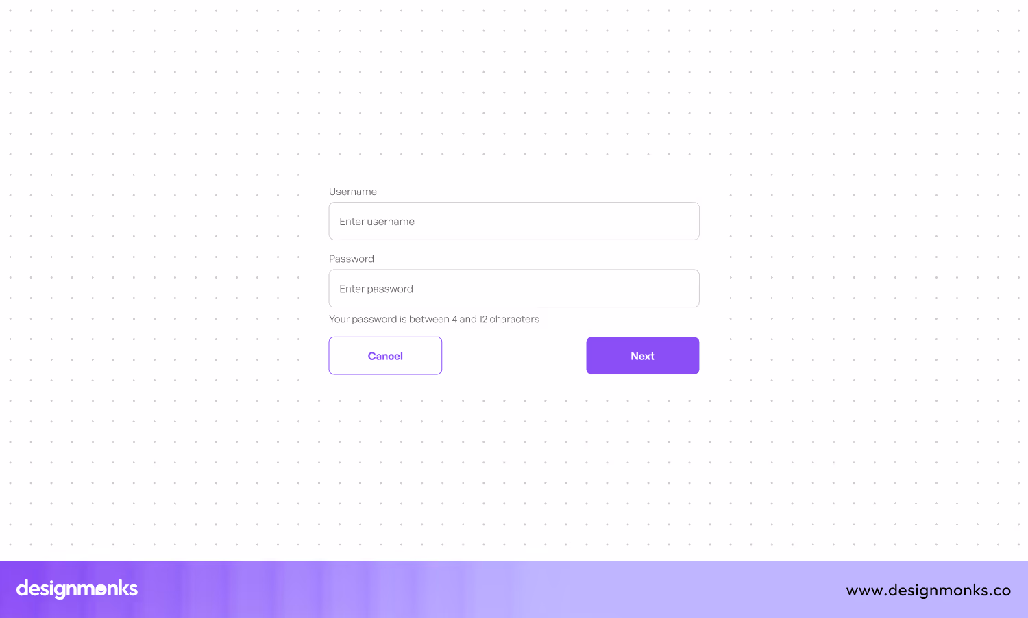
These forms are interactive UI elements that collect user input. They are also used for tasks like registrations, surveys, or checkout processes. They usually consist of various input fields, like text boxes, dropdowns, and checkboxes.
Forms on a site should be simple and clear. You can use clear labels and placeholder text to guide users through each field. Also, you can group related fields together to make it more intuitive. Try to minimize the number of fields to reduce friction, and add an auto-fill facility.
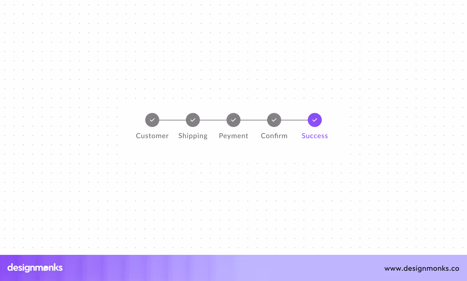
31. Stepper
Steppers help guide people through a series of steps. It greatly makes complicated tasks easier. Stepper shows each step with numbers or progress bars, so users can see where they are and what to do next. They are often used in forms when signing up for something, or during checkout.
You must confirm each step is clearly labeled and concise when you design steppers. It is better not to add too much information at once. Good designers use visual cues like check marks or color changes to indicate completed steps.
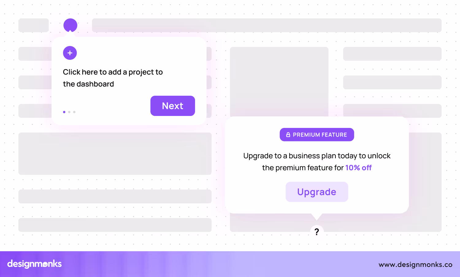
32. Pop-up Menu
A pop-up menu temporarily appears over the main content. It offers additional options or actions in response to a user’s interaction, like a right-click or tap. It’s often used for context-sensitive actions, like editing or deleting an item, without cluttering the interface with too many visible buttons.
An effective pop-up menu should be simple and focused. It must offer only relevant actions to avoid pressure on the user. You should confirm the menu is easy to dismiss. Also, you should pay attention to the timing and context of the pop-up.
33. Footer
A footer is the bottom section of a webpage. It contains secondary information like copyright notices and contact details. Also, it includes links to privacy policies, and sometimes navigational links or social media icons. It serves as a final touchpoint for users.
If you want to design a good footer, you must ensure it’s visually distinct but complementary to the rest of the page. Try to organize the content logically, and group related links or information together. Also, you should use a clean and responsive layout that is easy to scan.
34. Hamburger Menu
A three-line icon is called the hamburger menu. It expands when clicked to reveal a hidden navigation menu. It’s a popular solution for saving space, especially on mobile devices. The hamburger menu lets users access a lot of navigation options.
While you design a hamburger menu, you must confirm the icon is easily recognizable. It should be placed in a consistent, accessible location. Most people place it in the top corner. Also, you should decide whether hiding key navigation items is the right choice or not.
35. Scroll Bar
This UI element lets users navigate through content that exceeds the visible area of a window or container. It usually appears as a thin bar on the side or bottom of the content area. There's a draggable thumb that users can move to scroll vertically or horizontally.
Scroll bars should be easy to spot and responsive. you need to adjust their size and visibility based on the amount of content and the user’s input method. Also, consider using custom scroll bars that blend seamlessly with your design.
36. Link
A link, or hyperlink, is a clickable text or image that directs users to another webpage, a section of the same page, or a different online resource. Links are fundamental to web navigation as it lets users move through content, access additional information, or perform actions like downloading files.
When creating links, you should use descriptive text that clearly conveys the destination or action. Try to avoid generic phrases like "click here." Also, ensure links stand out visually from the surrounding text, using color, underlines, or hover effects to indicate interactivity.
37. Calendar Picker
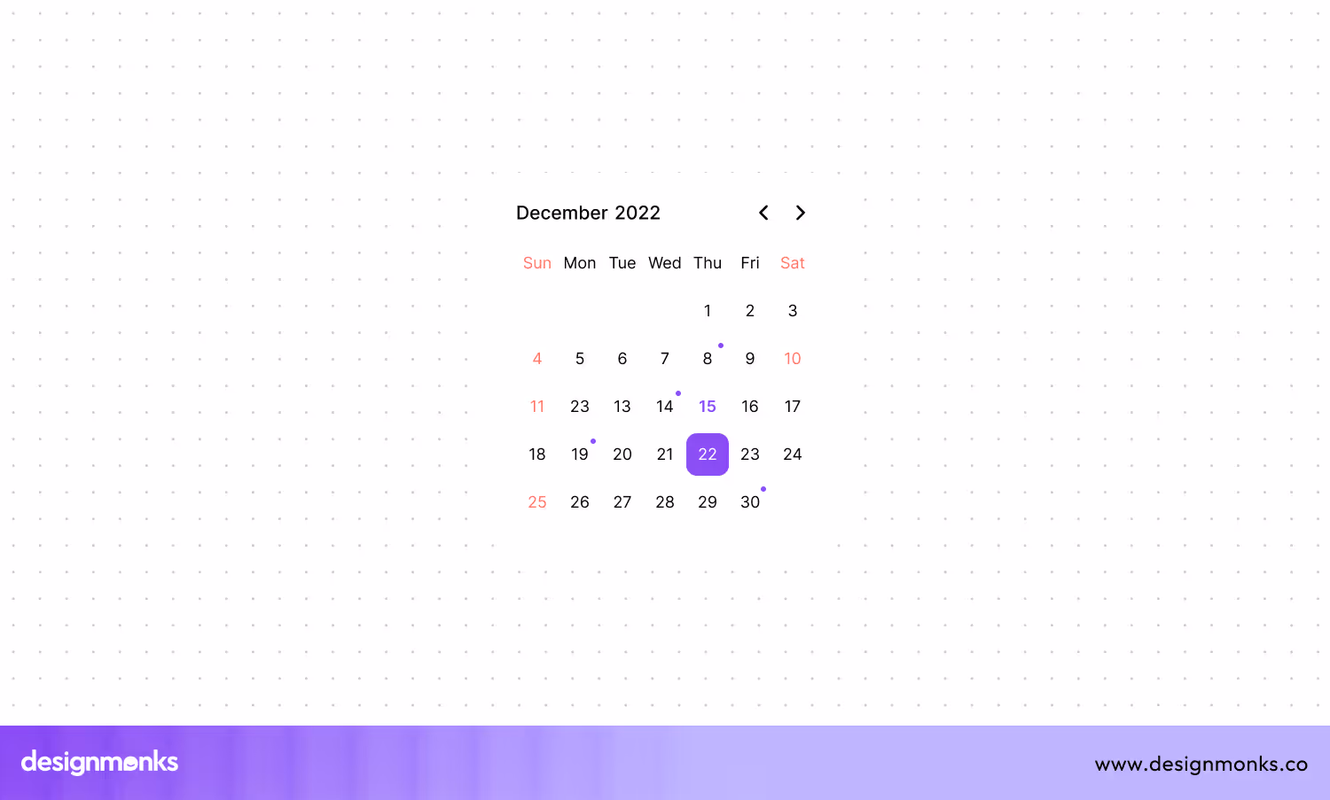
This UI component lets users select dates from a visual calendar interface. It’s commonly used in forms where users need to input a date, like booking systems, scheduling tools, or event registration.
A user-friendly calendar picker must be intuitive and easy to navigate. It should have clear labels for months, years, and days. While designing this element, you should highlight the current date and any selected dates, and provide options for quick navigation, like month and year dropdowns.
38. Breadcrumb Navigation

A secondary navigation aid that displays the user’s current location within a website’s hierarchy is known as Breadcrumb Navigation. It usually appears as a horizontal row of links, separated by symbols like arrows or slashes. Thus, it shows the path from the homepage to the current page.
To implement breadcrumb navigation, you should place it prominently near the top of the page, but don’t let it overshadow the primary navigation. Also, use clear, concise labels that accurately reflect the page hierarchy. Besides, ensure each breadcrumb link is clickable.
39. File Upload Field

A file upload field lets users select and upload files from their device to a website or application. It’s often used in forms for tasks like submitting documents, images, or other types of files. Thus, this element makes it a crucial element for user-generated content.
To create an effective file upload field, ensure it is clearly labeled and easy to use, with a visible button for file selection. Let users drag and drop files as an alternative to clicking. Also, provide feedback once a file is selected or uploaded, like a progress bar or confirmation message.
40. Status Indicator
Lastly, it's the status indicator, a UI element that conveys the current status or condition of an item, process, or system. It can appear as a small icon, text, or color change that communicates whether something is active, completed, in progress, or requires attention.
A status indicator must be clear and have distinct visual cues, like color coding—green for success, yellow for warnings, and red for errors. The indicators must be consistently placed and sized, so users can quickly recognize them.
Tips For Choosing the Right UI Elements
All the above interface elements are necessary. However, it doesn't mean that you can use just any element anywhere. Choosing the right elements is pretty much like an art. Also, you need to follow the principles of user-centered design.
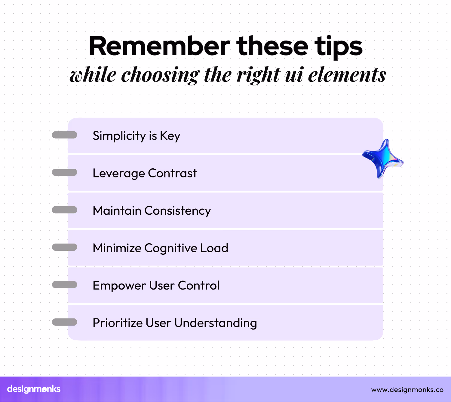
However, there are some tips on choosing the right UI elements that you need to remember while creating a user-friendly interface. Here are some of them:
Understand Your Users First
To create an effective design, you should first know who your users are and what they need. For that, research their preferences, habits, and challenges. Pro[er research will help you choose UI elements that match their expectations and make their experience smoother.
For example, if your users are not tech-savvy, choose simpler elements like basic buttons and clear text fields. Make sure that the users won't get lost in the deep ocean of technical aspects while using the interface. remember that understanding your users ensures that your design is relevant and accessible.
Keep It Simple
Simplicity is a must-have in UI design. Use elements that are minimalist and easy to understand. Also, avoid cluttering the interface with too many options or features.
Simple designs are easier for users to navigate. Indeed, it reduces the chances of confusion. For example, instead of using multiple buttons for different actions, you can use a single button with clear instructions. Keeping it simple makes your interface more intuitive and user-friendly.
Utilize Contrast Effectively
Contrast helps users distinguish different elements on your interface. S, be careful while contrasting colors, sizes, and shapes. Remember that these aspects will highlight important features. Also, they guide users' attention to where it is needed most.
For instance, you can make call-to-action buttons stand out by using a bold color that contrasts with the background. Effective use of contrast improves visibility and ensures that users can quickly find what they need.
Ensure Consistency
Consistency means using the same design patterns and elements throughout your interface. This approach helps users learn how to navigate your site or app quickly.
To make things clearer, think about the style of buttons. If you use a certain style for buttons on one page, you have to use the same style on other pages. Remember that consistency builds familiarity and trust, making the user experience more seamless and enjoyable.
Reduce Cognitive Load
Cognitive load refers to the amount of mental effort required to use your interface. So, it's essential to reduce cognitive load to get rid of user frustration. You can keep it low by minimizing the number of choices and information users need to process.
Here, you should use clear labels, and group-related elements, and avoid unnecessary details. Reducing cognitive load helps users focus on their tasks and prevents them from feeling overwhelmed.
Keep Users in Control
Always try to let users feel in control of their actions. For that, provide clear feedback for every interaction and offer options to undo mistakes. You can include confirmation messages before performing critical actions.
This approach will let users edit their inputs easily. It also helps improve user trust and loyalty. Keeping users in control significantly enhances their confidence and satisfaction with your interface.
So, try to follow these tips to choose the right UI elements that create a smooth and enjoyable user experience.

FAQs
Why are buttons important in UI design?
Buttons are important because they enable user interaction. They are used for actions like submitting forms, navigating pages, or initiating commands. Well-designed buttons improve the usability and accessibility of an interface.
What is the purpose of checkboxes in UI design?
Checkboxes let users select one or more options from a list. They are useful for forms and settings where multiple selections are needed. Checkboxes are intuitive and easy to use, enhancing user interaction.
What role do icons play in UI design?
Icons represent actions, objects, or concepts visually. They help users quickly understand functionality without reading text. Well-designed icons improve navigation and make interfaces more intuitive and engaging.
End Note
The mentioned 40 user interface elements are, undoubtedly, very crucial and if you use them properly, they can make it a successful interface. However, these are not the only elements you may have to use. There are many more that you may need to implement while designing an interface.
Also, getting introduced to the essential elements isn't enough alone. You need to learn how to choose and implement them properly. We have plans to cover that fact as well. So, stay will use useful UI/UX tips and information.

.avif)
.avif)
.avif)
.avif)


.avif)
.avif)
.avif)
.avif)


.avif)
