.svg)


Key Takeaways
- Well-designed CTAs guide users clearly toward desired actions on digital products.
- Bright, contrasting colors help CTA buttons stand out and grab attention.
- Proper placement above the fold or expected spots improves user engagement.
- Limit CTAs per page to avoid confusing or overwhelming users.
- Use action-focused, value-driven text to encourage immediate user interaction.
Do you know that a properly designed personalized CTA can increase your traffic by 42%? Yes, that’s the fact according to Mindstamp. These small buttons are quite effective in pushing your users to take specific actions on websites, apps, or emails. However, designers often fail in this case because they didn’t try the CTA best practices.
CTA or the call-to-action button links user interest and desired outcomes. That’s why designing and setting the CTA buttons is a thoughtful process. You need to be strategic, know your visitors, and then learn some basic guidance to make your CTAs work effectively.
Today, my discussion will follow this topic. I mean, I’ll talk about everything you need to know about proper CTA buttons. So, don’t skip any part if you want to learn to create CTA buttons most effectively.
What Is CTA Button?
A Call-to-Action (CTA) button is one of the most prominent User Interface elements. Designers utilize this CTA button on websites, apps, and software to push users to take the next action. Not even on a digital product, CTA can be on email or an online advertisement.
It usually comes with bold text and bright colors so that it can easily grab the attention of users. These CTA buttons usually highlight common actions like Sign Up, Buy Now, or Learn More.
The purpose of using a CTA button is simple. It guides users toward the next step, like making a purchase or subscribing to a service. A well-designed CTA button should be clear, easy to find, and expose exactly what to do next.
Why Are CTA Buttons Necessary?
CTA (Call-to-Action) buttons are one of the major elements for any digital product like a website, app, or email. A well-placed, clear CTA button can make a huge difference in driving engagement and conversions.

Here’s why CTA buttons are so important:
The Direct User Action
CTA buttons provide a clear direction for users. If your site doesn’t have properly used CTAs, visitors may browse your page without having any idea about what to do next.
A CTA makes things clear for them about exactly where to go, whether it’s to sign up, shop, or learn more. This is how they push users to complete the desired action indirectly and sometimes directly.
They Improve Conversion Rates
The right CTA button can significantly increase conversion rates. These elements usually encourage users to move forward in the sales funnel. As the users move forward, it increases the potential for them to make a purchase or subscribe. Thus, CTA buttons help increase conversion rates.
They Create a Sense of Urgency
CTA buttons often use language that creates urgency, like Shop Now or Get Started Today. This approach encourages users to act quickly rather than leaving the page. Urgency usually pushes users who might otherwise hesitate to make a decision.
They Highlight the Main Goal
Your CTA button highlights the primary goal of your page. It can be the focal point that ties everything together. They even remind the users why they are there. The CTA helps focus your page on its main goal, whether it’s getting people to sign up for a newsletter or make a purchase.
They Enhance User Experience
CTA buttons enhance the user experience effectively. It makes the path to action clear and easy. A well-designed button is easy to find and click. Thus, it reduces friction and confusion for users. The smoother the process, the more likely users are to engage.
Also, CTAs help increase user engagement. They give clear instructions on the next step. Users are more likely to interact with your content if they get a clear idea of the targeted action. Without a CTA, you might lose potential customers who don’t know what to do next.
Best Practices for CTA Buttons
Now, let’s cut the chase and learn what to do for the most effective CTA. Remember that you can’t just create a button of any size, color, and shape to make it an effective one. Here are 25 CTA best practices you should follow to make it look perfect and function impactful.
1. Make the Button Noticeable
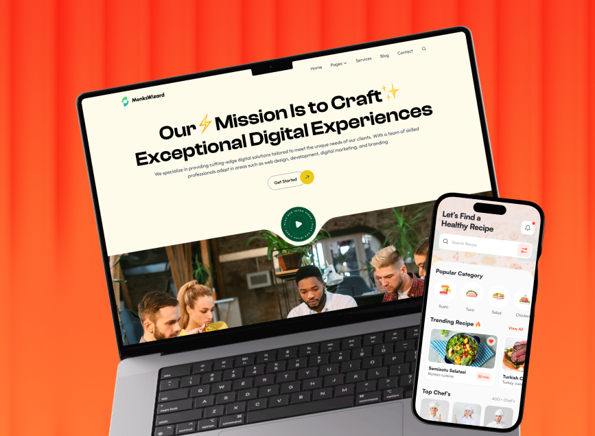
You should always strategically place and distinctly design your CTA buttons. Try to position it centrally or above the fold to make it visible. Set the size that balances clickability with aesthetic harmony.

A well-executed CTA button can guide the users towards desired actions. So, avoid using excessive surrounding elements that can dilute its effectiveness. Remember that a clear path to your CTA can increase user engagement and conversion.
2. Use Bright, Contrasting Colors
Color plays a remarkable role in making your CTA button pop. Try to use colors that make a nice contrast with your site’s primary palette. This way, it can create a visual focal point. Here, you should research color psychology.
Also, don’t be afraid to make bright and bold choices. They can significantly boost click-through rates if you choose the right one.
3. Ensure Contrast with Background
Proper contrast between your CTA button and its surroundings is important for instant recognition. High contrast ratios ensure the button doesn’t blend into the background. It enhances visibility and improves accessibility for users with visual impairments.
You should aim for a contrast ratio that meets WCAG standards. Try to avoid low-contrast combinations or busy backgrounds. These could really camouflage your CTA.
4. Add Space Around the Button
You must accept the strategic use of white space around your CTA button. This empty area acts as a visual buffer. It isolates the button and amplifies its presence. Adequate spacing reduces cognitive load and it lets users focus on the CTA without distraction.
Besides, it creates a clean look that improves overall design aesthetics. You should make sure not to overcrowd the site.
5. Keep Text Easy to Read
An ideal CTA button text should be easy to read with simple and common words. Aim to choose the text for maximum impact and readability. Try to select a font size that’s easy to read on different devices.
Remember that the right typography can significantly influence click-through rates. To try this CTA best practice, prioritize clarity over creativity and avoid complex fonts. Also, try to confirm sufficient contrast between text and button color for perfect visibility.
6. Choose Attention-Grabbing Colors
Colors play a bigger role in attracting users’ attention to your CTA button. You should choose a vibrant color that goes well on natural white or whatever background you use. Here, red, orange, and green work well. These colors attract the eye and suggest action.

However, you must avoid harsh colors that clash with your design. Try to test different colors to find the best one for your audience.
7. Size the Button Appropriately
The size of your CTA button can dramatically affect visibility and usability. You should make your CTA button big enough to notice easily. This is fundamental for mobile users. Remember that a tiny button frustrates users and it can reduce potential clicks.
At the same time, a huge button overwhelms the page. So, you must find a balance. The button should look good without dominating other content.
8. Position the Button Prominently
Location matters a lot for CTA buttons. You must place your button where users look naturally. The center of the page or end of a persuasive paragraph works well. You can also place it above the fold for immediate visibility.
Also, never hide your CTA in obscure spots. Make sure that users don’t have to search for it. Good placement is another CTA best practice that makes the action easy and natural.
9. Place the Button in the Expected Spots
Most users expect CTA buttons in certain places. For instance, the button should be at the bottom of forms, in the middle of landing pages, or at the end of articles.

These spots feel natural to the users and they reduce friction and confusion. So, never place buttons in unusual places or your users will be confused. Try to stick to conventional placements. They work because users know where to look.
10. Avoid Too Many CTAs
Too many CTAs can confuse users. You should focus on one main CTA per page. It guides the users clearly. However, if you need more, you can make them secondary.
Always remember that multiple CTAs can reduce overall engagement. Users might not know which action to take. So, you must keep it simple with one strong call to action. It often yields better results than offering many choices.
11. Use Action-Focused Text
Use CTA button text that successfully encourages users to take immediate action. Use strong, clear verbs like Get, Start, Download, or Join instead of long and complex phrases. Make sure that the text tells users exactly what to do.
Also, try to keep the text short and direct and never use vague language like Click Here or Submit, which doesn’t convey the benefit of taking action.
12. Match CTA with the Landing Page
Ensure your CTA aligns with the content and goals of your landing page. The button text and placement should convey your message properly. If your page promotes a free trial, the CTA should say something like Start Your Free Trial.
Make sure to be consistent all over the site while choosing CTA text. Consistency builds trust and guides users smoothly through the conversion process. Follow this CTA best practice to effectively match it with the landing page.
13. Clearly State the Value
Your CTA should communicate the value to users while informing them about the value of the state properly. Instead of just Sign Up, you should write Sign Up for Free Access to highlight the benefits.
Make it clear what users will receive, whether it’s a discount, a free resource, or exclusive content. Don’t leave users guessing with generic CTAs that don’t convey a benefit, as they may not motivate users.
14. Create Urgency or Scarcity
You should create a sense of urgency or scarcity to encourage users to act quickly. Phrases like Limited Time Offer, Only a Few Left, or Sign Up Now usually push users to take immediate action.

Urgency is important when it’s about the CTA. It can increase conversions by making users feel they might miss out if they don’t act fast. However, never overuse this tactic, as it can lose effectiveness if users don’t believe the urgency is genuine.
15. Use Sticky CTAs in Each Section
Try to place sticky CTAs that stay visible as users scroll through your page. This approach keeps the call-to-action accessible no matter where they are on the page.
Sticky CTAs work especially well on long pages with lots of content. They remind users of the next step without being intrusive. Your sticky CTA buttons should be moderate in size so that they won’t distract users.
16. Test Different Button Variations
Testing buttons of different designs help you find what works best for the site. You should experiment with different colors, sizes, shapes, and text to see which version gets the most clicks.

Prioritize A/B testing in this case and remember that it’s one of the CTA best practices. It lets you compare performance and make data-driven decisions. Also, never assume one design would fit all situations. Regularly test and refine your CTA buttons to keep improving.
17. Make Button Appear Clickable
Your CTA button should be clickable, so users know it’s interactive. Add visual cues like shadows, borders, or hover effects to make the button pop. Buttons that look flat or blend in with the design can confuse users.
Ensure that it changes when hovered over to indicate that it’s ready for action. In this case, avoid making buttons look like static images or text, or users will simply overlook them.
18. Provide Sufficient White Space
Adding white space around your CTA button makes it clearly visible and draws users’ attention. White space helps separate the button from other elements. As a result, the button gets more room to breathe and it becomes more noticeable.
Cluttering the area around the button can confuse users and diminish its impact. So, avoid placing the button too close to text, images, or other buttons that can reduce its visibility.
19. Avoid Words that Create Resistance
Always use positive, action-oriented words in your CTA and avoid terms that may cause hesitation, like Buy or Submit. Words that imply effort or cost can create resistance.
Instead, use softer language like Get Started or Claim Your Spot. These phrases feel less demanding and encourage users to take action. Also, you should never use negative wording or overly formal terms that feel impersonal.
20. Ensure the Button is Functional
A CTA button must work properly on all devices and browsers. Make sure to test the button thoroughly to ensure it functions smoothly and guides users to the correct destination.
An unresponsive or broken button can frustrate users and cause them to leave the page. That’s why remember to regularly check for responsiveness, especially on mobile devices. Also, avoid assuming that once the button is live, it’s always working. Instead, routine checks and updates it regularly.
21. Optimize Button for All Devices
Your CTA button should be responsive and works well on all devices, including mobile, tablet, and desktop. On smaller screens, the button sometimes looks much smaller. So, make sure to keep the button size large enough to tap easily, but not so big that it disrupts the layout.

Mobile users should find the button easy to reach without zooming in. Don’t forget to test how the button looks and functions on various devices and screen sizes.
22. Add Social Proof Nearby
Placing social proof, like customer testimonials or reviews, near your CTA button increases credibility and encourages users to take action. This one is quite an effective but indirect way to push users to take action.
For example, showing “5,000+ happy customers” right next to the button can make users feel more confident in clicking. However, make sure not to crowd the area with too much information. Only a few well-placed stats or testimonials can make the CTA more persuasive.
23. Use Size for Visual Hierarchy
Try to create a clear visual hierarchy by making your primary CTA button larger than other elements. This CTA best practice simply indicates that the bigger button is important. You can use different sizes to distinguish between primary and secondary actions.
In this case, a large Get Started button can stand out more than a smaller Learn More button. This approach helps guide users toward the most desired action.
24. Try Different Button Shapes
Experimenting with different button shapes can help your CTA look unique, noticeable, and effective. Even though rectangular buttons are common, rounded or pill-shaped buttons can attract more attention and create a modern look.

The shape should complement the overall design without looking out of place. Some shapes may work better according to your brand or audience. Here, try to avoid sticking to one standard shape without testing. Remember that variations can add visual interest and improve engagement.
25. Routine Test and Improve
Finally, you should make a routine to test your CTA button regularly. Continuously testing and refining your CTA buttons ensures they remain effective over time. User preferences and behaviors can change, so it’s important to stay flexible.
Regular A/B tests on color, text, size, and placement help you find the most suitable design. Keep track of performance metrics and make adjustments based on data.

End Note
Effective CTA buttons can significantly boost user engagement and conversions. Make sure to follow the mentioned CTA best practices to create CTAs that truly resonate with your audience.
Remember to keep your buttons clear, visually appealing, and strategically placed. Test different designs and messages to find what works best for your specific users.
With well-designed CTAs, you’ll effectively guide visitors through their journey while increasing your site’s conversion rate. So, start implementing these tips today, and watch your conversion rates soar.

.png)
.png)
.png)
.png)


.png)
.png)
.png)
.png)


.avif)