Did you know that 90% of users stop using an app due to poor UX? That’s why while designing a mobile app, looking over the UX is mandatory. A few underrated mobile app UX tips can help you in this case.
Mobile app UX design is the science behind creating intuitive interactions between users and mobile applications. It’s about creating apps that look good while feeling natural and effortless at the same time.
A well-designed app with good UX can boost user engagement and retention rates to make your app the people’s favorite one. On the flip hand, poor UX can result in app abandonment faster than you can say “uninstall.”
So, learn the secrets of exceptional mobile app UX design. Check this blog for expert mobile app UX tips and strategies that’ll transform your app from good to unforgettable.
What is Mobile App UX?
Mobile App UX focuses on user interaction with apps that we use on our smartphones. It’s all about designing user-friendly interfaces in the best possible way. Good UX is necessary to make apps successful because it ensures that the app is easy to navigate and use.
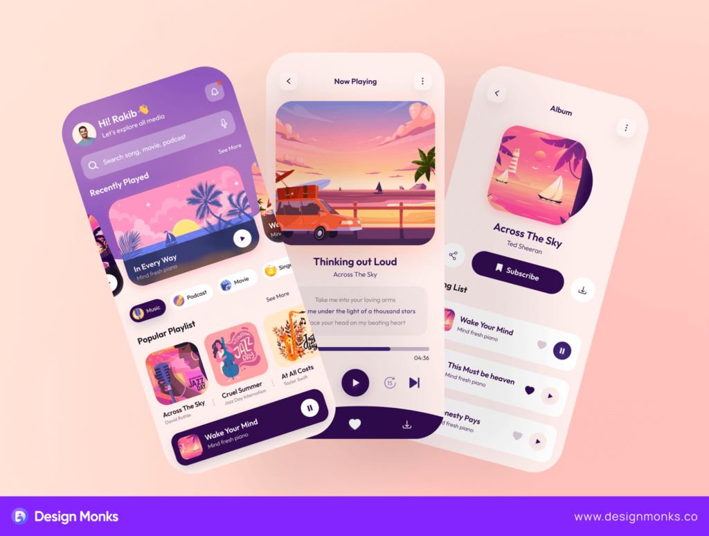
On an app with good UX, users can find what they need quickly. The app must load fast and work well on different devices to maintain responsiveness. Clear navigation is essential in this case as well. Also, content should be easy to read and access. According to the Interaction Design Foundation,
Mobile UX designs are interfaces for hand-held and wearable devices. Designers focus on accessibility and efficiency to optimize these on-the-go interactions.
So, a positive UX is necessary for an app to satisfy users. Users are more likely to keep using the app if the UX is good. They may recommend it to others for the same reason.
Major Elements of Mobile App UX Design
Usually, a mobile app needs a clean and functional UX. For that, there are lots of elements UX teams need to use to make the interface. There are hundreds of elements available to utilize.
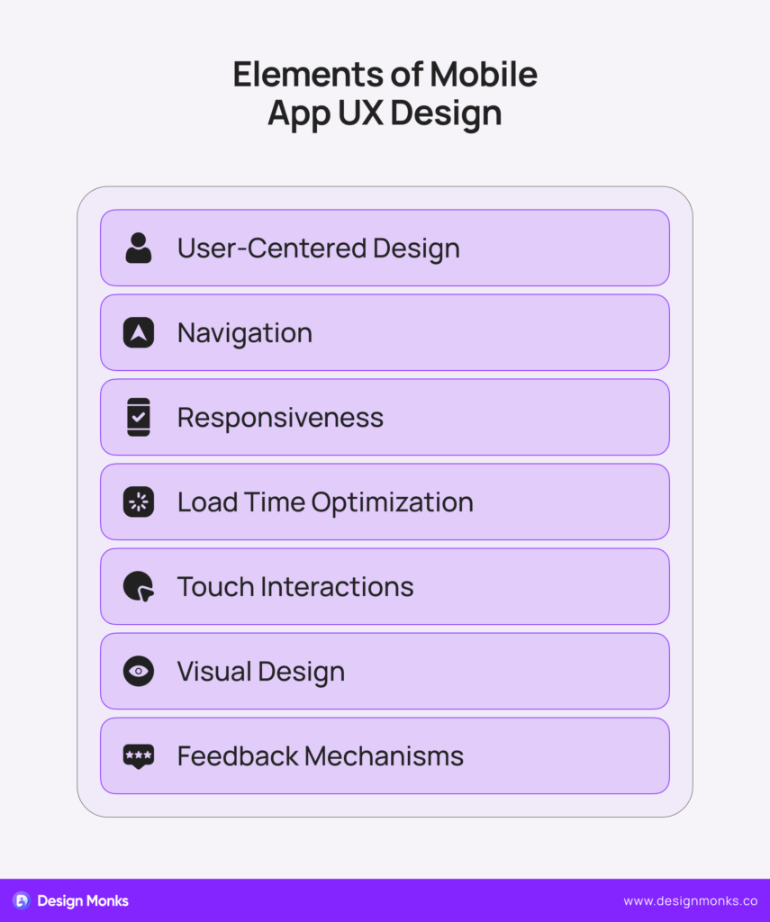
Still, they can’t use all of them when they try to make a minimalist design. Here are some elements that are mandatory for any mobile app.
User-Centered Design
It’s about understanding user needs and behaviors. Designers create user personas and journeys to help customize the app according to user requirements. User-centered design makes apps relevant and useful. Also, it increases user satisfaction.
Navigation
Navigation guides users through the entire app. It must be simple and consistent. Clear menus and recognizable icons are crucial at the same time. Besides, the logical flow keeps users engaged and it can reduce confusion and frustration. Thus, a good navigation system helps users find what they need quickly.
Responsiveness
It’s all about making apps work well on different devices. Being responsive means the app works well on all screen sizes and orientations. This flexibility is important because users access apps from different types of mobile devices.
Load Time Optimization
Fast load times are essential especially to keep your users engaged. Users usually expect quick responses from apps and slow loading can frustrate them effectively. It may cause them to abandon the app.
That’s why designers must minimize data usage and optimize images to ensure faster load times.
Touch Interactions
Mobile apps rely on touch so touch interaction matters. Buttons and sliders must be easy to tap and suitable for all finger sizes. It’s also essential to place interactive elements appropriately. Good touch design makes apps more accessible and helps improve the user experience.
Visual Design
Visual elements are all about the matter of outlook. Consistent colors and typography are necessary to create a cohesive look. Also, good visual design directs user attention and makes important elements noticeable. Thus, it enhances the overall user experience.
Feedback Mechanisms
Feedback can be visual, auditory, or tactile. It’s almost mandatory because it increases user confidence. Besides, it reduces errors and lets users understand how the app responds to their actions. This way feedback ensures a more intuitive experience.
These elements work together to create user-friendly apps. They help meet user needs effectively and ensure a good UX design to achieve higher user satisfaction.

Why Does Mobile App UX Matter?
Mobile App User Experience (UX) usually determines an app’s success along with some other factors like marketing and strategies. It affects how users interact with and perceive your app. Let’s learn about the core reasons why Mobile App UX is important.
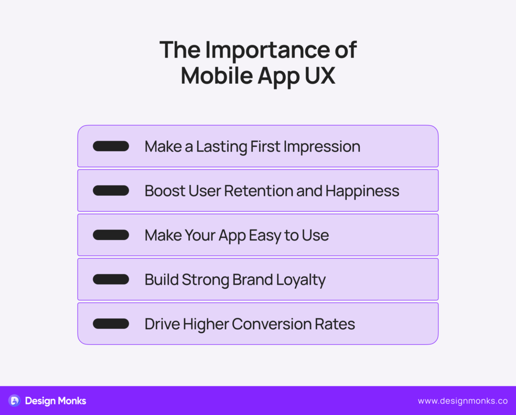
Ensure a Good First Impression
The UX of a mobile app has a lot to do with the landing page. A user-friendly and visually appealing app can effectively attract users. Also, good first impressions are necessary for higher user retention rates. More users will return to apps if they manage to provide smooth experiences from the start.
Increase User Retention and Satisfaction
Effective UX design helps users achieve their goals easily. It will encourage them to make a purchase, find information, or enjoy content. Besides, quick and easy access to desired features increases user satisfaction. As a result, they would love to return to the app and you’ll get a lot of traffic.
Enhance Usability
Great UX makes apps simple and easy to navigate. Clear paths and intuitive design elements help new users get rid of frequent confusion. As a consequence, the app will be accessible to audiences of any category. Even less tech-savvy users won’t have any issues while using the app.
Improve Brand Loyalty and Reputation
A good UX can also positively impact your brand perception. Users who have good experiences often develop brand loyalty. They have the potential to share their positive experiences with others. It’ll help build a strong reputation for your brand.
Increase Conversion Rates
UX design directly affects an app’s ability to convert users into customers. Well-thought-out UX usually pushes users indirectly while making decisions like purchases or lead generation.
Features like simple navigation and clear calls-to-action also improve conversion rates. This approach usually results in better business outcomes.
Additionally, good UX can make you noticeable in a crowded market. Users prefer apps that offer better experiences. So, if you invest in UX design to get the best one, there’s no way you’ll regret it in the future.
9 Must-try Mobile App UX Tips
Designing a mobile app has its first requirement to have a good UX. Once you fail in it, there would be no hope for the app to be popular. However, here are some essential mobile app UX tips for mobile app design that will help you ensure a good UX.
1. Put Users First
You should begin with prioritizing user-centered design. That means you need to focus on the needs and preferences of the users at every step of the design process. This approach helps you design features that perfectly match your audience’s needs and pain points.
When the app feels comfortable to the users, they’ll keep using it. Eventually, there’s a big chance that they’ll recommend the app to others. In this case, you can try to use surveys, focus groups, and analytics to gather insights. Remember to regularly update your user profiles as you learn more.
2. Create Easy Navigation System
You should create a navigation system that seems familiar and comfortable to the users. Make sure that they find whatever they’re looking for quickly. It’ll reduce user frustration and increase engagement.
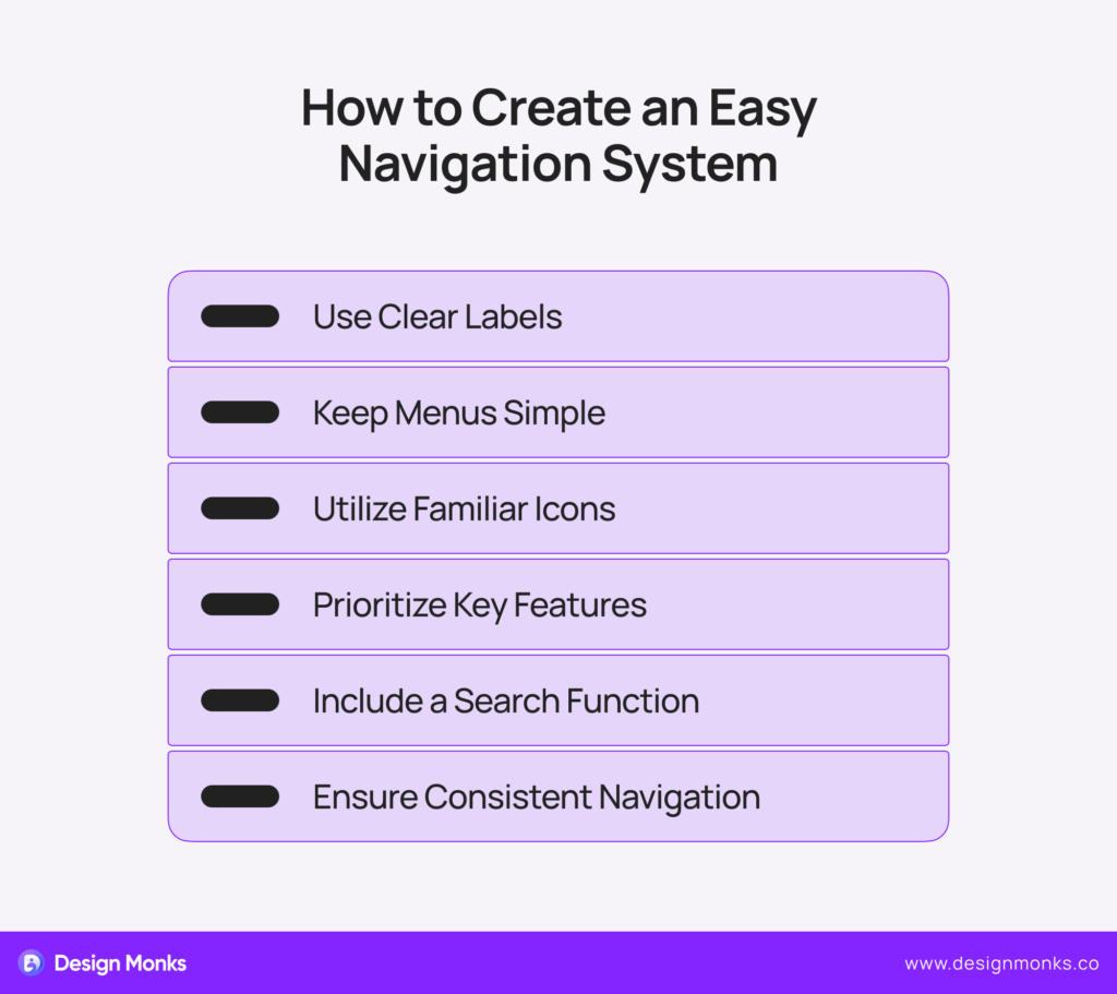
On the other hand, a confusing layout can result in users leaving the app quickly. To get rid of this nightmare, use familiar icons, clear labels, and logical groupings. Don’t forget to test your navigation with real users and iterate based on their feedback.
3. Touch-Friendly Design Is A Necessity
Make sure to design your app to be comfortable for thumbs and fingers of all sizes. This means appropriately sized buttons (at least 44×44 pixels), generous spacing between elements, and intuitive gestures. It’s one of the most effective mobile app UX tips.
A properly developed touch-friendly design can increase usability, reduce errors, and provide a smooth user experience. If the touch system is not working properly, it’ll cause user frustration. For sure, they’ll leave the app for good.
So, try using design tools to test tap areas like Userlytics and Mr. Tappy. Also, it’s necessary to implement forgiving touch zones and ensure instant visual feedback for all interactions.
4. Never Overlook Consistency
Consistency matters because it’s a way to create a cohesive visual language all over your app. Try to develop a comprehensive style guide that dictates colors, typography, iconography, and spacing.
For that, you can use design systems and component libraries to ensure consistency across your development team. This consistency builds trust and reduces cognitive load. Also, a harmonious design feels professional and is easier to navigate.
5. Utilize the Action Catalyst Approach
This is about properly implementing a clear call to action. Proper CTAs improve conversion rates and user engagement. They can guide users about what to do next, like signing up, making a purchase, or sharing content.

However, creating CTAs is easier but making them look perfect can be tricky. Focus on contrasting colors, action verbs, and strategic placement. A/B testing different CTA styles works well especially to find what goes best with your users.
6. Speed Matters
Ensuring fast load times is necessary too. Slow apps frustrate users and increase abandonment rates. Conversely, quick load times improve the overall user experience, keep them engaged, and reduce bounce rates.
So, you should prioritize app performance with a lightning-fast experience. For that, try to optimize images, minimize code, and utilize caching techniques.
Also, use performance monitoring tools, implement lazy loading, and utilize a content delivery network (CDN) for faster global access. Regularly test your app’s speed and make necessary adjustments as well.
7. Responsiveness Has No Alternative
Never ever imagine the success of whatever digital product you make without responsiveness. This is about the app or product adapting to all screen sizes. A responsive app ensures that your app looks great and functions well on different devices like smartphones, desktops, and tablets.
To make a design responsive, use flexible grids, scalable images, and adaptive layouts. Make sure to prioritize a mobile-first approach and use relative units (like percentages) instead of fixed pixels. Also, test your app on different devices to ensure that everything is going smoothly.
8. Listen to Users
User feedback is gold for continuous improvement. Besides, listening to users makes them feel valued, and the approach provides you with valuable insights into areas of improvement. So, try to utilize all possible ways to get user feedback.
You can create multiple channels for users to provide feedback and make it easy for them to do so. Implement in-app surveys, feedback buttons, and user testing sessions as well. Also, don’t forget to prioritize common requests, and review feedback regularly.
9. Ensure Access for Everyone
Lastly, it’s about accessibility and it’s one of the most effective mobile app UX tips. Accessible design expands your user base and is often a legal requirement. So, there’s no way you can ignore it. Maintaining accessibility standards will make your app usable for everyone, including people with disabilities.
To make such a design use readable fonts, provide alt text for images, and support screen readers. Also, you should ensure high contrast for readability.
At the same time, you need to follow Web Content Accessibility Guidelines (WCAG), use sufficient color contrast, and support screen readers. Regularly audit your app’s accessibility features and make necessary improvements as well.
Besides, you should properly use white space to improve readability and focus user attention on key elements. Also, schedule regular usability tests, use heat mapping tools, and analyze user behavior data. Be prepared to make both small tweaks and major overhauls based on your findings.
FAQs
How can I test my Mobile App UX Design?
You can test Mobile App UX Design through different methods. For example:
- User testing: It’s about real users interacting with your app and providing feedback.
- A/B testing: It compares different versions of your app to see which performs better.
- Analytics tools: They track user behavior within the app and help identify areas that need improvement.
Can UX designers build apps?
UX designers usually focus on creating user-friendly interfaces. Their main job is to ensure apps are intuitive and easy to use. So, they can only design and make the core structure of apps.
Building apps, on the other hand, requires coding skills. Developers can handle this part of the process. So, UX designers and developers need to work together to create fully functional apps.
How does Mobile App UX design improve usability?
Mobile App UX design improves usability in several ways. It makes apps easy to navigate so that users can find what they need quickly. Also, good UX design minimizes loading times to keep users engaged and prevents frustration.
It ensures the appropriate use of buttons and other elements to make a smooth and efficient experience.
End Note
All right, let’s wrap this up! The mentioned mobile app UX tips will let you set yourself up to create an app that doesn’t just tick boxes – it wows your users. They will help you make the app just feel right – smooth, easy to use, and solve a problem for you. That’s the power of great UX design.
So, before you start your next mobile app project, keep your users front and center. What do they need? What will make their lives easier? Answer those questions to create that they will love to use.
Also, don’t be afraid of the long way to learn new things. Stay curious, keep an ear to the ground, and be ready to adapt. Trust me, your users will thank you for it.


