
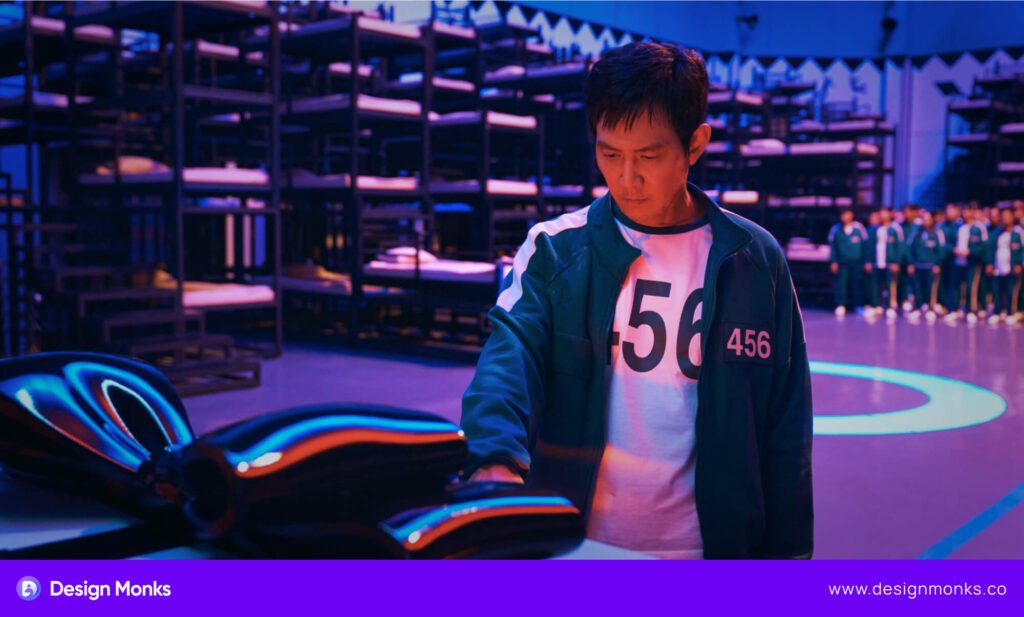
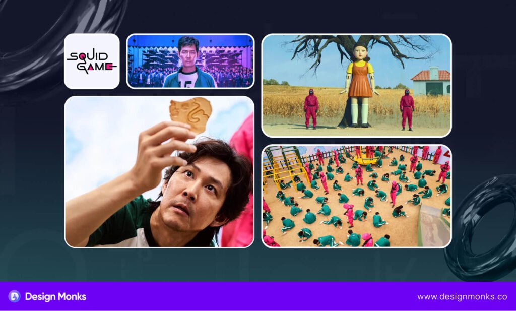
Squid Game has taken over from memes to discussions, especially after the second season was released. This South Korean series became a cultural phenomenon overnight. But there’s more to it than meets the eye, especially the setup from the perspective of UI/UX design.
The design elements of Squid Game, did you think about it? They mix simplicity, creativity, and strategy. If you think from the UX perspective, Squid Game ft Design UI/UX fact must amaze you.
From colors to shapes, every detail in the series has a purpose. These details tell stories and create emotions. As designers, we have a lot to learn from this. So, this blog will follow my insight about this series from the design perspective.
Less is More: Simple Yet Iconic Design
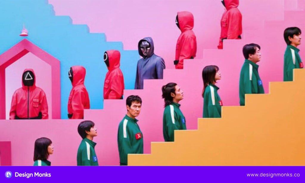
You must notice that the design of Squid Game uses simple shapes and bold colors. Still, it was able to make a strong impact. The shapes – circle, triangle, and square – are easy to recognize and symbolize different roles in the game.
The workers, soldiers, and managers are all marked by these basic shapes. This minimal use of squid game symbols makes it clear who is who, without extra details.
The colors in Squid Game are also simple yet powerful. The pink and green tracksuits contrast well and are noticed in every scene. Do you know that these colors are opposite on the color wheel? Well, they perfectly create a balance on screen.
UI/UX Connection with the Simple Design
When it comes to the UI/UX design, shapes and colors play an important role, especially while creating memorable interfaces. Just like in Squid Game, designers use simple shapes to guide users and make interactions clear.
For example, buttons and icons often use simple geometric shapes, like circles or squares, to help users understand their function quickly.
Colors also play an important role in UI design. They can highlight important actions, create moods, or even guide users through a website or app. In Squid Game, the use of bold colors draws viewers’ attention and strengthens the emotional tone of each scene.
Psychological Effects of Minimalistic Design
Minimalistic design, like the one seen in Squid Game, has a strong psychological effect. Simple shapes and colors make it easier for viewers to process information quickly.
This approach keeps the focus on important elements and reduces distractions. It simply makes the message clearer. Well, in UI/UX design, this simplicity helps users navigate and understand an interface without feeling overwhelmed.
Creating Emotional Impact & Nostalgia
Design isn’t just about how things look, it also covers how they make you feel. Squid Game uses visual elements to create intense emotions like fear, tension, and urgency. These ideas are pretty similar to the way we design an interface.
Let’s learn more about how the show’s design choices can inspire emotionally engaging experiences like in UI/UX:
The Role of Lighting
In Squid Game, lighting plays a big role in setting the mood. Bright and playful lights create false comfort before the deadly games start. On the other hand, dim and shadowy lighting during tense scenes increases fear and anxiety.
Similarly, in UI design, light and shadow can guide attention or create a sense of depth. Using contrast wisely can create different emotions from users.
The Power of Sound
The eerie background music in Squid Game makes viewers feel uneasy. I’m sure that you will agree. However, the sudden sound effects amplify the feeling of danger.
In digital experiences, sound can add emotional depth as well. For example, soft notification sounds can reassure users, while a harsh beep might signal an error. Choosing the right sounds can influence how users react to your interface.
Minimalism for Emotional Focus
The show’s minimal sets keep the focus on the characters and their emotions. This simplicity intensifies the drama. In UI/UX, clean and minimal designs reduce distractions. A simple layout lets users focus on what’s important, whether it’s a message, task, or action.
So, Why Emotional Design Matters?
Designing with emotions creates connections. People remember experiences that make them feel something. In UI/UX, this could mean designing a cheerful checkout page or a calming meditation app. Emotional design makes interfaces more human and relatable.
Onboarding Excellence: Key Takeaways from Squid Game
User onboarding sets the tone for any experience. In Squid Game, they utilize this process in the best possible way. Their onboarding happens under extreme and high-stakes scenarios. Yet, the steps are simple and clear.
Let’s break down how Squid Game manages to onboard and what we can learn for digital products.
Clear Instructions Build Trust
In Squid Game, players receive simple, direct instructions before each game. They know what they must do to survive, even if the stakes are deadly. In UI/UX, clarity in onboarding is important. Use plain language and show users what to do step by step. A clear way makes users feel confident and ready to engage.
Use Visual Aids for Better Understanding
The show uses visual cues like symbols, colors, and gestures to explain the rules. This approach makes it easy for players to follow even without complex explanations. Similarly, digital onboarding can use icons, images, or animations to guide users. Also, visuals can reduce confusion and speed up understanding.
Psychological Tactics to Improve Engagement
Squid Game creates urgency and keeps players focused by limiting time and resources. Even though digital products don’t need this level of intensity, we can add small nudges that can work wonders. Highlighting rewards or progress during onboarding motivates users to complete the process.
The Impact of Ambiguity
In this series, unclear instructions create chaos and fear. Its ambiguity can hurt the experience. For digital onboarding, it’s better to avoid vague messages. Test your process to ensure all steps are easy to follow.
Here are some lessons we get from this show for a clean onboarding process:
- Keep it short and focused.
- Use visuals for clarity.
- Show progress to encourage completion.
- Avoid confusing language or steps.
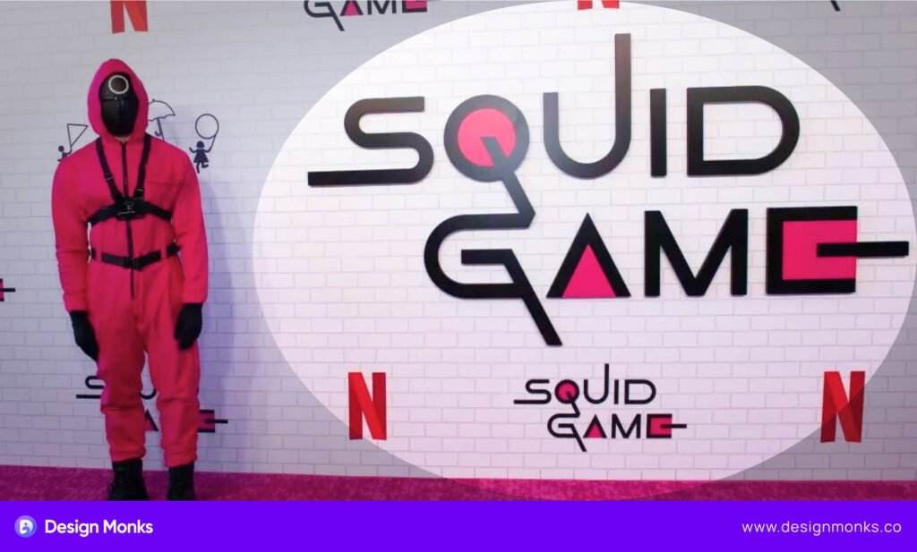
The Power of Visual Branding In Squid Game
Visual branding is like a signature, no matter if it’s a series or a design. It sets the tone and helps people remember you. Squid Game nailed this with its unique design. It uses colors, symbols, and visuals to create a world that sticks in your mind.
Let’s see what made their branding so strong and how we can learn from it.
Bold Colors Speak Loud
Squid Game used pink, green, and yellow in most scenes. These colors are bold, bright, and impossible to miss. Pink suits the workers, while green shows the players. These strong color choices make every frame stand out.
Well, in branding, picking the right color is important. Think of apps like Instagram or Spotify. Their colors are instantly recognizable.
The Shapes Tell Stories
The circle, triangle, and square weren’t just random. Each shape had meaning like a circle for workers, a triangle for soldiers, and a square for managers. These simple shapes made it easy to understand roles at a glance.
Similarly in UI/UX, visual branding needs simplicity like this. Clean and clear shapes stick in users’ minds.
Consistency is Everything
Squid Game’s sets, costumes, and props followed the same design rules. Did you notice it? The consistency made its world feel real and believable.
Brands like Google or Airbnb also follow cohesive designs. Their fonts, icons, and layouts match everywhere. This consistent approach helps build trust and makes users feel at home.
Lessons for Digital Design
Visual branding is powerful in apps and websites too. A cohesive design system ensures users don’t feel lost. Matching colors, shapes, and styles guide users easily.
They Prioritize Simple Communication
Good communication is the heart of great design. Squid Game taught this lesson with its simple instructions. Players understood the rules instantly, no matter how shocking the game was.
Let’s explore why simple communication works and how it applies to UX microcopy.
Clear Instructions Build Trust
In Squid Game, every game began with clear rules. “Do this to survive.” No fancy words, and no confusion. This clean instruction gave players the information they needed to act.
Apps and websites need the same clarity. For example, “Enter your email” works better than “Please provide your electronic mail address.” Keep it short and direct.
Simplicity Reduces Stress
Complex instructions overwhelm users no matter where they’re used. Squid Game kept its rules simple to avoid confusion. This approach allowed players to focus on the task, even under pressure.
Similarly, in digital design, a simple microcopy can ease frustration. Think of a checkout button labeled “Pay Now.” It’s better than “Finalize Your Transaction and Submit Payment.”
Try these tricks to make effective microcopies:
- Use short words and sentences.
- Avoid technical jargon.
- Focus on what the user needs to know.
Apps like Duolingo use phrases like “Great job!” or “Try again.” This keeps users engaged and motivated.
Here are some real examples that can help:
- Google: “Search” instead of “Initiate Query.”
- Spotify: “Find your next favorite song.” Short and inspiring.
- Slack: “What’s on your mind?” Friendly and inviting.
Squid Game shows us the power of clear communication. In UX, simple microscopy improves user experience and builds trust. Always ask, “Can I say this in fewer words?” Simple wins every time.
End note
Squid Game is more than just a thrilling series; it’s a masterclass in design. From its bold visuals and simple shapes to its emotionally charged storytelling, it shows how design can create impact. The lessons are clear:
- Simplicity matters in both visuals and communication.
- Emotional resonance keeps users engaged.
- Cohesive design builds recognition and trust.
As designers, we can apply these insights to our work. Focus on clarity in microcopy, use consistent visual branding, and design for emotional connection.
Think beyond aesthetics – tell a story that resonates with your audience. Great design isn’t just seen; it’s felt. And like Squid Game, it leaves a lasting impression.