.svg)


Key Takeaways
- Button alignment should match screen size, horizontal for wide, vertical for mobile.
- Use a clear visual hierarchy to guide users toward the primary action.
- Maintain consistent button size, style, and spacing to avoid confusion.
- Prioritize accessibility with large touch targets and clear labels.
- Use two primary buttons only when both actions are equally important.
Ever faced difficulty aligning two primary UI buttons because of layout inconsistencies or screen size variations? If you face this issue so often you should learn how to show two primary buttons UI effectively without overwhelming the user or creating confusion.
Whether you align them vertically, or horizontally, or choose another approach, the placement of these buttons demands critical design thinking. Properly showcasing two primary buttons can guide users smoothly through actions. Conversely, incorrect placement risks diminishing clarity and usability.
However, want to ensure your design achieves the perfect balance? Keep reading to learn everything about how to show two primary buttons UI the right way and make your interface seamless and intuitive.
How to Display Two Primary Buttons in a UI with Different Alignment Options?
Designers often need to place multiple buttons together. Proper alignment is essential to usability and visual balance. Here are four ways to align buttons based on screen size and purpose.
1. Horizontal Alignment
This type is the best for wider screens like desktops or tablets. To make this style, place the buttons side-by-side in a horizontal line. It usually works well when there’s enough space, and users can see both actions clearly. The following tricks might help:
Spacing & Sizing
Maintain a spacing of 8–16px between the buttons. Too little space makes them look cramped. Also, too much space makes them seem unrelated. Keep the buttons equal in size. Consistency in width and height helps the design look clean and professional.
Placement
For left-to-right languages (like English), place the most important button (Primary Button) on the left and the secondary button on the right. For right-to-left languages (like Arabic), reverse the order. That means, put the Primary Button on the right.
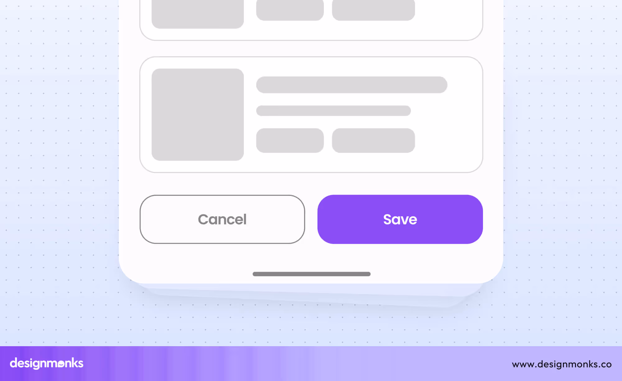
Example
For a desktop app, you can show two buttons like “Save” and “Cancel” side by side. This layout works well because the user’s eyes naturally move across the screen horizontally.
2. Vertical Alignment
When the screens are narrow like mobile devices, vertical alignment works the best. In this case, stack the buttons vertically, one above the other. Mobile screens are tall but narrow, so vertical alignment saves space and ensures clarity.
- Use a spacing of 16–24px between the buttons to prevent them from looking crowded.
- Make sure buttons are touch-friendly. They should have enough height and padding so users can tap them easily with their fingers.
- Aim for a minimum button height of 44px.
- Use a clear visual hierarchy. Like, the Primary Button can use a brighter color, while the secondary button has a lighter or outlined style.
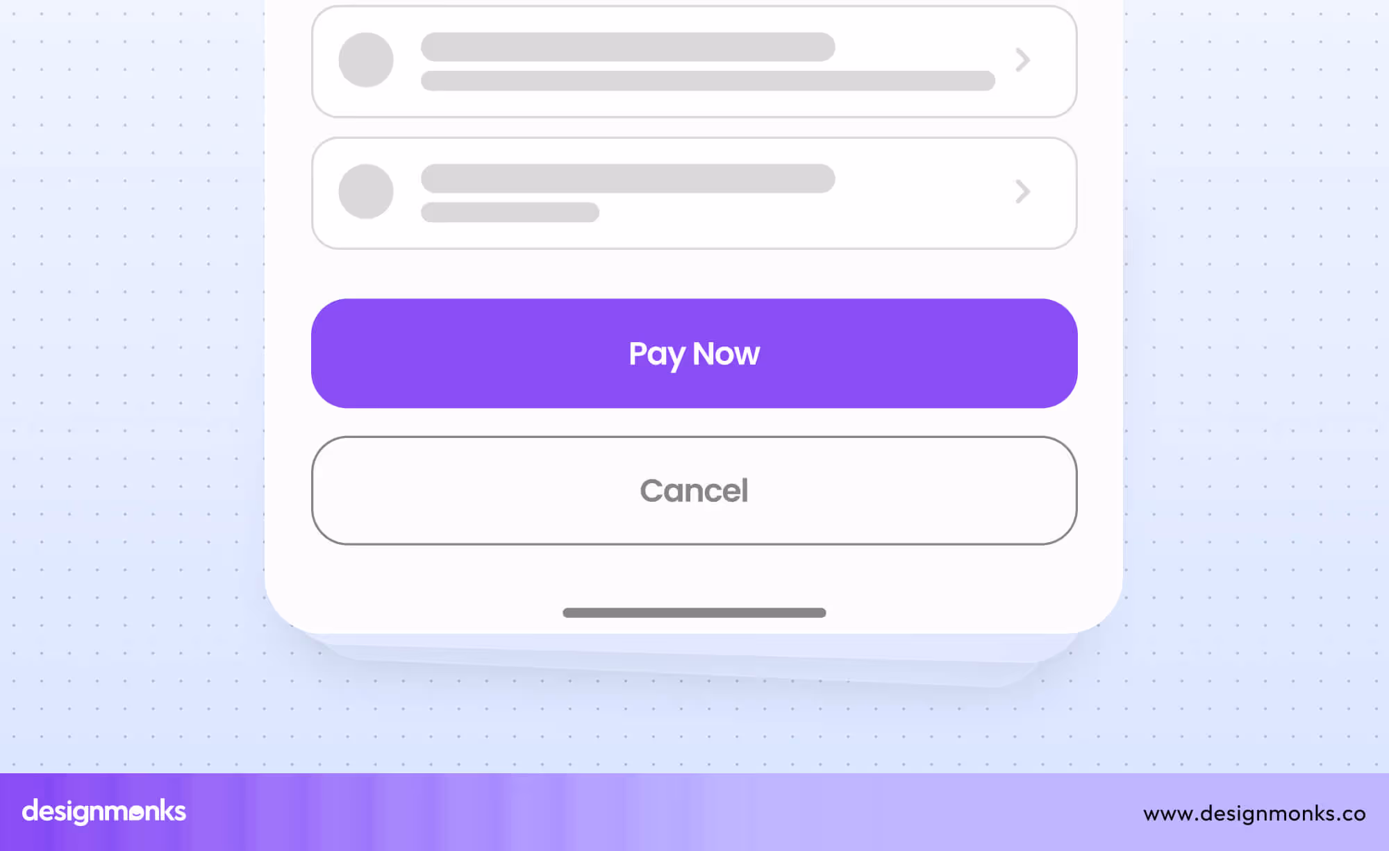
Example
On a mobile checkout screen, stack “Pay Now” (Primary) and “Cancel” (Secondary) buttons vertically. This ensures users don’t accidentally tap the wrong button while using their thumb.
3. Inline with Content
This one is perfect for contextual actions tied to specific content. Designers use this style commonly in lists, tables, or cards. Here, they place buttons in line with the content to keep them connected to the item they act on. You can align them to the left, center, or right based on the layout.
- Keep buttons close to the related content, so users immediately understand what they do.
- Maintain consistent spacing between buttons and other UI elements to avoid clutter.
- Use smaller buttons if space is limited but ensure they remain clickable.
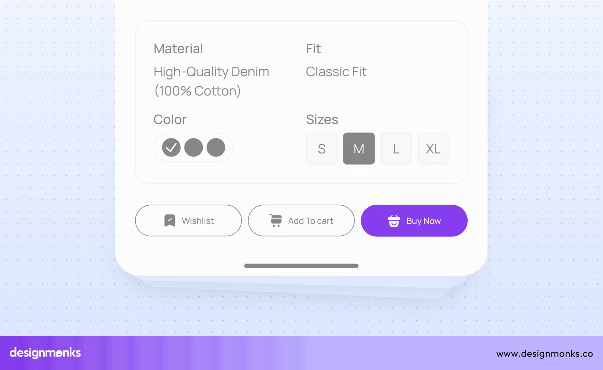
Example
In a product list, you might add “Wishlist," "Add to Cart", and “Buy Now” buttons for each item. Align these buttons to the right side of the row for easy access. This method keeps the actions contextual and avoids confusion.
4. Floating or Corner Alignment
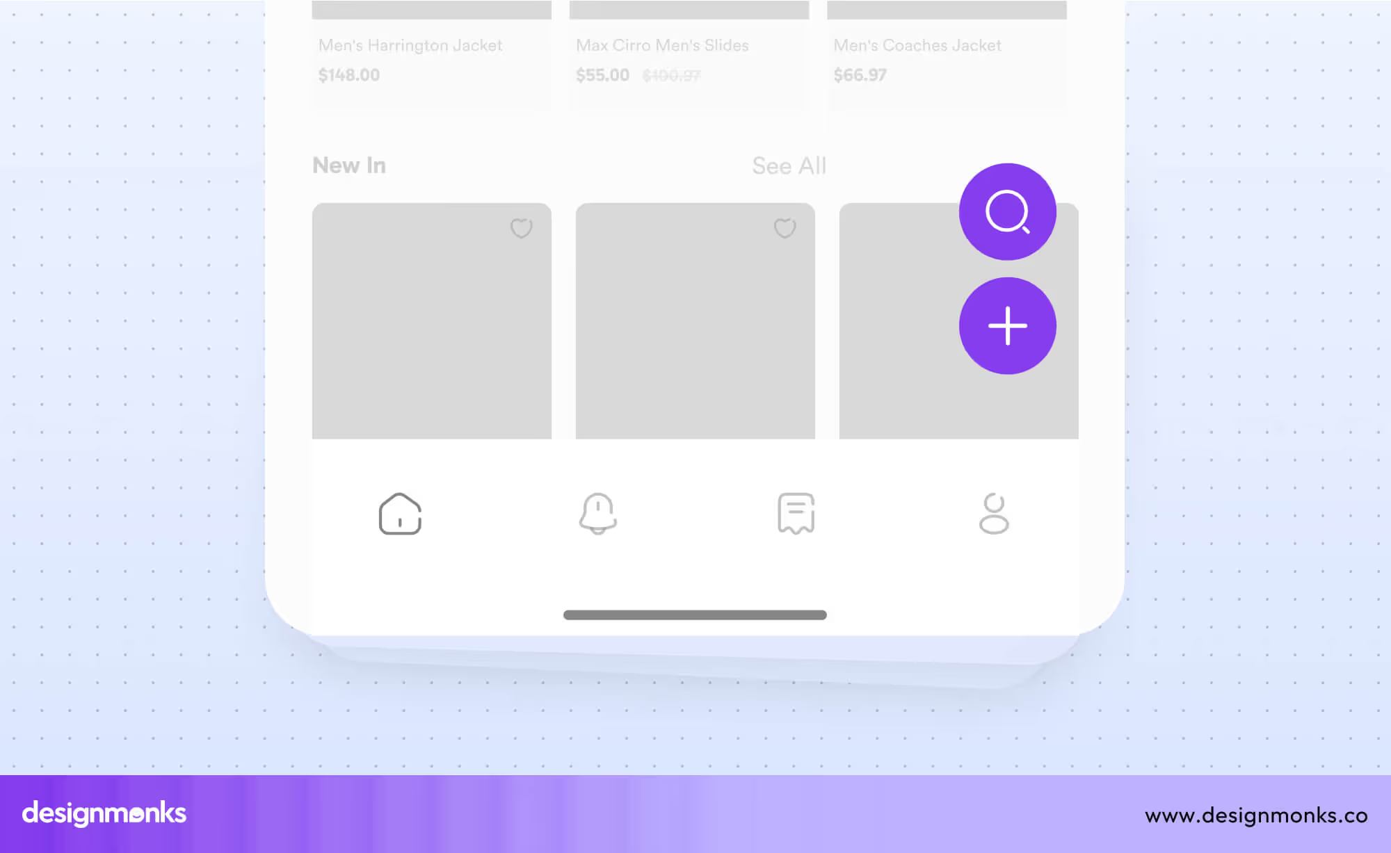
This type works great for global or persistent actions, especially in mobile apps. You need to show the buttons as floating action buttons (FABs) or place them at the bottom corners of the screen. Floating buttons are eye-catching and easy to access, even with one hand.
Button Style
Use a floating button style for important global actions like “Add,” “Chat,” or “Upload.” These buttons often appear with bold colors, icons, or a shadow to make them stand out.
Alignment
For bottom-aligned buttons, place them on the left and right corners. Keep a spacing of 16–24px from the screen edges for comfort.
Button Count
Limit the number of floating buttons to avoid overwhelming the user. If you have two buttons, make one primary and the other secondary using color or style differences.
Example
In a mobile note-taking app, you might use a floating “+” button to add a new note and a smaller search button to help people find what they are looking for. This approach keeps actions accessible without crowding the screen.
As we see, choosing the right alignment for buttons depends on your screen size and design needs. For wider screens, use horizontal alignment for clarity. For mobile devices, stack buttons vertically to save space.
Inline buttons work best for contextual actions and floating or corner buttons are great for global tasks.
Best Practice for Showing 2 Primary Button UI
You must know that clear and well-designed buttons are essential for a good user experience. Poor button design can confuse users. Here are some best practices for effective two-button UIs.
Hierarchy and Visual Priority
When two buttons are shown together, it’s important to guide users toward the right action. Visual hierarchy helps you highlight the most important button. You can do this by using color schemes.
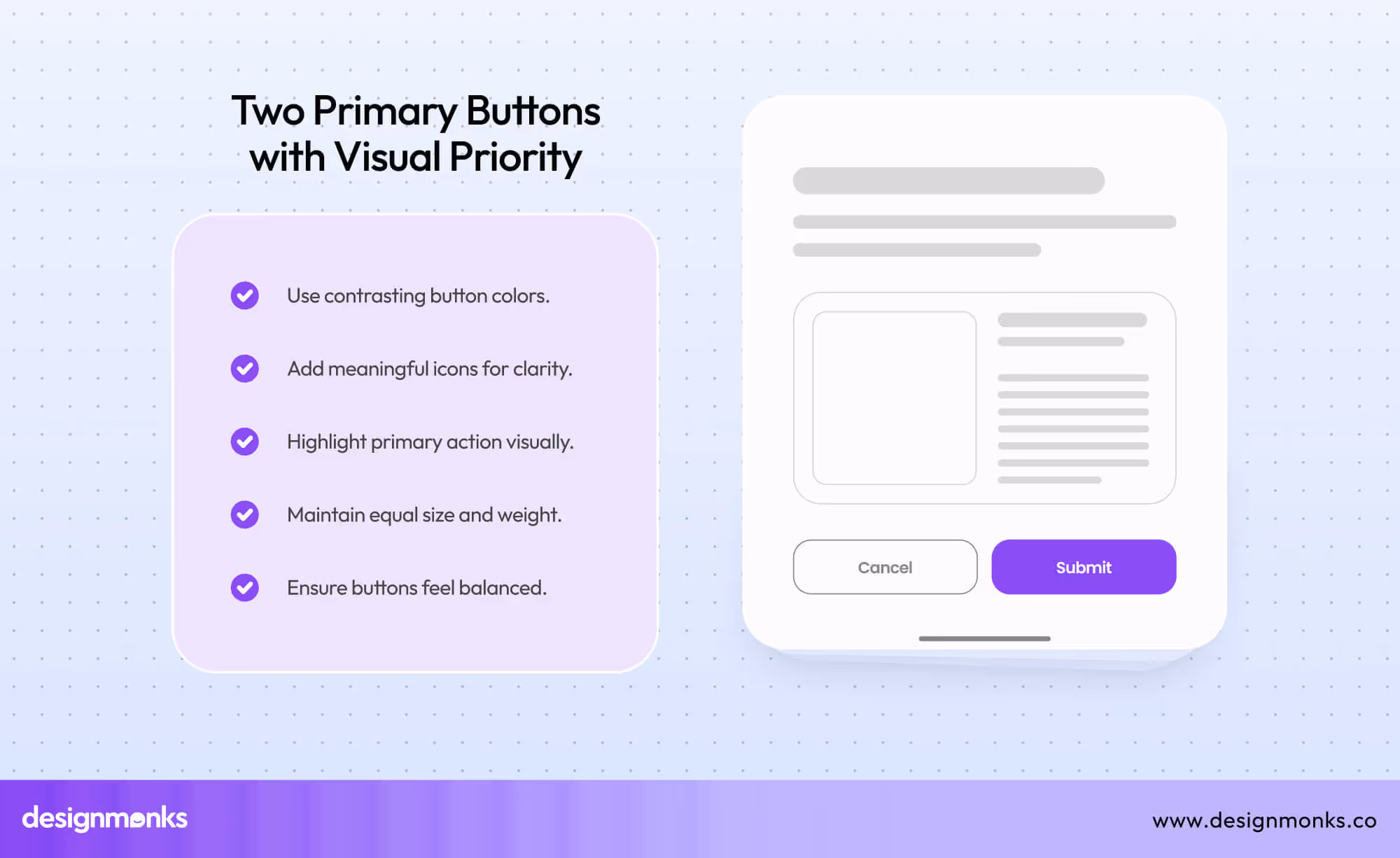
For example, use green or blue for actions like “Confirm” or “Save” and red for actions like “Delete” or “Cancel.” This color difference tells users which button they should focus on.
Icons or bold text can also add clarity. For example, placing a checkmark icon next to “Save” makes its purpose clear at a glance. Even though the buttons look different, they must feel balanced. Both buttons should have equal size and weight.
Button Styling
The UI buttons need to look consistent on the entire design. They should share the same shape, size, and font style. For example, if one button is rectangular with rounded corners, the other should look the same. A mismatch in styling can confuse users and make your design look messy.
Besides, the spacing between buttons is equally important. You don’t want the buttons to look crammed together. Maintain proper space between the buttons and other user interface elements to give them breathing room.
Lastly, don’t forget button states. Design different states like hover, focus, and disabled. When a user hovers or taps a button, it should respond visually—like changing color or showing a shadow.
Accessibility Considerations
Buttons should be accessible to everyone, including users with disabilities. For screen readers, use clear and descriptive labels. For example, “Confirm Payment” is better than a generic label like “OK.” It tells users exactly what the button does.
Make sure users can navigate between buttons using a keyboard. The “Tab” key should let users move from one button to the other logically. This is especially helpful for people who don’t use a mouse.
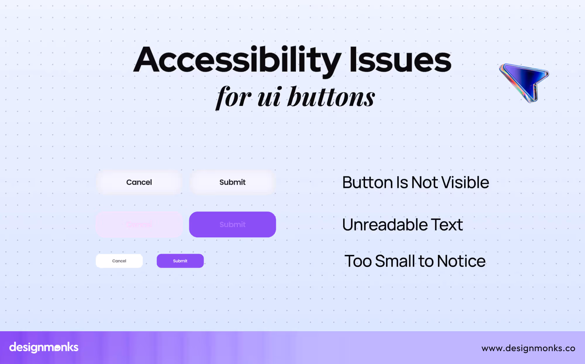
Touch targets are also essential for accessibility. Each button should be large enough to tap easily, at least 48x48 pixels. Small buttons frustrate users, especially on touch screens.
Designing Buttons for Smaller Screens
On mobile devices or smaller screens, horizontal space is limited. To solve this issue, stack buttons vertically instead of placing them side by side. Vertical alignment saves space and ensures buttons are easy to see and tap.
Buttons for mobile screens must be large enough for touch interactions. Keep their size at least 48x48 pixels to make them user-friendly. Avoid small text and instead simplify labels while keeping them descriptive. For example, “Proceed” is short but still clear for users.
Spacing between buttons matters even more on smaller screens. Keep enough space to prevent users from tapping the wrong button accidentally.
For even smaller devices like smartwatches, two buttons may not fit together. Consider showing one button at a time or using sequential navigation where users perform actions step by step.
Focus on Clarity and Simplicity
Always make a clean and simple design for buttons. Don’t overwhelm users with too much detail. Use clear text that explains what each button does. Avoid technical words or abbreviations that may confuse beginners.
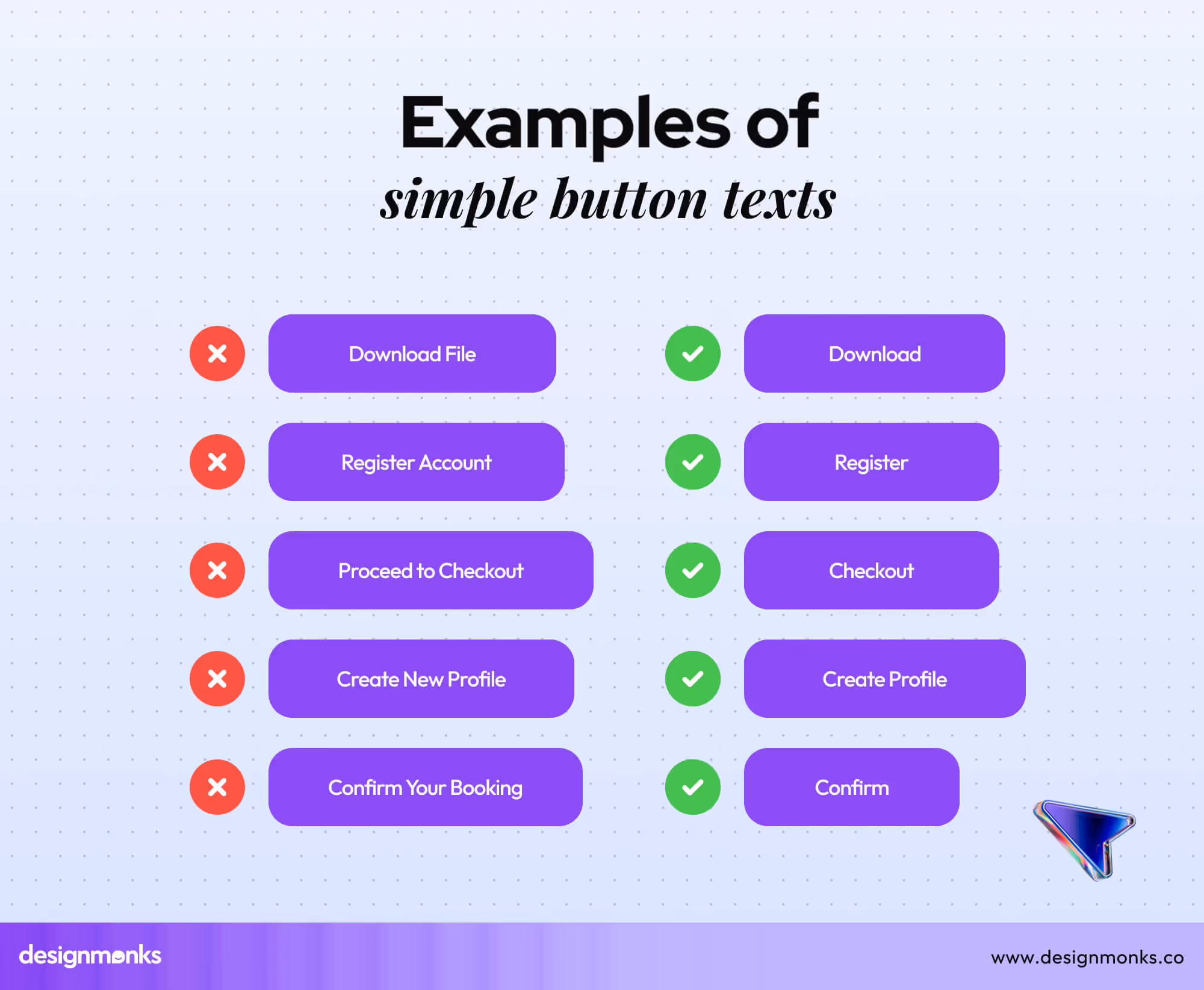
Examples of Simple Button Texts
For example, instead of writing “Submit Form,” a simpler label like “Submit” works better. Buttons should be straightforward, so users instantly know their purpose.
Test Button Placement and Design
Before finalizing your design, test your buttons with real users. Check if they understand the button actions and whether the alignment works for different screen sizes.
On desktops, users may prefer side-by-side buttons, but on mobile, stacked buttons work better. Testing helps you improve spacing, sizing, and placement. It also shows if the buttons are visually balanced and easy to interact with.
Displaying two primary buttons may seem simple, but it requires careful design thinking. Use visual hierarchy to guide users, keep button styling consistent, and make sure they are accessible to everyone.
The Use Case of 2 Primary Buttons in UI
As we know, sometimes, two buttons are equally important, and both need attention. However, using two primary buttons in the wrong place can confuse users. Here’s when to use and when to avoid two primary buttons.

When to Use Two Primary Buttons:
Use two primary buttons when the user has to choose between two equally important actions. Both actions should matter to the user and hold the same priority. Here are the common scenarios when you should use two primary buttons together:
- Decision prompts: When the user needs to make a critical choice, like “Accept” or “Decline.”
- Permission requests: For actions like “Allow” or “Deny” notifications or location access.
- Saving changes: When the user has options like “Save” or “Don’t Save.”
- Navigation choices: If two paths are equally valuable, like “Go Back” or “Continue.”
- Confirmation actions: When confirming or rejecting tasks, such as “Yes” or “No.”
- Multiple outcomes: When the user can choose between actions with different results but equal importance, like “Download” or “Share.”

When Not to Use
Avoid using two primary buttons when one action is clearly more important than the other. In these situations, using a primary button and a secondary button helps guide the user. However, you should avoid two primary buttons in these cases:
- Forms and submissions: Use a primary button like “Submit” and a less important option like “Cancel.”
- Checkout processes: Highlight the main action, like “Pay Now,” and de-emphasize actions like “Go Back.”
- Confirmation messages: When one action (e.g., “Confirm”) matters more than the other (e.g., “Close”).
- Optional steps: Use a primary button for “Next” and a secondary button for “Skip.”
- Less critical tasks: When the secondary action is rarely used, like “Download” (Primary) and “View Details” (Secondary).
FAQs
What is the perfect mobile button size?
The ideal mobile button size is 42 to 72 pixels. This specific sizing ensures buttons are touch-friendly while reducing accidental taps. It also improves usability on smaller screens like smartphones.
Can two buttons work on smartwatches?
Yes, two buttons can work on a smartwatch. However, space is limited here. That's why it's better to use single-button actions or stack buttons vertically with clear labels. For better usability, consider sequential navigation instead of showing two buttons together.
How do you ensure button design consistency?
To ensure button design consistency, use the same size, shape, font, and style. Maintain consistent spacing and align them properly on the UI to avoid confusing the user.
End Note
When designing interfaces with two primary buttons, clarity, and usability should take center stage. Effective button placement, spacing, and alignment guide users seamlessly and enhance their experience.
On wider screens, align buttons horizontally with 8–16px spacing, while on smaller screens, stack them vertically for touch-friendliness. Consistency in size, color, and style prevents confusion, while accessibility ensures inclusivity for all users.
Always consider the importance of both actions before choosing this approach. Thoughtful design keeps interfaces clean and user-focused. It will help you enhance the overall experience.

.avif)
.avif)
.avif)
.avif)


.avif)
.avif)
.avif)
.avif)


.avif)
