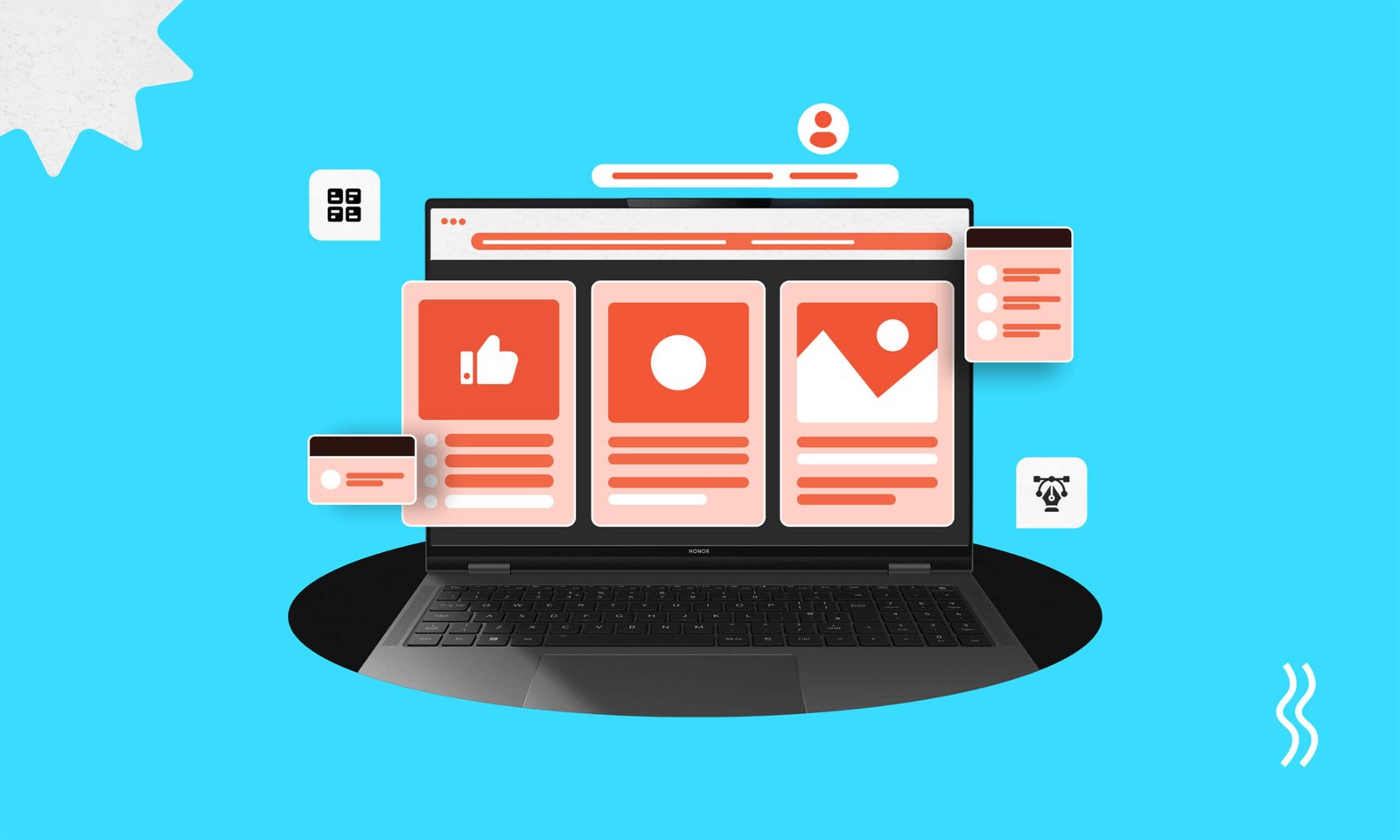
Are you sure that your business website’s interface is good enough to enhance growth? If not, you might be missing out on a crucial opportunity to engage users and drive success. To ensure a good interface, you should first learn what should a good interface design incorporate.
A well-designed interface is more than just visually appealing, it must have clarity, create seamless experiences, enhance trust, and encourage interactions that convert visitors into loyal customers.
But what truly defines a ‘good’ interface design? Is it the colors, navigation, or responsiveness? It’s all that and more. It’s about accessibility and consistency to speed and feedback. However, want to learn more about a good interface? Then keep reading to know what a good interface design should incorporate.
What Does It Mean by a Good Interface?
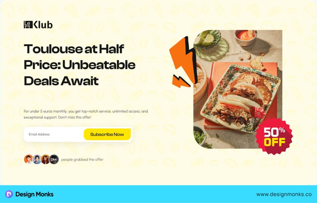
A good interface makes interacting with an app or website simple and easy. It’s like a guide that helps users accomplish their tasks without confusion. For example, a shopping app with clearly labeled categories and an easy checkout process ensures users can shop effortlessly.
Good interfaces are intuitive and easy to navigate. So, users don’t need to think hard about what to do next. Familiar icons like a magnifying glass for search or a trash bin for deletion make navigation easy. For instance, Google’s homepage is clean and focused so, we can immediately find the search bar.
Additionally, a good interface is visually pleasing but not distracting. It must use consistent colors and layouts. For example: Spotify’s dark theme, which feels organized and easy on the eyes. This design balance creates trust and a better user experience.
The Importance of Good Interface Design
A UI alone may not be that useful. You need a good UI. A well-designed interface makes apps or websites easy to use and efficient for users. It’s not just about looks. It’s about how smoothly everything works together.
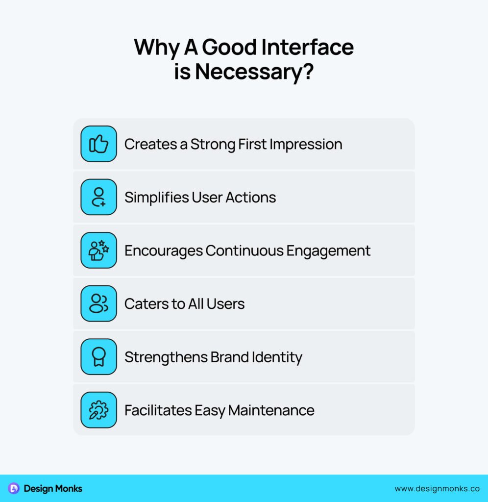
Here’s why good interface design matters:
First Impressions Matter
When someone uses your app or website for the first time, the interface is what they notice. A clean and nice design makes users curious to explore more. On the other hand, a cluttered or confusing design might make them leave right away. For a good first impression, you must get a good interface for the product.
Makes Tasks Easy
Good design makes complicated things simple. It helps users complete tasks quickly without facing any complexities. For example, clear buttons and simple menus guide users step by step. This smooth experience encourages them to spend more time on the app and even come back.
Keeps Users Engaged
A great interface doesn’t just work, it excites users. Thoughtful animations, quick responses, and interactive elements are always available in a good interface. They make users want to stick around. As a result, they’re more likely to recommend it to others.
Works for Everyone
Not all users are the same. Some may have difficulty seeing small text or certain colors. A good interface includes features like larger fonts, easy-to-read contrasts, and accessibility options. This way, everyone can use it comfortably, even if they have disabilities.
Reflects Your Brand
The design of your app shows what your brand stands for. Consistent use of colors, fonts, and visuals can create a lasting impression. A professional interface builds trust and helps users recognize and remember your brand.
Easier to Update
Over time, you’ll need to add features or fix problems. A well-organized design makes updates easier. Developers can make changes without confusing users. This way, a perfect interface helps you keep the app fresh and relevant.
Good interface design is more than pretty graphics. It helps users, grows your audience, and strengthens your brand. That’s why you should always think twice before ignoring a good interface for your website or app.
14 Things a Good Interface Design Incorporate
Now, let’s come to the core point about what should a good interface design incorporate. Well, a good interface design isn’t just about how it looks, it’s about how it works. It ensures users can easily and effectively interact with an app or website.
Below are 14 major elements every good interface design should include:
1. Clarity
Clarity is the cornerstone of a good interface. It’s about using simple language with easy-to-use visuals. Users should instantly understand what to do and how to do it. For that, always try to use clear labels, simple instructions, and an intuitive layout.
Make sure to avoid jargon and keep the design free of unnecessary clutter. A clear interface is essential because it can reduce user confusion, speed up task completion, and ensure a seamless experience for everyone.
2. Consistency
Your interface needs consistency for a better impression. Also, consistency creates familiarity and helps you keep the users engaged and not feeling confused. However, to ensure consistency, follow the tricks below:
- Follow predefined styles for colors, fonts, and components.
- Keep similar pages structured in the same way.
- Use consistent button styles, icons, and navigation patterns.
- Stick to a hierarchy for headings, subheadings, and body text.
- Regularly check for design inconsistencies during development.
3. Responsiveness
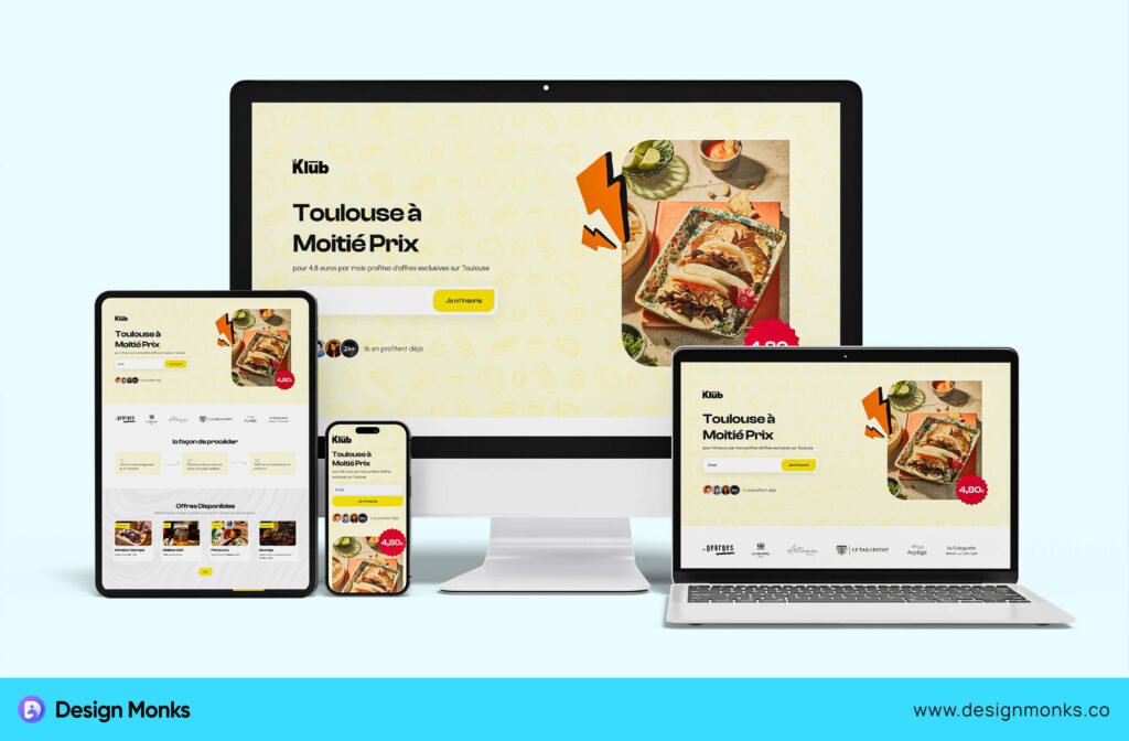
A responsive interface works seamlessly on different devices and screen sizes. Whether on the phone, tablet, desktop, or other device, users should experience smooth functionality. Responsive designs automatically adjust elements to fit the screen. It ensures accessibility for all users.
4. Simplicity
Simplicity focuses on what’s important. In this case, distractions should be removed, and features should be included that help users achieve their goals. Minimalist designs with sufficient whitespace and straightforward navigation reduce cognitive load, making it easier for users to interact.
5. Accessibility
Good design must be inclusive. Make sure to add features like screen reader compatibility, scalable fonts, and high-contrast themes. These elements help people with disabilities use the interface comfortably.
You should never ignore the fact of accessibility. Remember that it broadens your audience and ensures no one feels left out.
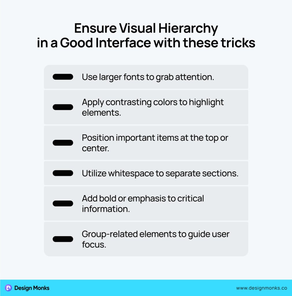
6. Visual Hierarchy
Guide users’ attention with a strong visual hierarchy. Use size, color, and placement to highlight important elements like buttons or headlines. For example, make call-to-action buttons stand out with bold colors and larger sizes.
7. Feedback
You must provide instant feedback for user actions. For instance, when users click a button, it shows a loading spinner or a success message. Feedback reassures users that their actions were successful or alerts them if something went wrong.
8. Navigation
Easy navigation is another necessity. In this case, include a clear menu, breadcrumbs, or a search bar to help users find what they need. A well-designed navigation system reduces frustration and keeps users on your site longer.
9. Error Prevention
An interface must prevent errors in advance to be a good one. Prevent mistakes with clear prompts and confirmations. For example, warn users before deleting files or auto-save their progress. Preventive measures reduce errors and improve the overall user experience.
10. Scalability
You can’t ignore scalability when it comes to a good interface. Design with future growth in mind. The interface must handle more features, content, or users as the app evolves. Scalable designs save time and effort during updates or redesigns.
- Use Modular Components: Design reusable elements that can be updated or expanded without redesigning the entire interface.
- Flexible Layouts: Create grid-based designs that adapt to different screen sizes and content growth.
- Optimize for Performance: Keep code and assets lightweight to manage increased user traffic seamlessly.
- Plan for Future Features: Leave space and flexibility in the design for adding new elements later.
- Use Scalable Technology: Implement frameworks and tools that support long-term growth and updates.
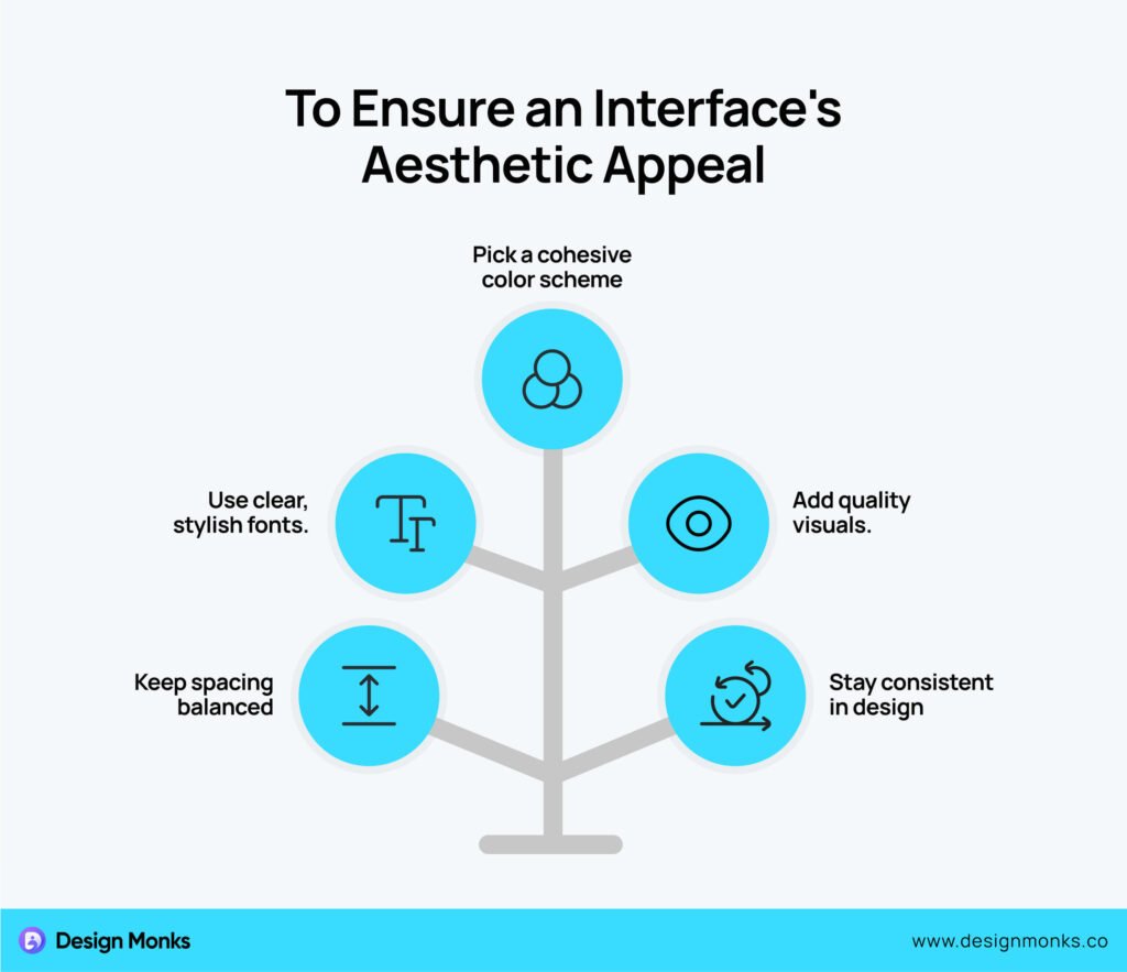
11. Aesthetic Appeal
Even though functionality comes first, a visually appealing interface keeps users engaged. It must be designed with harmonious colors, attractive fonts, and high-quality visuals. A beautiful design leaves a lasting impression and builds trust in your brand.
12. Intuitive Design
The interfaces must feel natural. It should have patterns that users are already familiar with, like swiping gestures on mobile or a shopping cart icon for checkout. Intuitive designs lower the learning curve and make users feel comfortable.
13. Performance Optimization
The website or application must have faster load times and smooth interactions. Users dislike slow apps or websites, so optimize images, code, and transitions. A quick, responsive interface keeps users engaged and prevents drop-offs.
14. User-Centered Approach
The interface design should focus on the user at every stage. A user-centered design with a proper usability testing approach ensures the interface solves problems effectively. Follow the tricks below to ensure a user-centered design for your interface:
- Know Your Users: Conduct thorough research to understand their needs.
- Design for Usability: Ensure every feature is easy to use.
- Prioritize Accessibility: Make the interface inclusive for all users.
- Test with Users: Gather feedback directly from real users.
- Adapt to Feedback: Improve designs based on user behavior and input.
- Simplify Navigation: Keep the flow intuitive and straightforward.
So, these are 14 major elements a good interface should incorporate. However, these are not all. There are more and those extra elements are needed based on the project type and details.
Common Mistakes to Avoid for a Good UI Design
Creating a good UI design isn’t just about adding features; it’s about avoiding mistakes that frustrate users. Even small errors can negatively impact the user experience. As a result, the app or website can be harder to use.
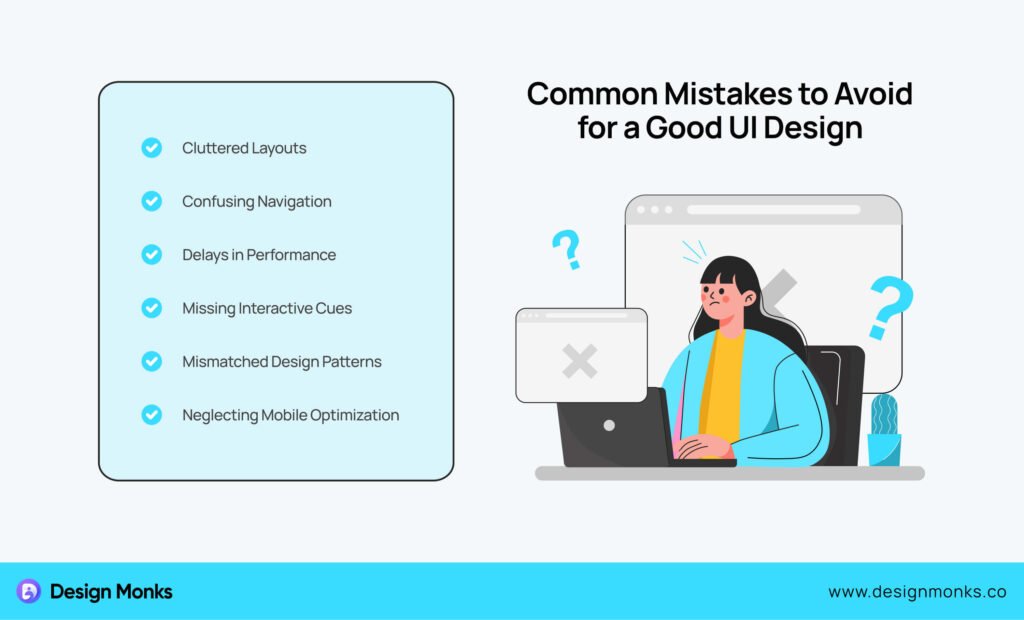
Here are some common mistakes to steer clear of:
Overloading the Interface
Crowding the interface with too many elements confuses users. Overusing buttons, menus, or text creates visual clutter and increases cognitive load. Keep the design clean and prioritize major features to guide users toward what matters most.
Ignoring Mobile Responsiveness
Many users access websites and apps on their mobile devices. If you ignore a responsive interface and relevant user pain points, the issue will result in poor usability on smaller screens. Ensure your UI adapts seamlessly to different screen sizes. It’ll provide a smooth experience for all devices.
Inconsistent Design Elements
Inconsistent user interface elements like fonts, colors, or button styles on different pages disrupt the user’s flow. Users expect a predictable design that feels familiar. Maintain consistency in typography, icons, and layouts to build trust and make navigation easier.
Poor Navigation Structure
A confusing or overly complex navigation system frustrates users. The interface should never hide important menus or use non-standard navigation patterns. The menus should be easy to find and organized logically, so users can move through your site effortlessly.
Lack of Feedback
When users interact with an interface, they need confirmation that their actions were successful. The website should provide feedback, like:
- Loading spinners,
- Error messages,
- Success notifications.
This feedback leaves users uncertain. Always include visual or auditory cues to keep users informed.
Ignoring Accessibility
A UI that doesn’t consider accessibility excludes a significant portion of users. Overlooking features like proper color contrast, readable fonts, or keyboard navigation alienate users with disabilities. That’s why always design inclusively to reach a broader audience.
Slow Loading Times
Even the most beautiful UI won’t matter if it’s slow. Users quickly lose patience with slow-loading pages or laggy interactions. Optimize images, minimize code, and use caching techniques to ensure fast performance.
Good or modern UI design must avoid these common mistakes at the same time, focusing on user needs. A clean, consistent, and responsive interface with clear navigation and accessibility ensures a positive experience for all users.
FAQs
What are the principles of good UI design?
A good UI design has several principles. The most common ones are:
- Clarity: Ensure the interface is easy to understand.
- Consistency: Maintain uniform design elements.
- Feedback: Provide instant responses to user actions.
- Simplicity: Focus on essential features.
- Accessibility: Design for all users, including those with disabilities.
- Responsiveness: Ensure smooth functionality across devices.
How can you say an interface is successful?
An interface is successful when users can easily achieve their goals without facing any confusion. The interface has succeeded if they navigate effortlessly, complete tasks quickly, and find the experience enjoyable. High user engagement, positive feedback, and repeated use are signs of a successful interface.
Is a good UI enough without a good UX?
No, a good UI without good UX is incomplete. Even though UI focuses on visuals, UX ensures the overall experience meets user needs. A visually appealing app with poor navigation or confusing functionality won’t retain users. That’s why, both UI and UX are essential for a well-rounded product.
Conclusion
A good interface design is the backbone of any successful digital product. It must incorporate essential elements like clarity, accessibility, consistency, responsiveness, and user feedback. Otherwise, you can’t create a seamless experience that builds trust and drives engagement.
Remember, it’s not just about aesthetics, it’s about functionality and usability that meet user needs. So, invest time and effort to improve your interface design which can transform how users interact with the website.